Project Overview
Client: Bank of Chile, Chile’s largest financial institution with a nationwide branch and ATM network.
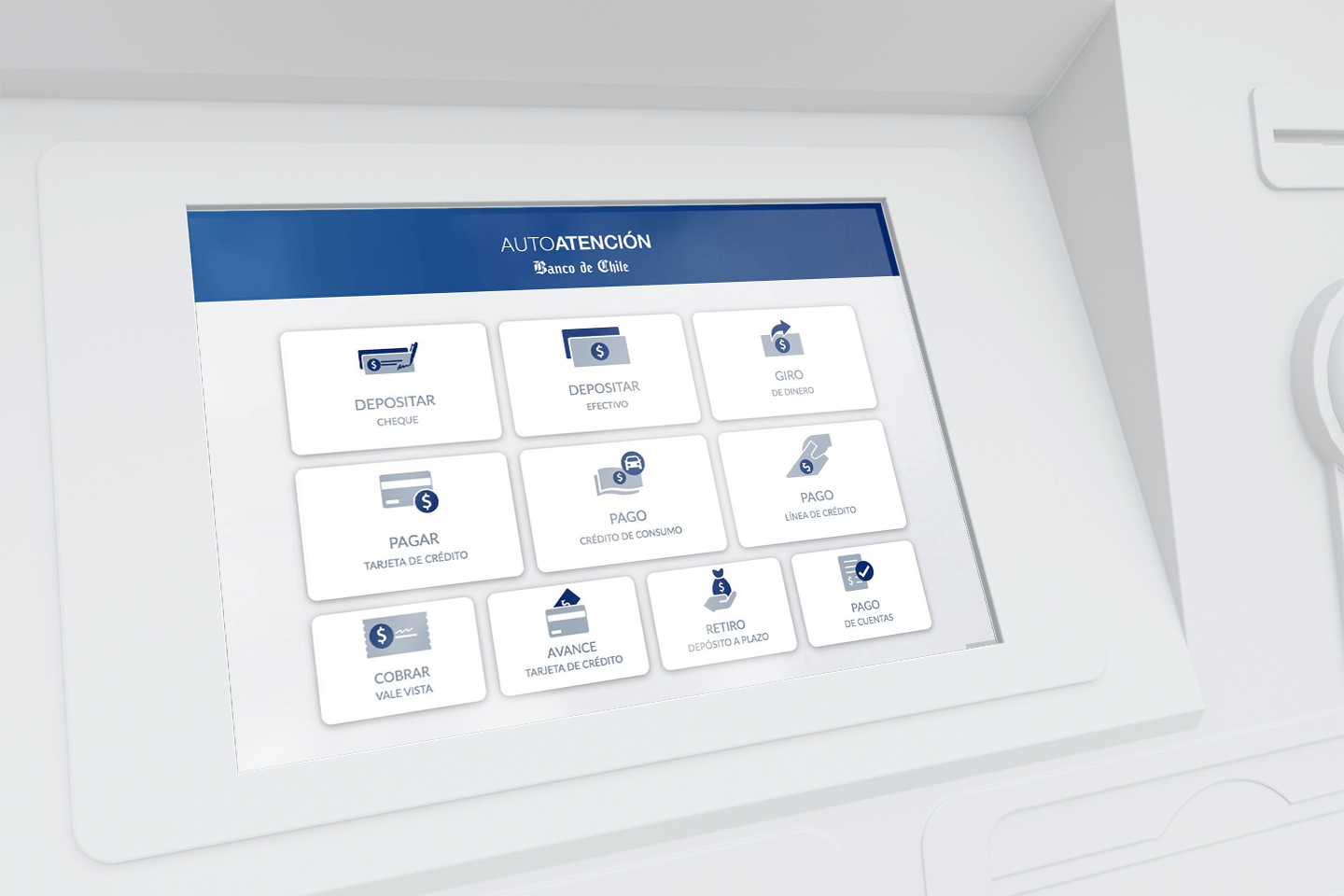
Challenge: Modernize the ATM experience by introducing a touchscreen interface for complex banking services and transactions, reducing branch congestion, and improving customer satisfaction while balancing accessibility, usability, and stakeholder expectations.
THE PROBLEM TO BE SOLVED
The existing Term Deposits application had two major shortcomings:
- Customer-side (B2C): Users were leaving the platform due to limited features and less attractive interest rate options.
- Business-side (B2B): Companies had no digital solution at all. Their only option was to negotiate with bank executives via phone — a system that worked for building relationships but felt outdated. This gap pushed large clients to competitors with more modern tools.
The bank needed an upgrade, but there was no clear goals beyond “deliver a new version in two weeks.”
MY ROLE
I worked as a UX Consultant, responsible for:
- Translating vague business requirements into clear, user-centered design outcomes.
- Collaborating closely with product owners, stakeholders, developers, and banking executives.
- Research and designing both B2C and B2B flows, wireframes, high-fidelity UI, and admin dashboards.
My role was part designer, part facilitator: helping stakeholders articulate their vision, then turning it into a concrete, usable product.
Approach
1. Aligning Stakeholders Through Collaboration
It quickly became clear that the main stakeholder had a strong vision but struggled to communicate it. To bridge the gap, I suggested bringing him directly into our design process. Working side by side, we rebuilt the product from scratch: mapping every touch point, interaction, refining user stories, and aligning on features.
Democratizing the design process through collaboration gave us momentum and clarity.
2. Ethnographic research and competitive benchmarking
To clarify doubts, I proposed spending a full day with the Term Deposits executive team. Observing how they worked with clients gave us valuable insights:
- Deals were often closed by phone, relying on trust and personal relationships.
- Executives customized offers (rates, terms, perks) depending on client profiles to outsmart the competition.
- Businesses lacked a digital way to monitor their investments but were comfortable with the status quo.
This highlighted the importance of designing a platform that balanced automation with flexibility — enabling digital convenience without losing the sense of trust that executives had cultivated.
We also studied competitors’ platforms, noting features such as:
- Real-time simulations.
- Multiple investment options.
- Dedicated flows for both individuals and businesses.
These benchmarks guided us in prioritizing features that could both match and differentiate Bank of Chile’s offering.
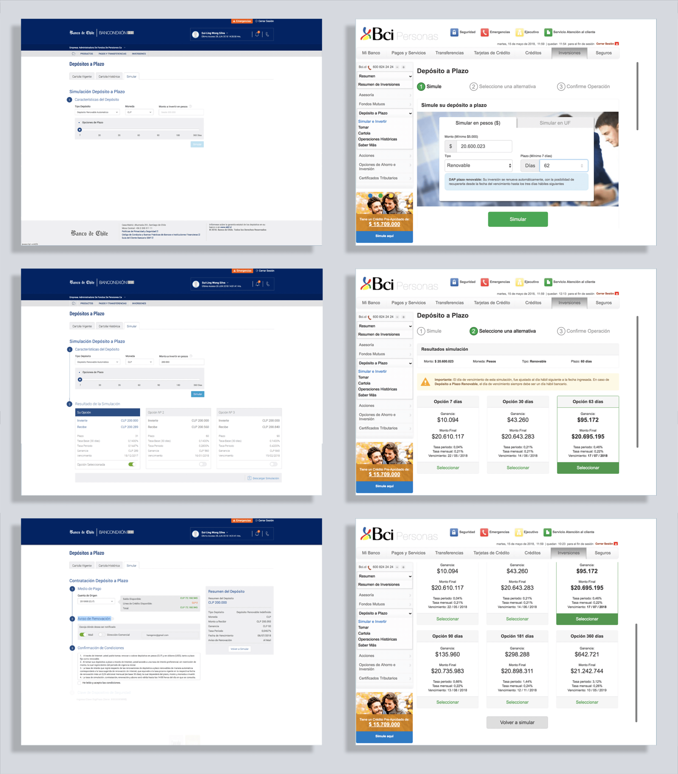
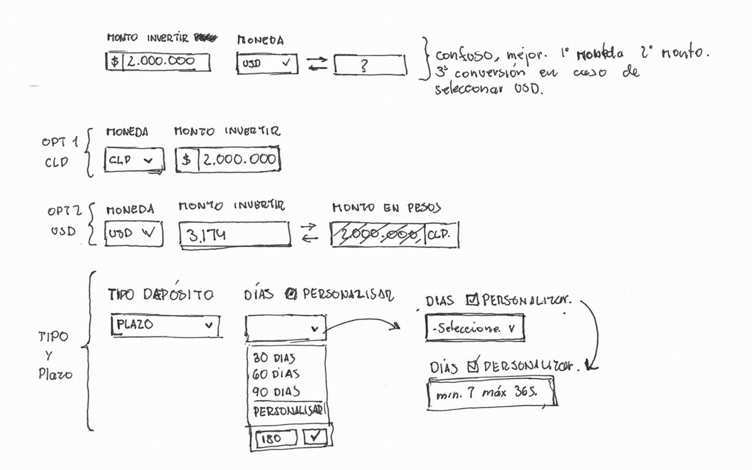
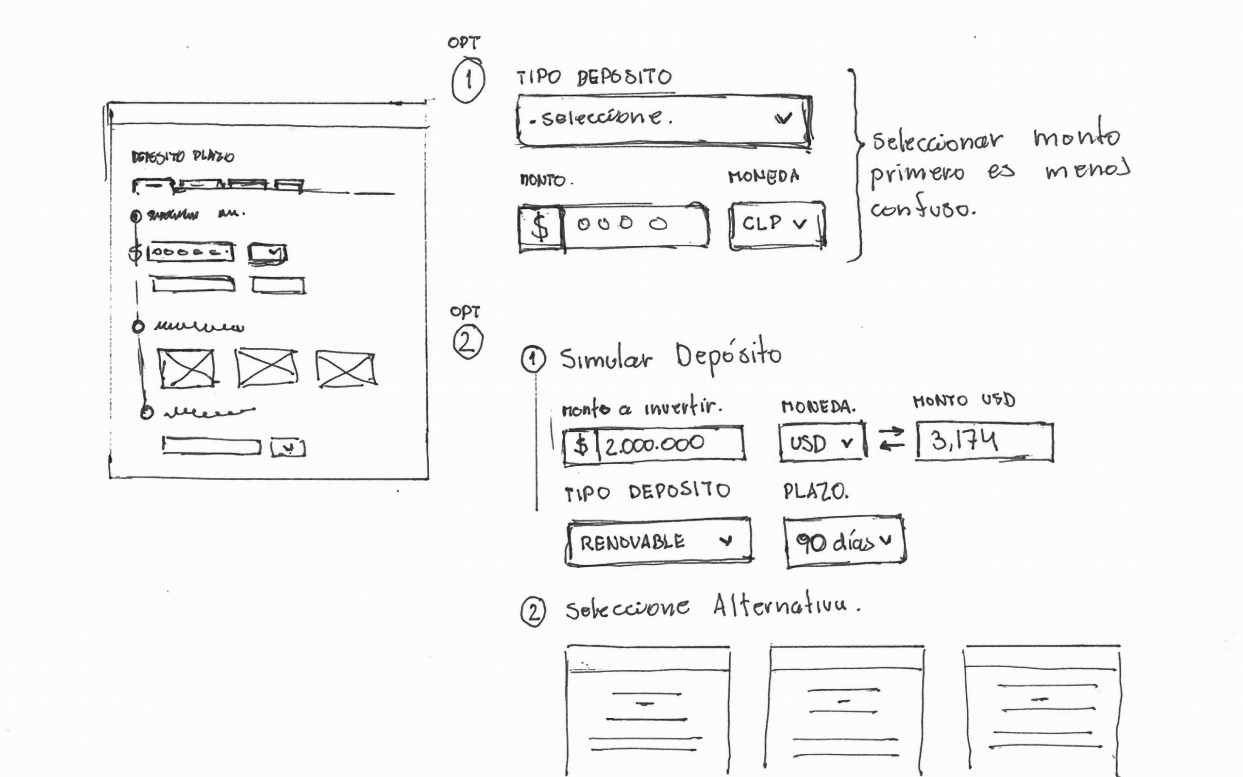
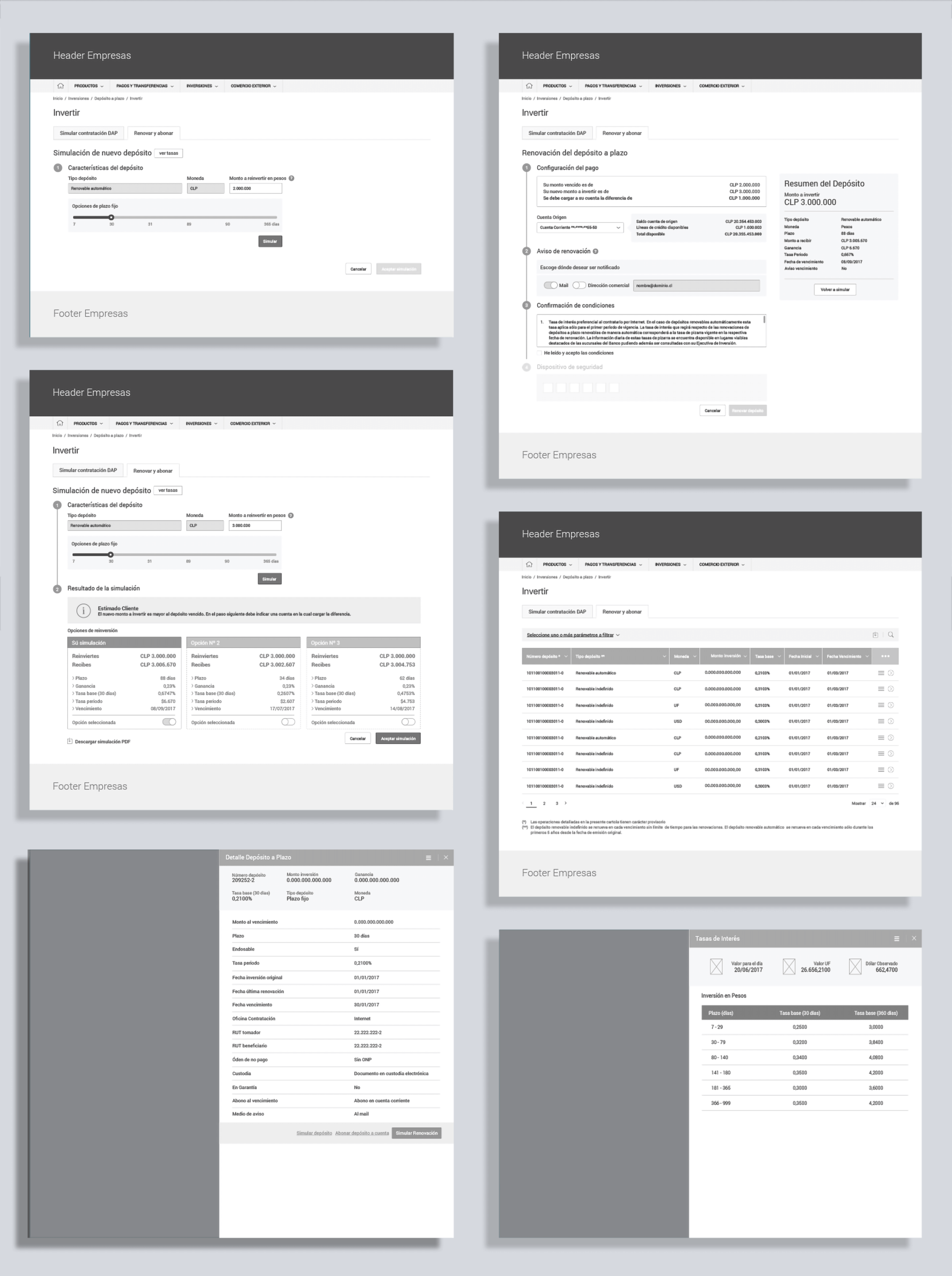
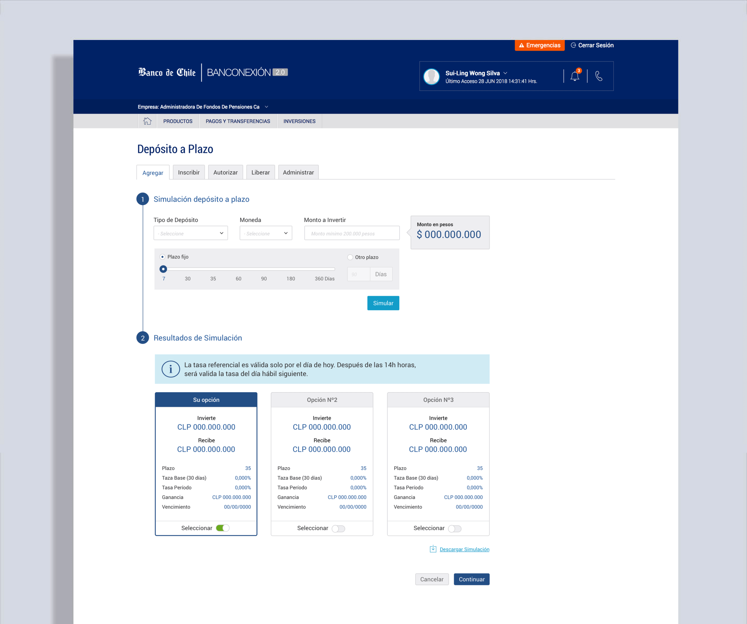
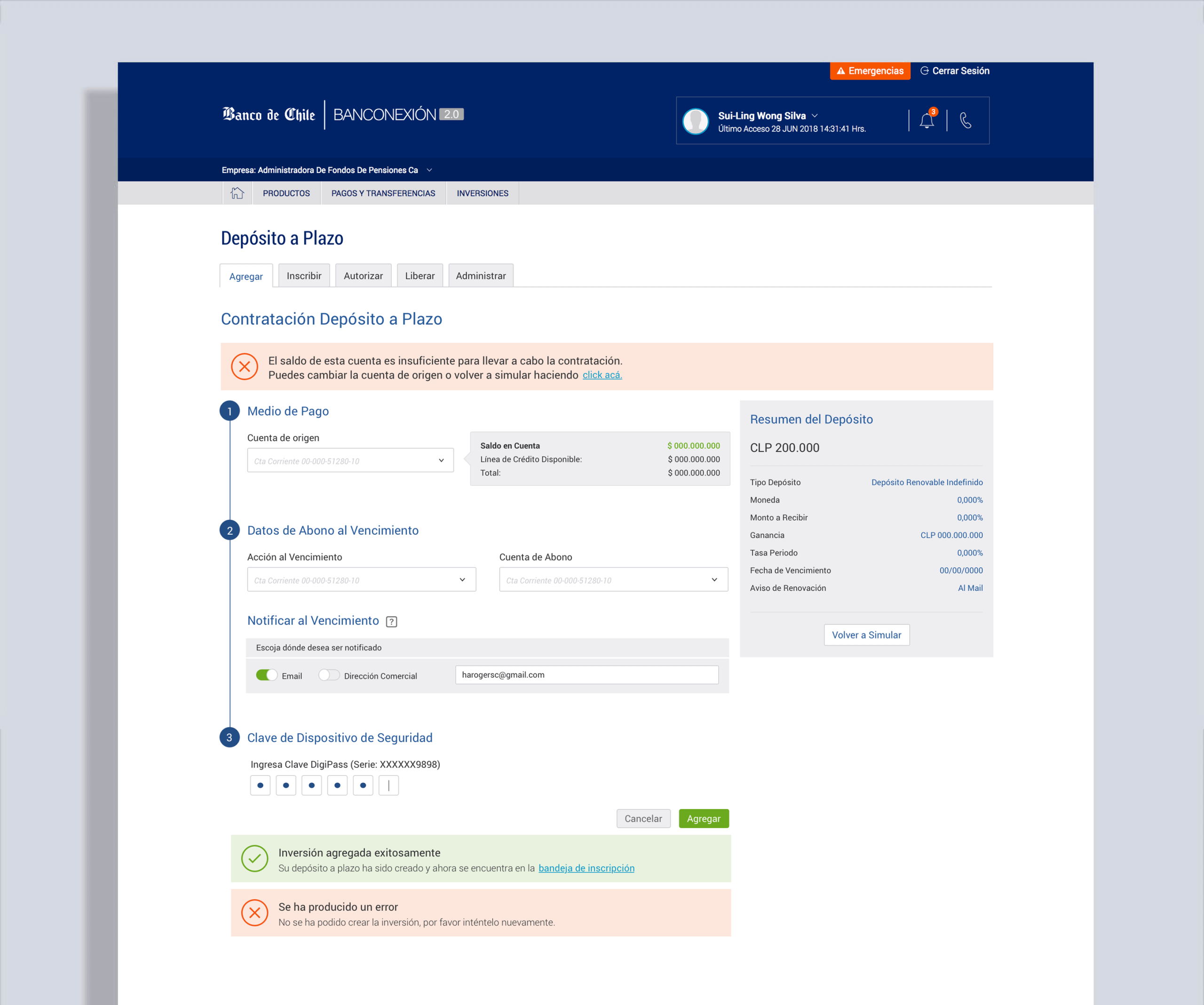
3. From Wireframes to UI
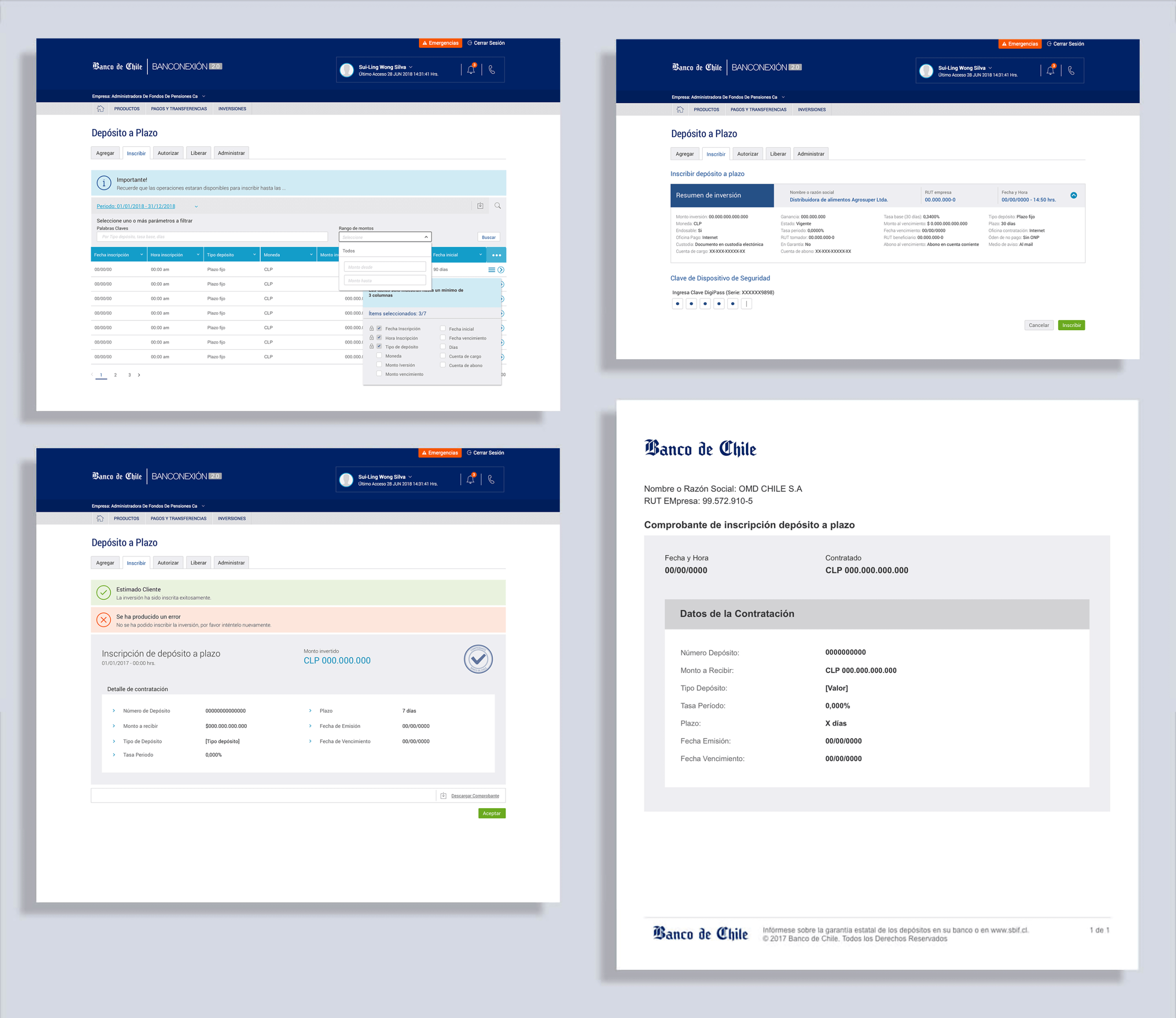
To move quickly, I sketched the initial flows and wireframes, inviting the product owner and stakeholder to participate in this creative process before translating them into medium-fidelity wireframes. My goal was to leverage as much of the existing UI kit as possible to reduce development overhead, creating new components only when necessary.
The main product changes included:
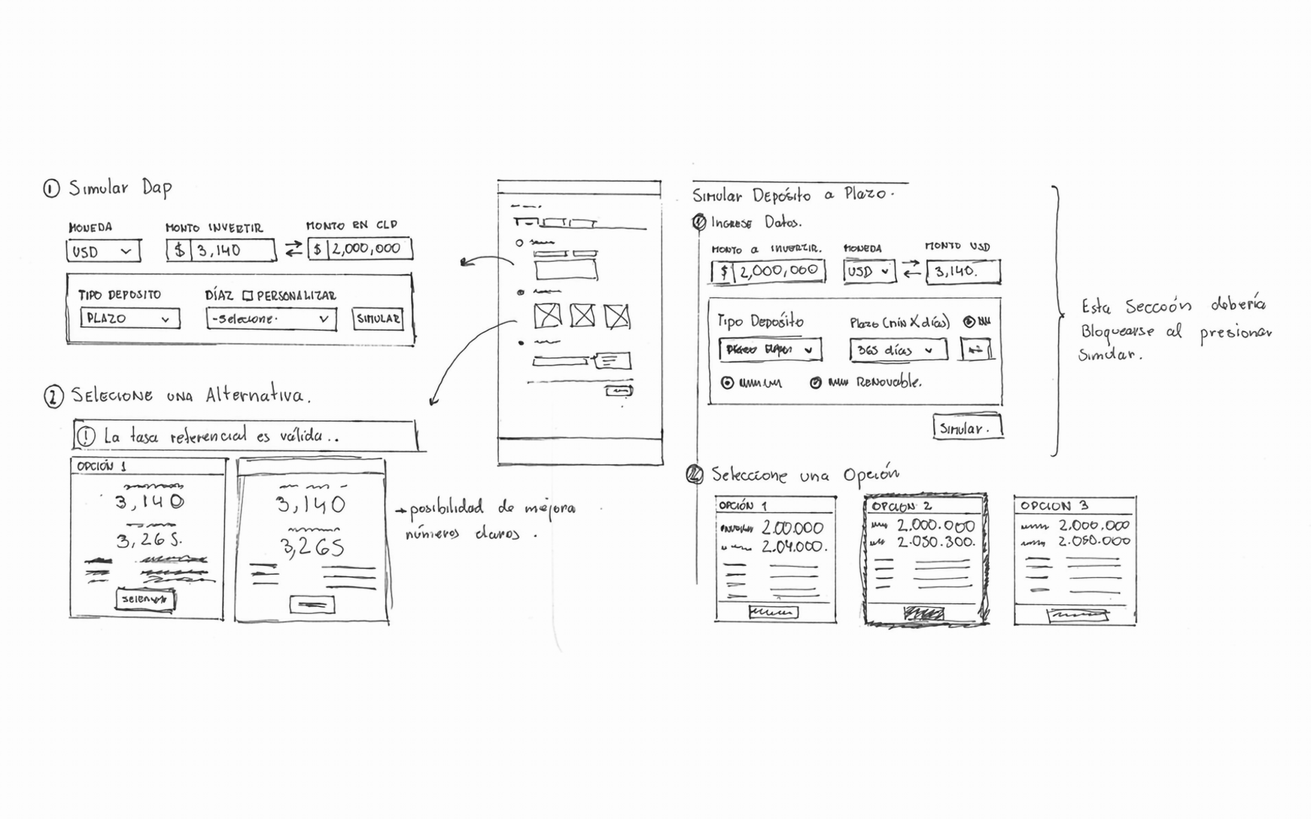
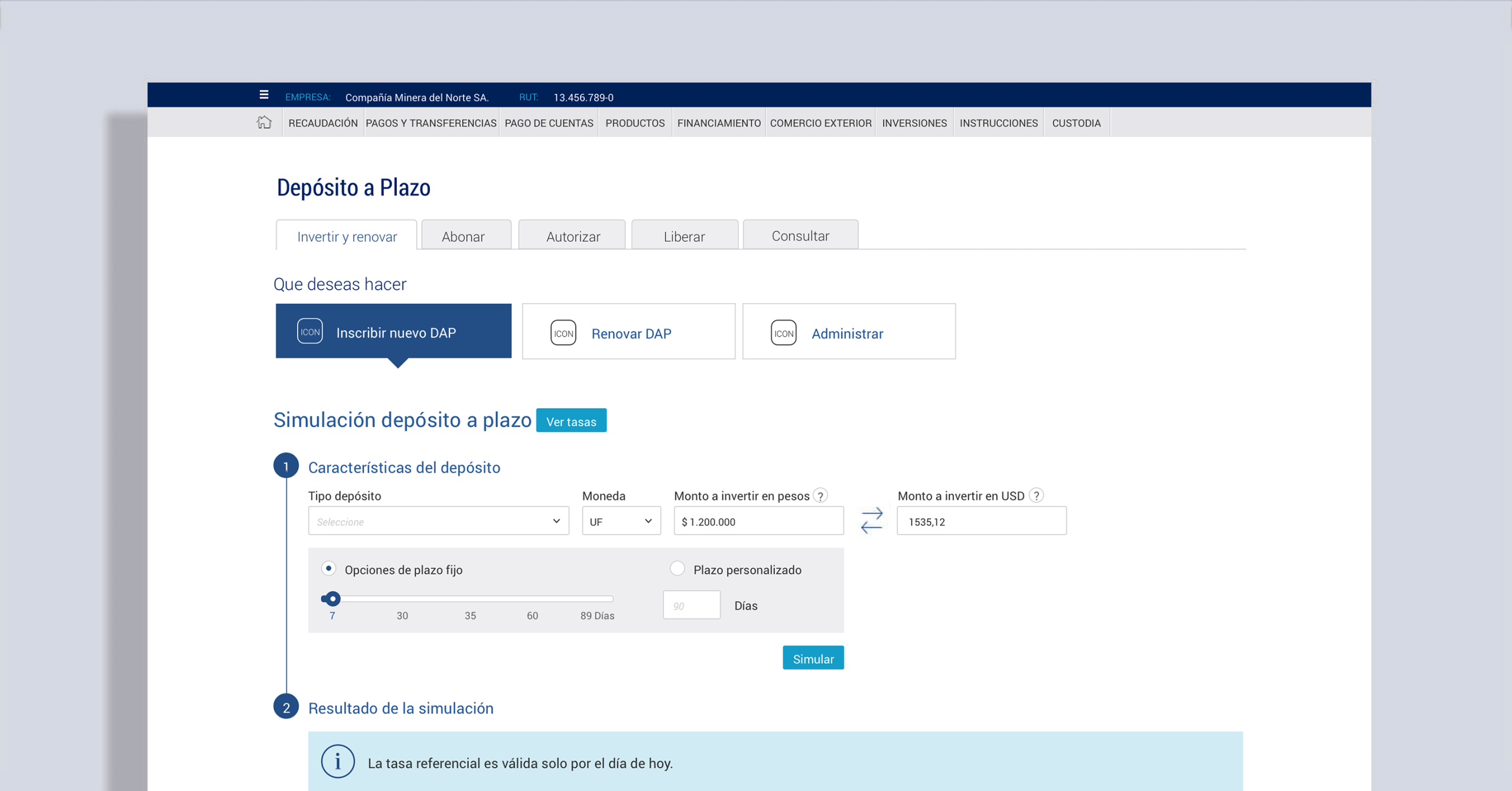
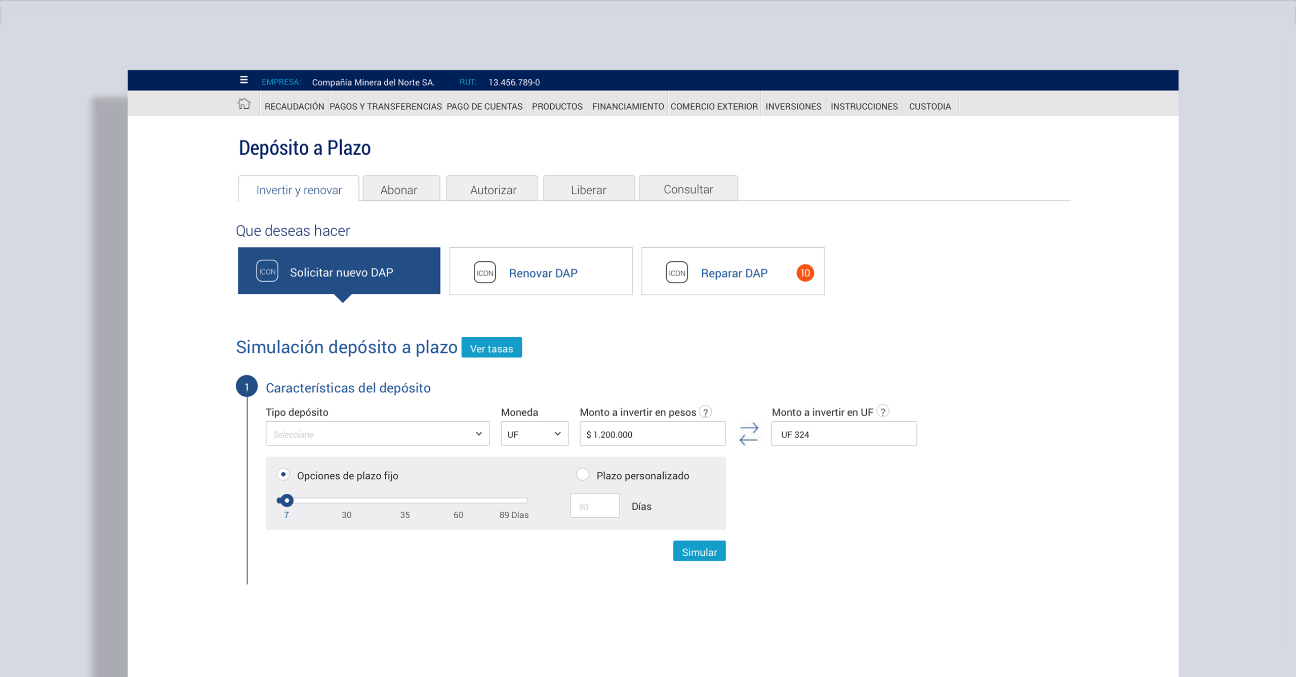
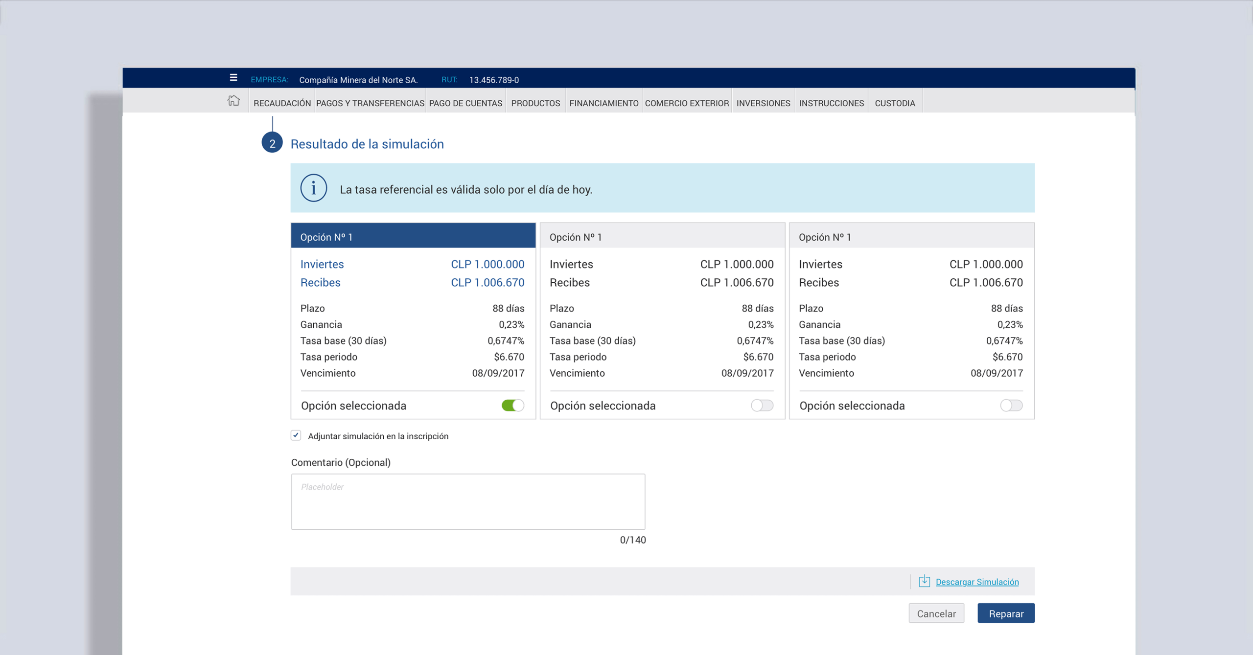
- B2B flow introduction: A two-step process where users could choose investment type, currency (with real-time conversion), amount, and duration — then run simulations.
- Simplified options: Instead of 9+ investment offers like competitors, we showed only 3. Research confirmed that large investors negotiate directly with executives anyway, so fewer options reduced cognitive load without limiting functionality.
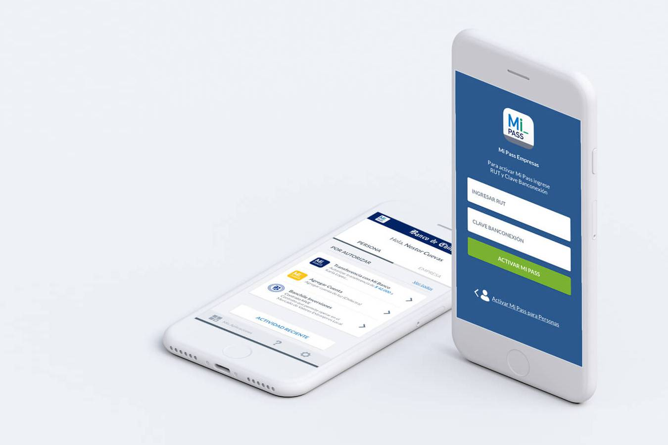
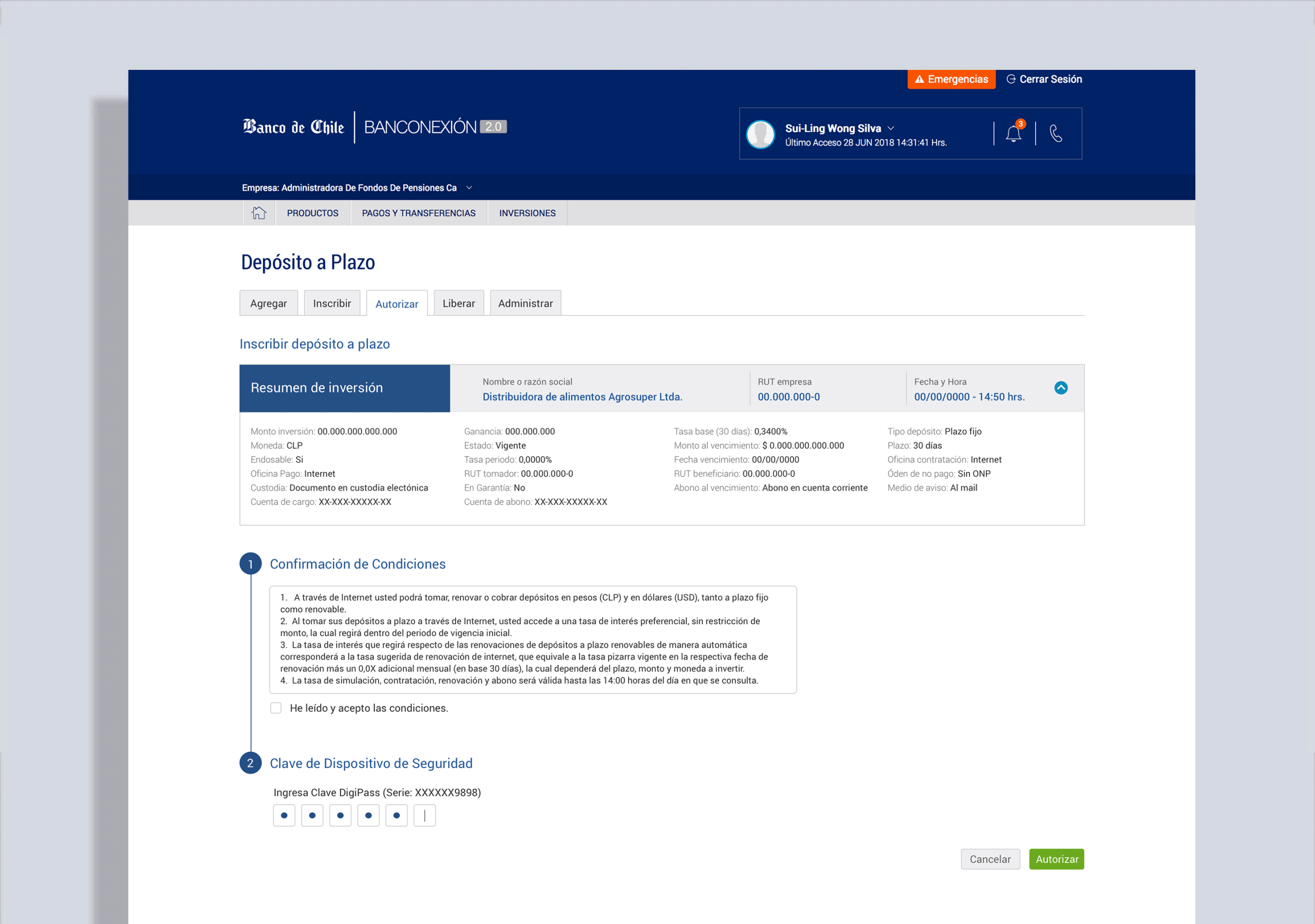
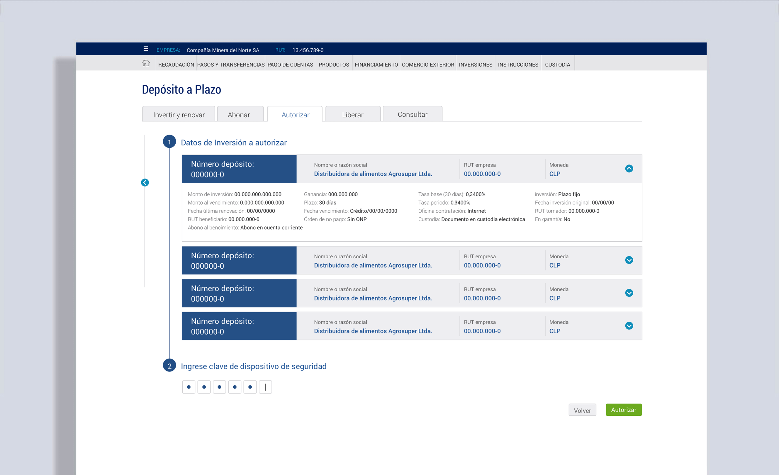
- Secure checkout: Users selected their funding account, notification preferences, and confirmed via two-step verification (or security device for businesses).
4. Designing for Businesses
I designed a minimalistic user interface to reduce complexity, ensure consistency, and incorporate common UI elements. I strategically used color and typography to establish hierarchy and facilitate clear communication.
Our studies showed that a user who invests large sums usually deals directly with the bank executives because they already have a long-term relationship and can bargain with them.
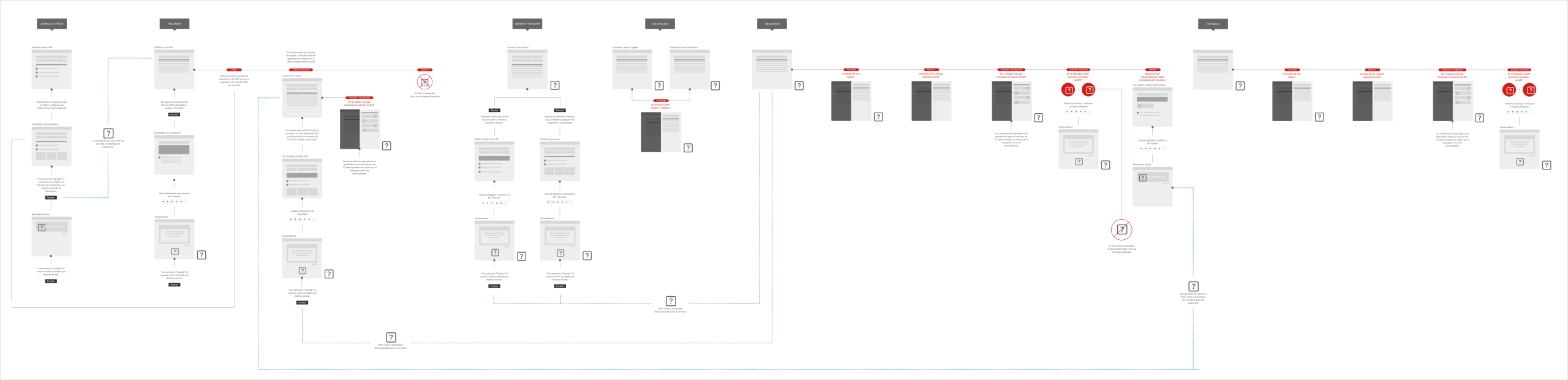
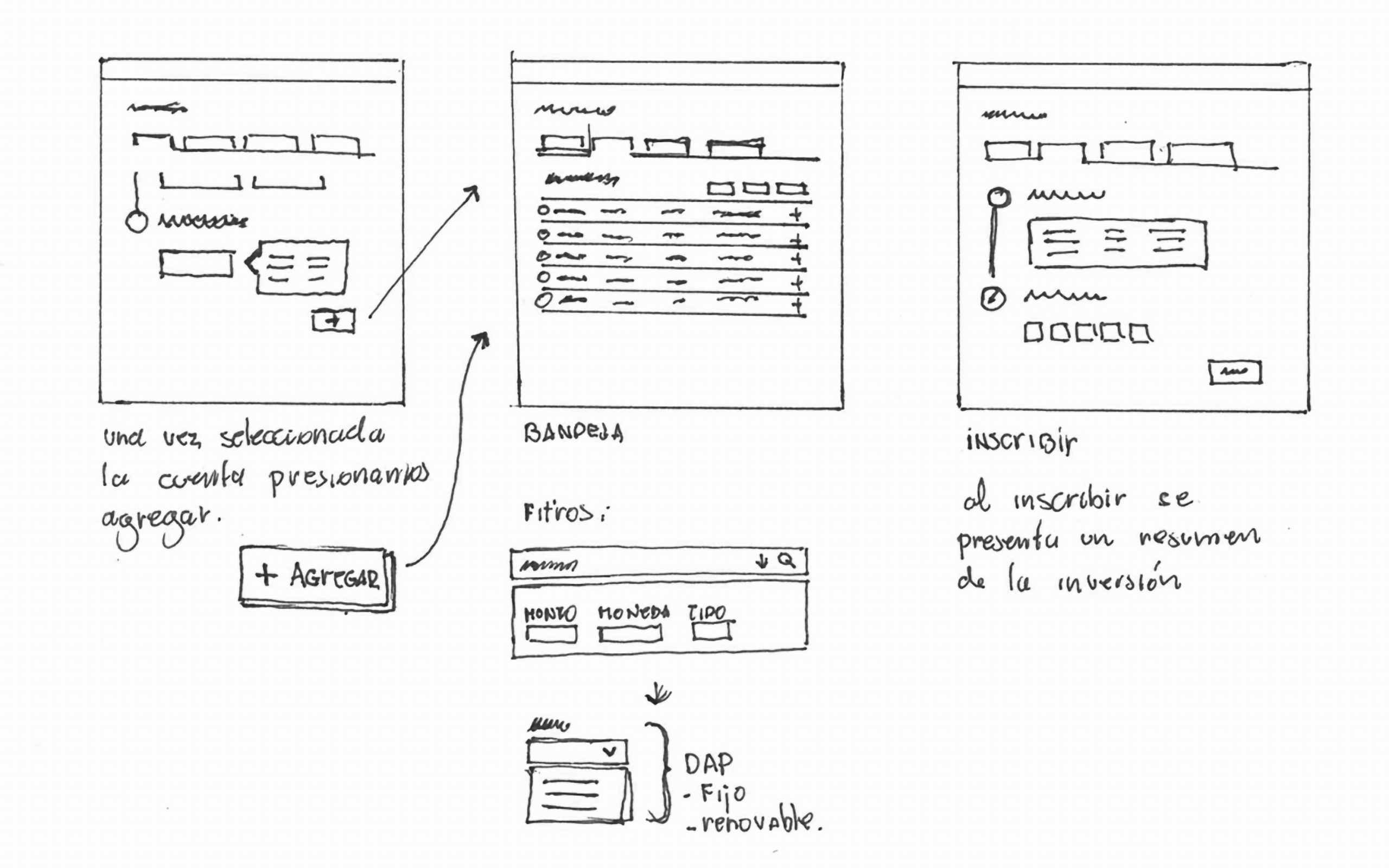
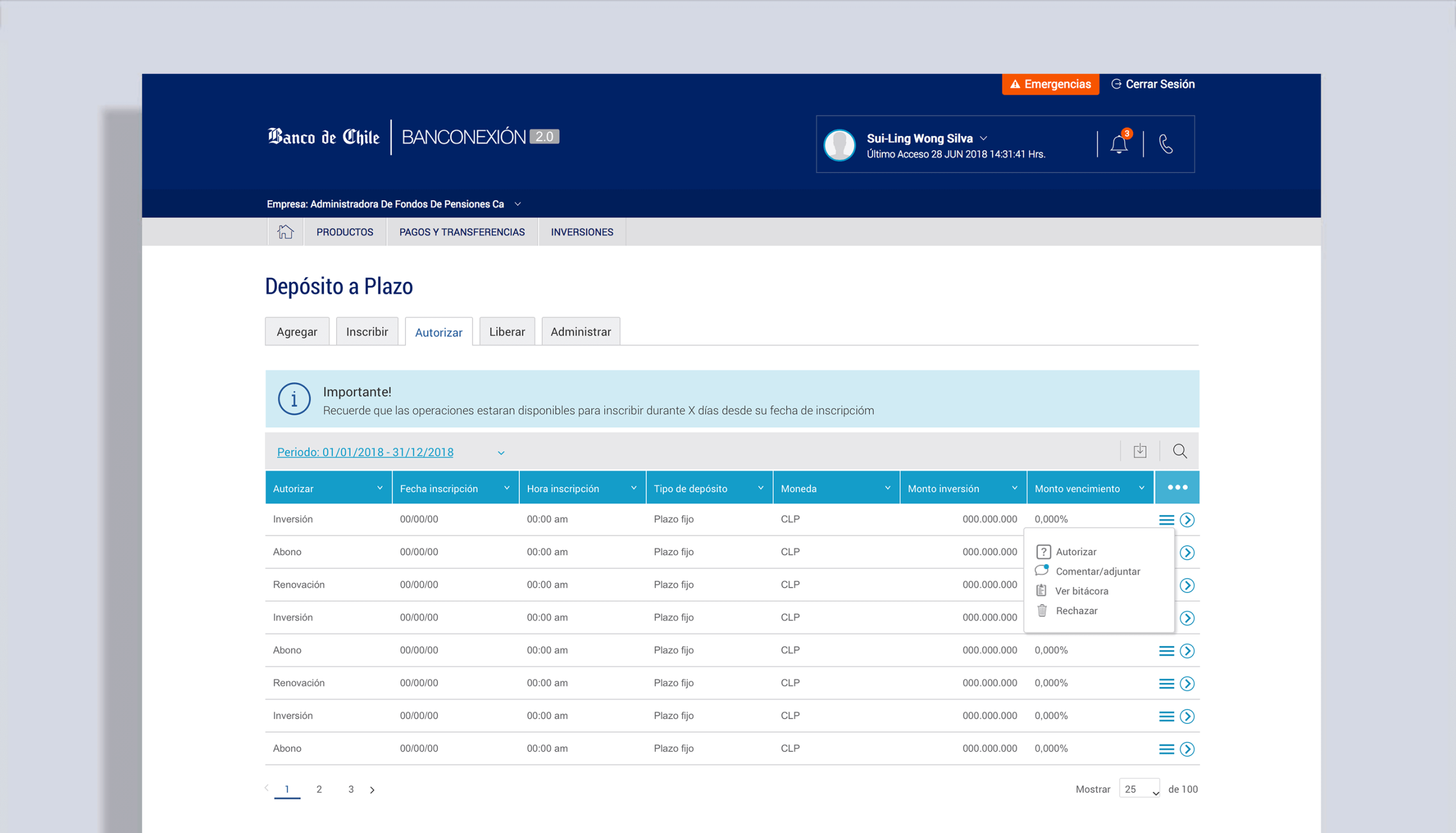
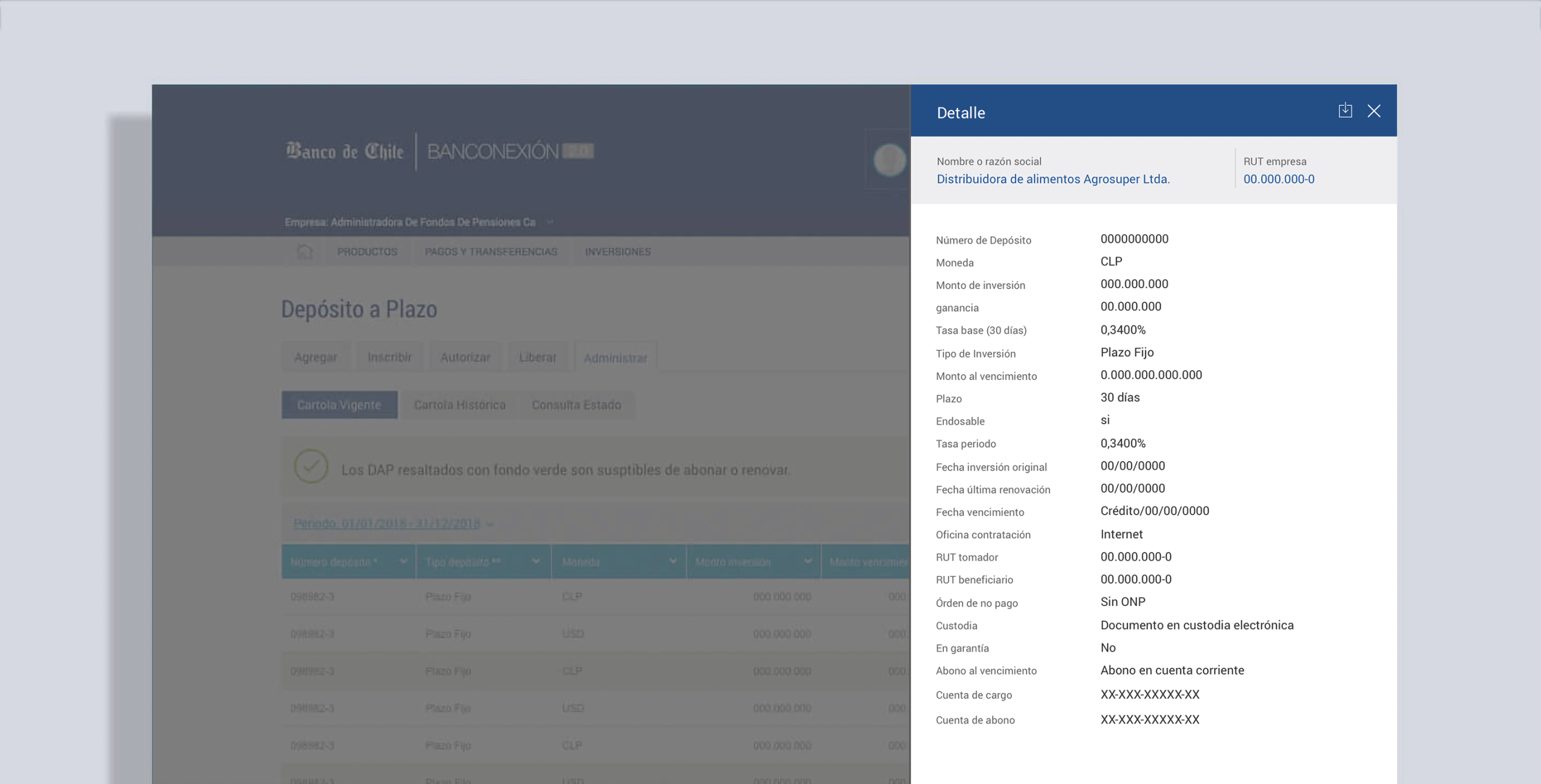
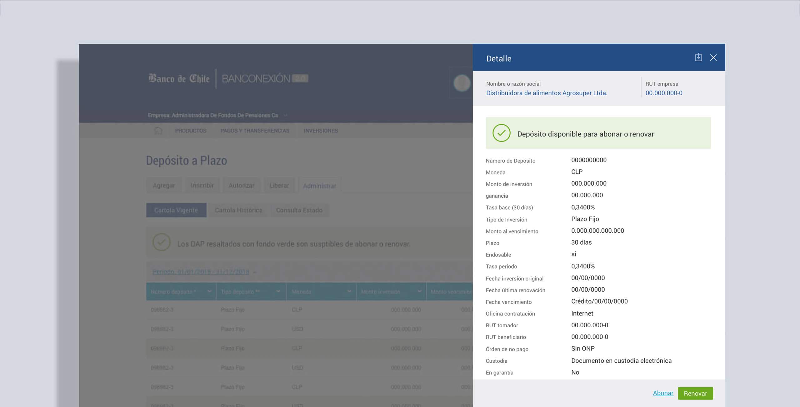
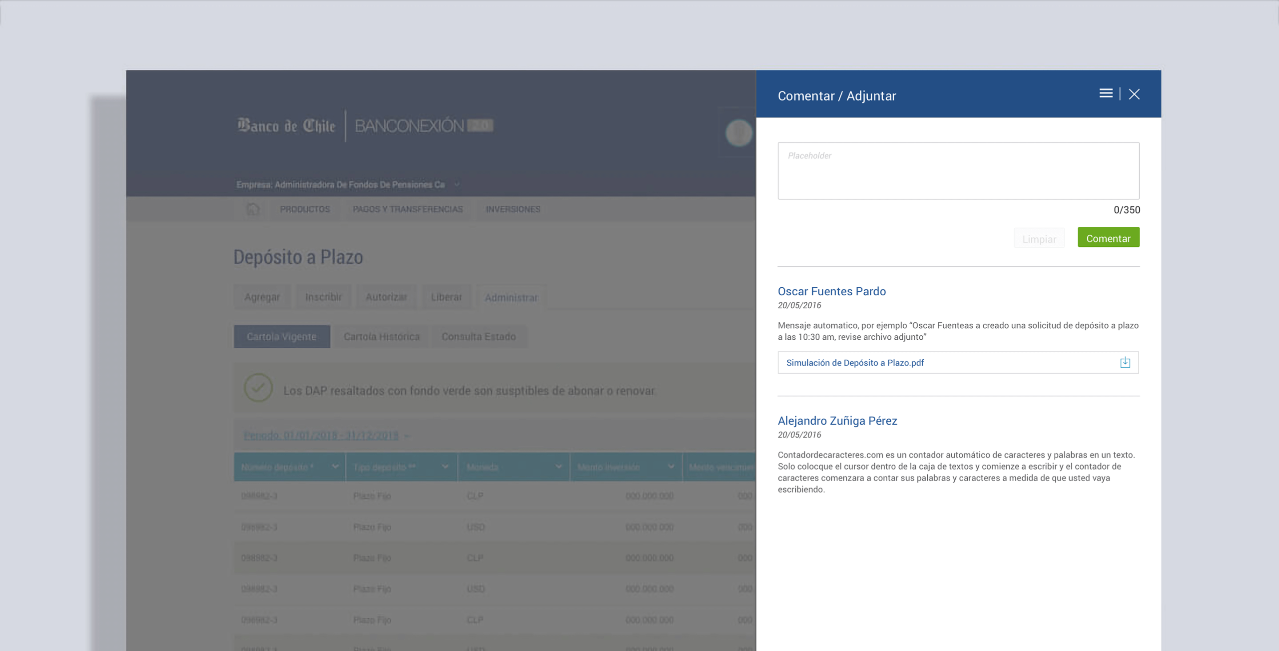
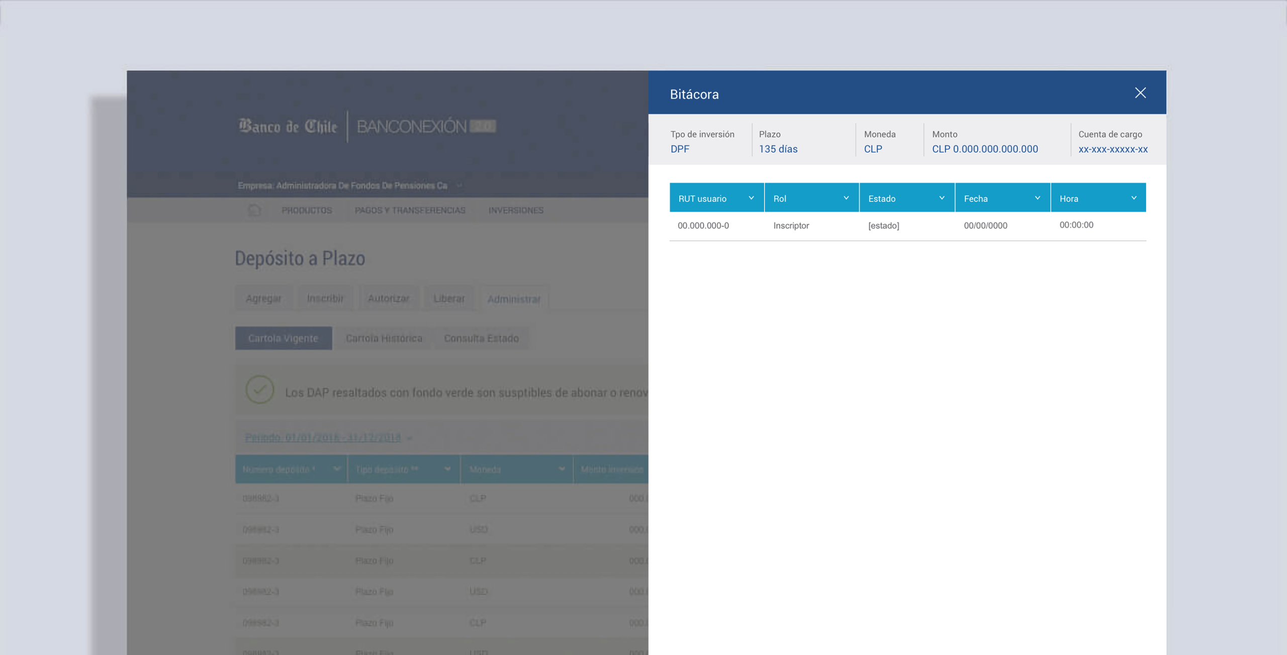
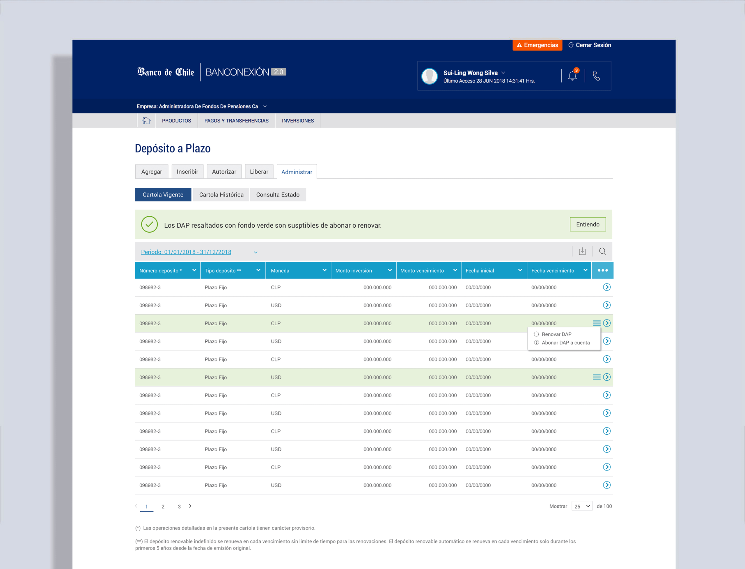
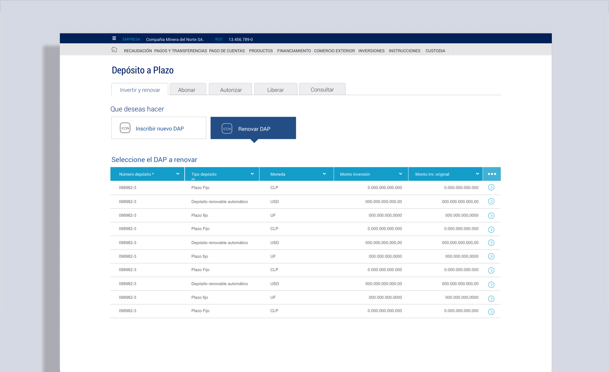
We designed a tabbed interface following the investment lifecycle, with contextual menus for actions such as stopping, messaging colleagues, renewing deposits, or increasing investment amounts.
When designing for the banking industry, you need to follow strict regulations, especially for B2B projects, which had to accommodate multiple roles within a company, such as creation, approval, modification, and deletion of assets, where there is no place for errors.
05. MICRO-INTERACTIONS
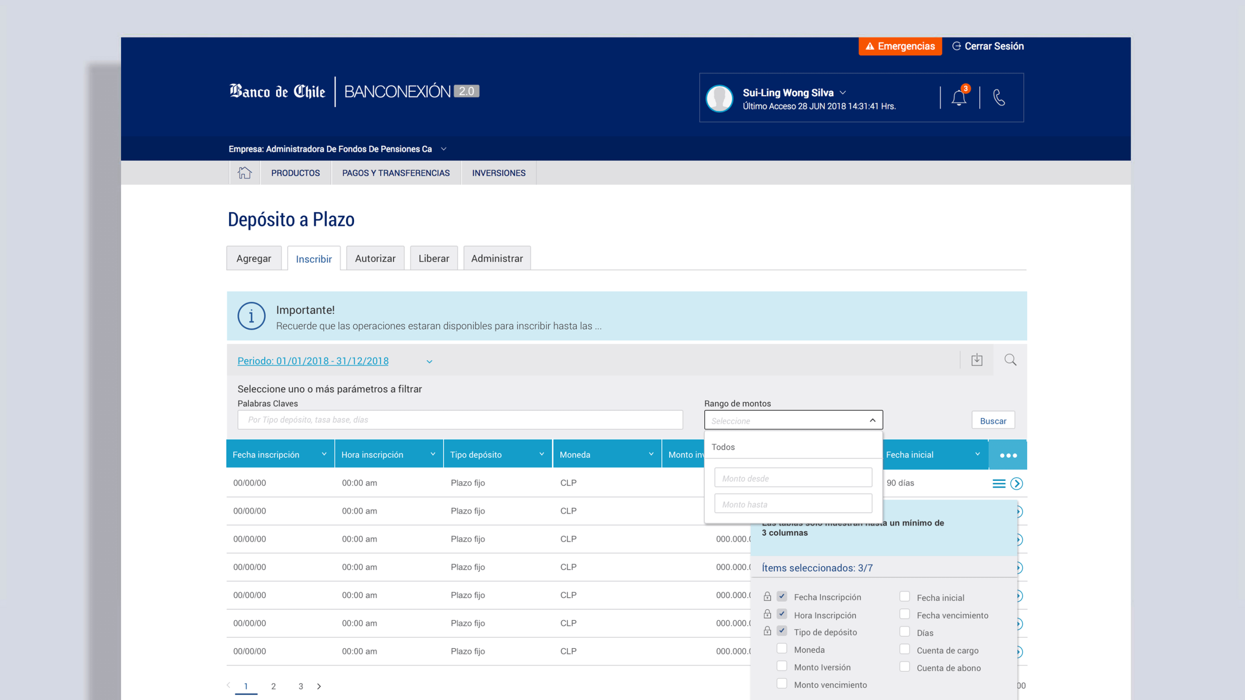
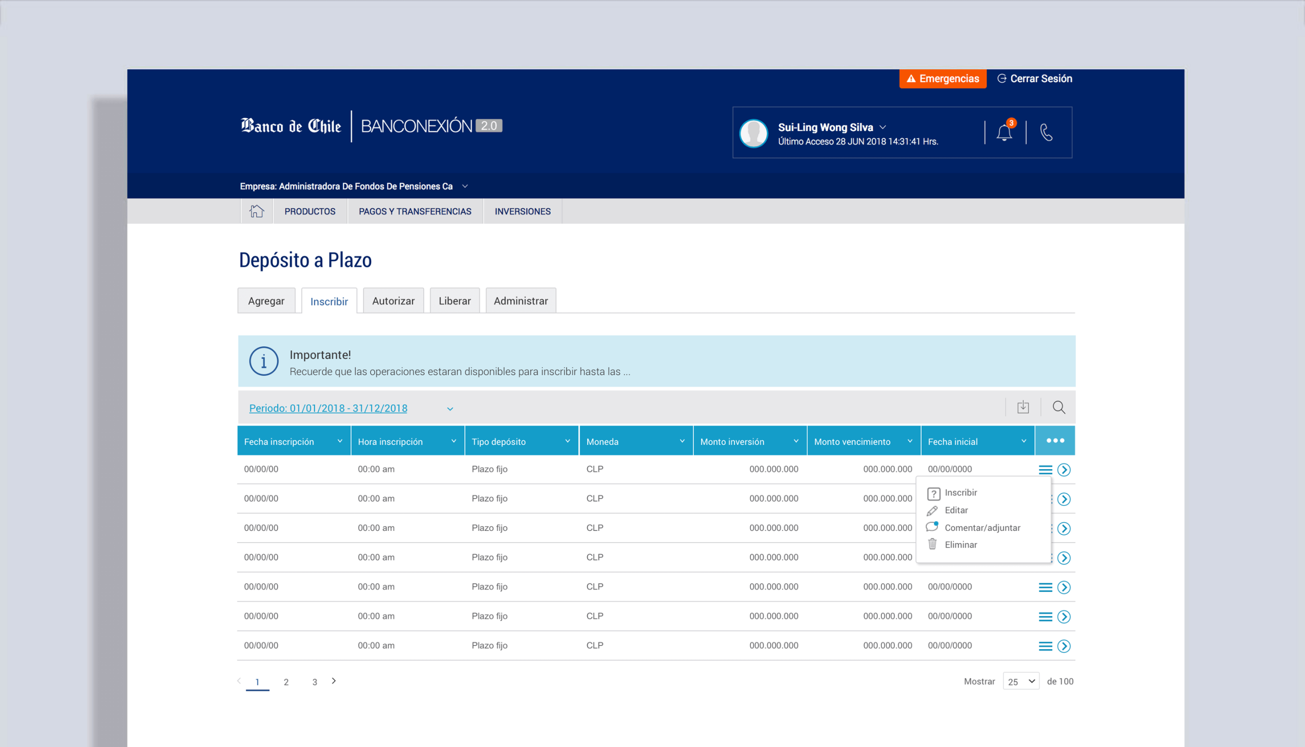
Micro-interactions were critical here — things like customizable tables, expanded search, and inline notifications ensured the dashboard handled large amounts of information without overwhelming users.
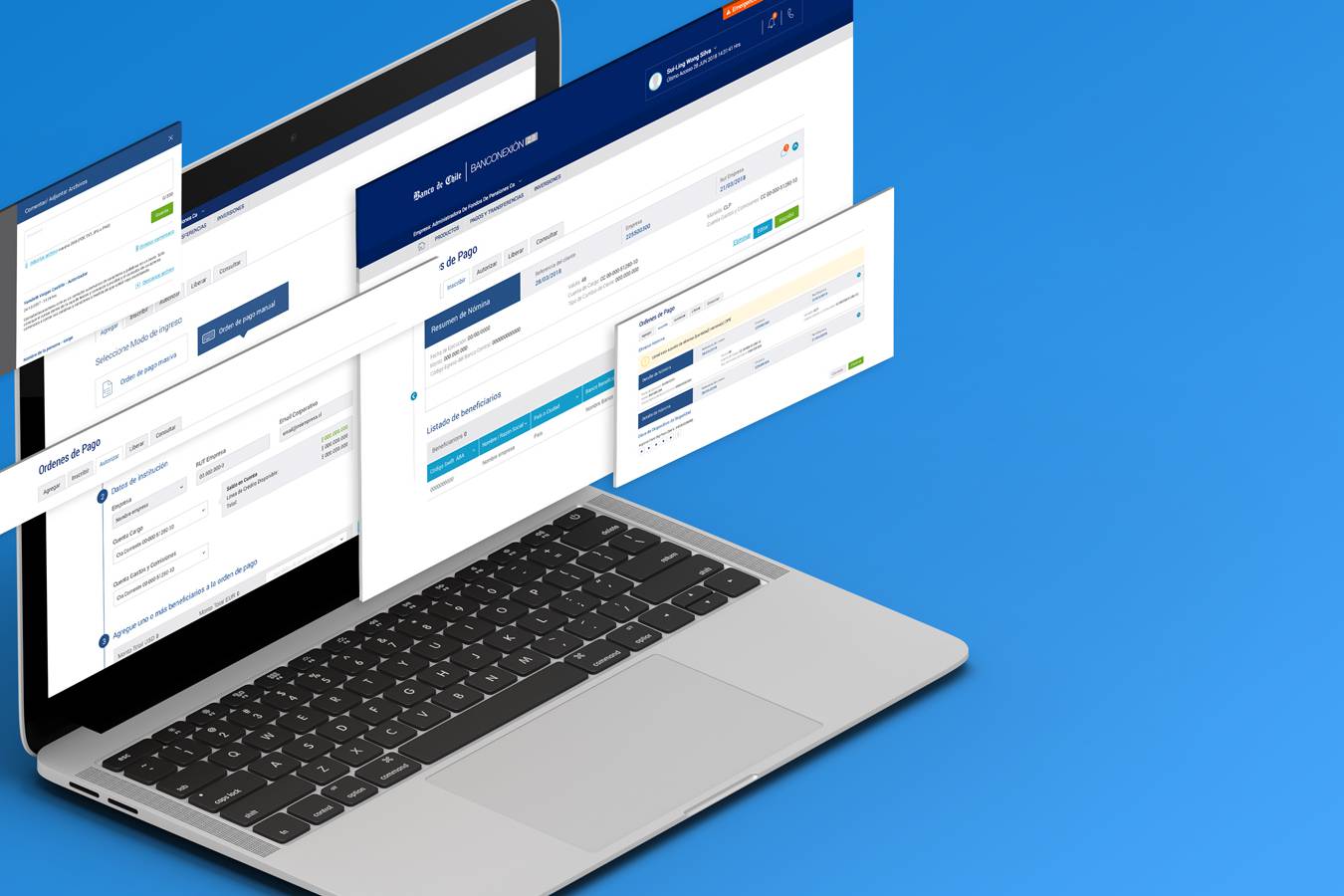
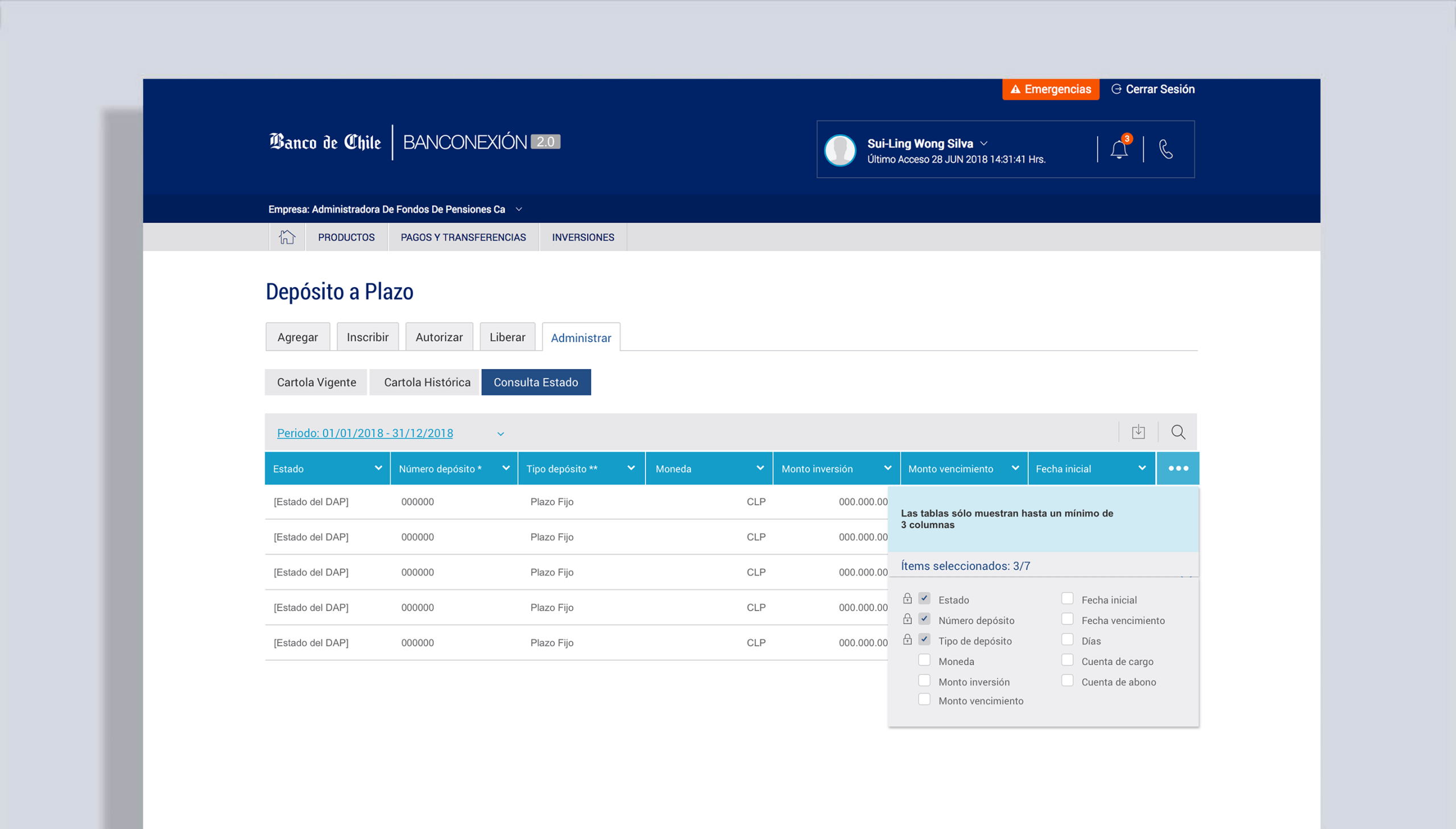
TABLES
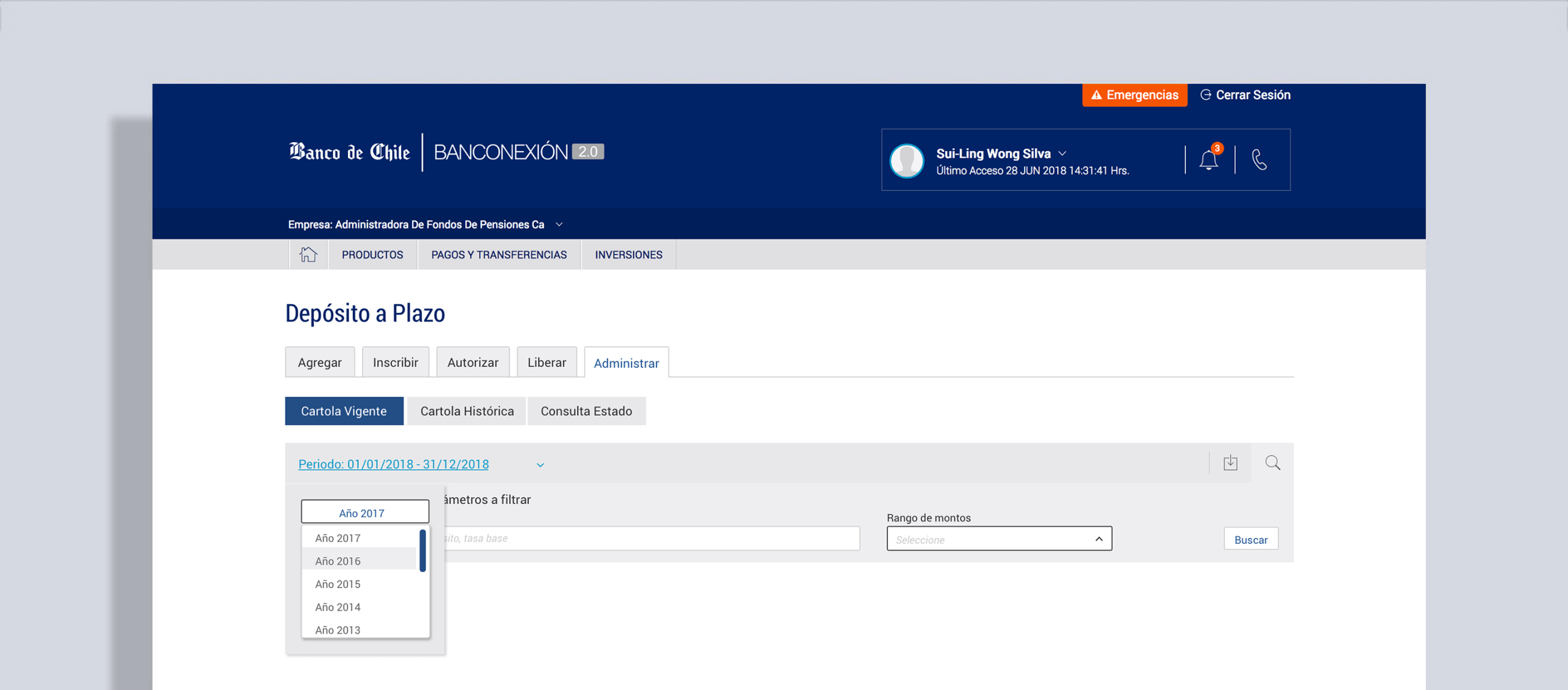
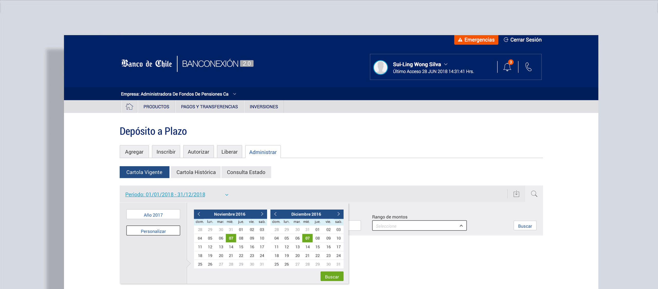
Banking applications handle large data sets, often with tables exceeding eight columns. Since internal guidelines prohibited horizontal scrolling, we introduced flexible table views that allowed users to show or hide columns as needed. This gave users control over how much information they wanted to display without breaking compliance rules.
To improve data filtering, we integrated a time picker into the interface. This allowed users to perform more precise searches—such as reviewing current or historical investments and checking the status of specific transactions—reducing time spent navigating large datasets.
SIDEBAR ACTIONS
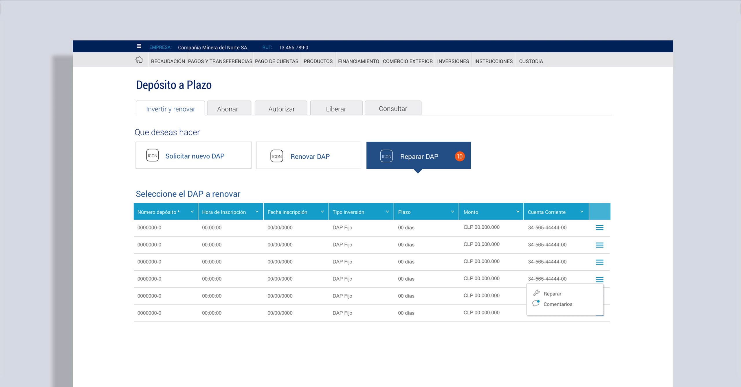
To streamline operations, each table row included a contextual action menu (accessible via a right-hand icon). Depending on user role, actions such as stopping a payment, messaging a colleague, checking logs, or adjusting investments were available. These interactions supported collaboration, accountability, and operational control—crucial for managing payrolls and high-value transactions.
6. Navigating Technical Constraints
A LEGACY BACKEND ARCHITECTURE PROBLEM
Not every idea was feasible. For example, we initially wanted to send real-time alerts about expiring deposits. But tests revealed the backend couldn’t handle the load — it crashed.
Instead, developers proposed a workaround: highlight deposits close to expiration a few days in advance, without running constant queries. It wasn’t what we envisioned, but it was practical and effective.
It is important to listen to colleagues outside of UX — sometimes the simplest, most sustainable solutions come from unexpected places.
ALTERNATIVE DESIGN IDEAS
At the early stage, I explored a more expressive design approach, aiming to create a tool that balanced utility with usability. My focus was on making key elements stand out from the predominantly grey interface and ensuring they were self-explanatory.
While these concepts were well received, they were not implemented at the time due to development constraints and the need to prioritize delivery speed.
OUTCOME
The redesigned platform successfully:
- Introduced a digital B2B flow, giving businesses their first online investment channel.
- Improved usability for B2C customers, increasing transparency and reducing decision complexity.
- Balanced innovation with bank guidelines, ensuring adoption without disrupting user habits.
Learnings
This project taught me that:
- Stakeholder knowledge is gold: inviting domain experts into the design process can save weeks of guesswork.
- Consistency matters: sometimes, the “complicated” interactions users are used to are more valuable than introducing sleek but unfamiliar patterns.
- Boundaries define the work: UX isn’t always about thinking outside the box — often it’s about finding the best solution within the box.
On a personal level, I appreciated the challenge of designing for both individuals and businesses — each with different expectations but shared needs for trust, clarity, and control.