Project Overview
Client: Bank of Chile is the largest financial institution in the country, with a wide-reaching network of branches, ATMs, and digital services.
Challenge: External Commerce is a service used by companies that export and import goods or services to manage payrolls and international payments—primarily to the United States and Europe.
THE CHALENGE
Transform an analog, manual service into a fully digital desktop application.
Until this project, external commerce transactions were carried out manually or through a simple webpage that allowed companies to upload XML payrolls (as required by the Internal Revenue Service) and then manually processed by back-office executives.
Our goal: create a modern, feature-rich platform that would streamline international transactions, reduce errors, and improve user experience.
MY ROLE IN THE PROJECT
As a UX Consultant, I worked closely with the Product Owner, stakeholders, and development team to translate complex banking requirements into a user-centered product.
The Product Owner had deep knowledge of the service, which helped me quickly assimilate and learn the complexities of external commerce operations, enabling me to design with accuracy and confidence.
APPROACH
Each project has its trade-offs, and due to time constraints, the Product Owner required me to skip formal UX research and validation processes, moving directly from user stories into high-fidelity prototypes using the bank’s design system.
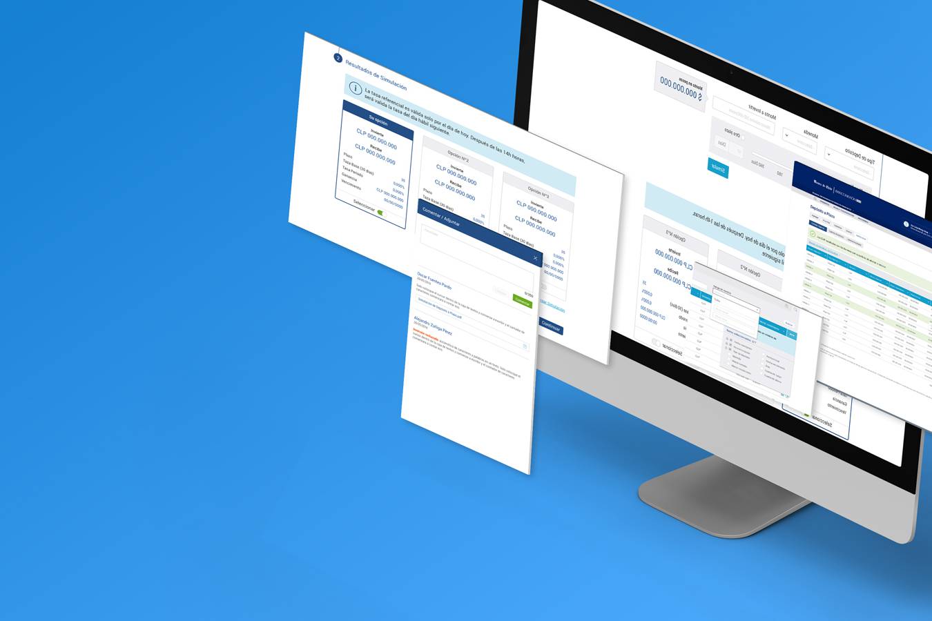
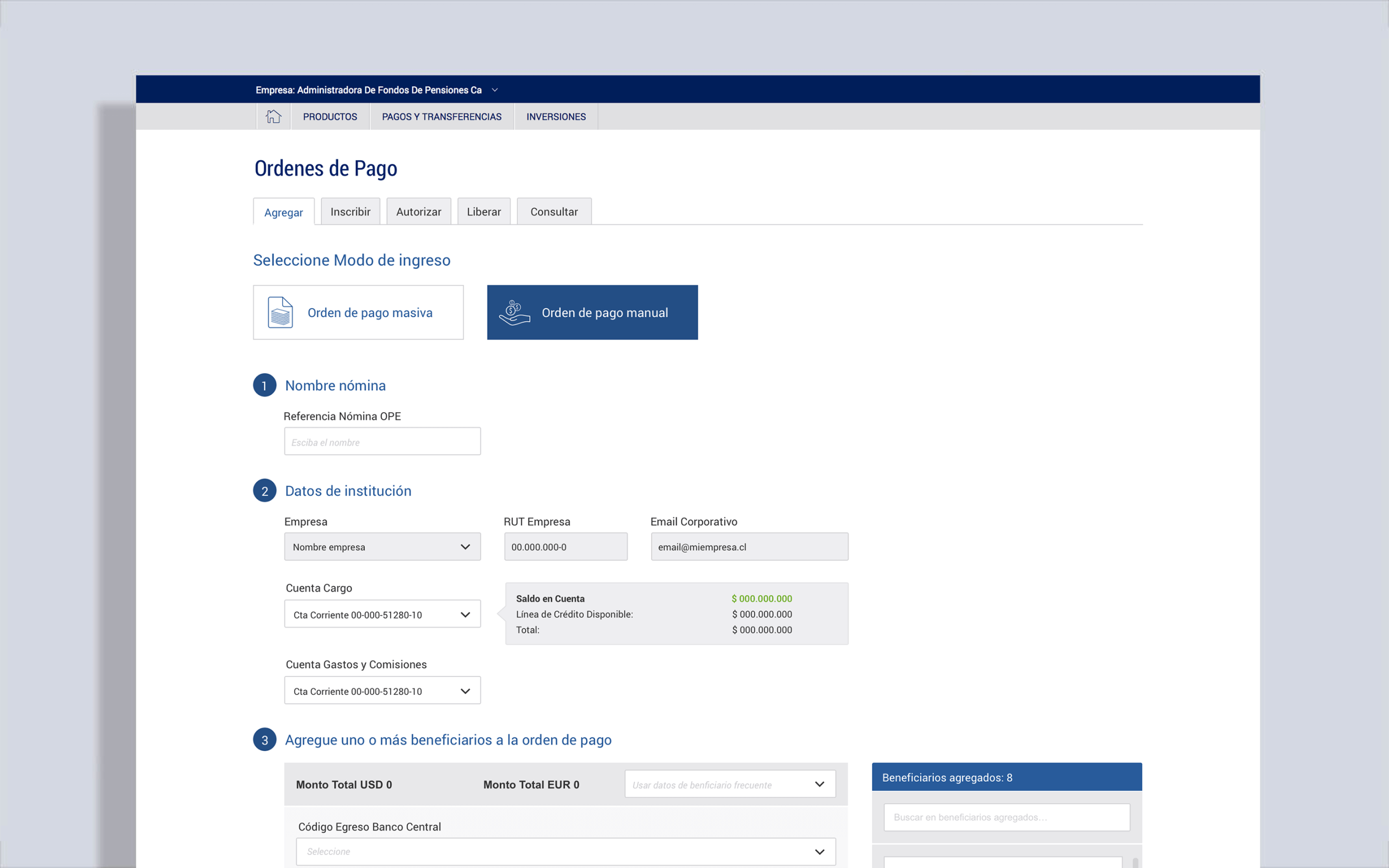
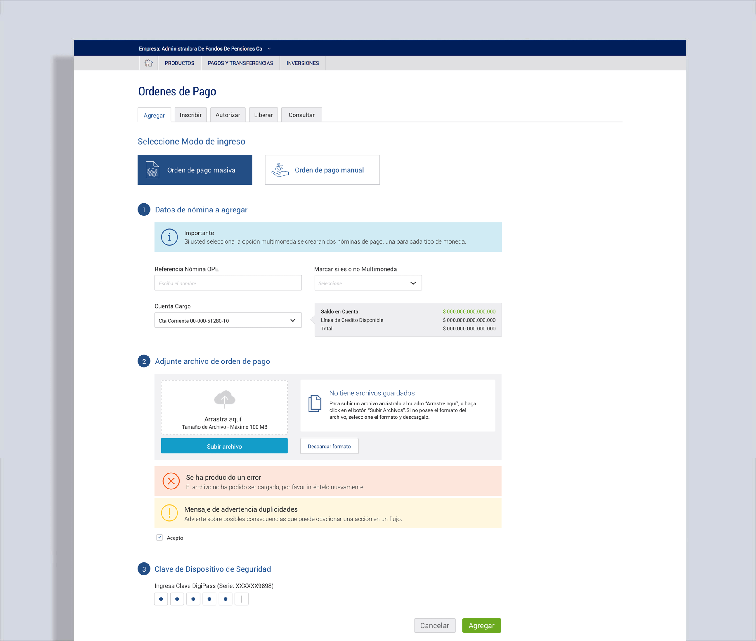
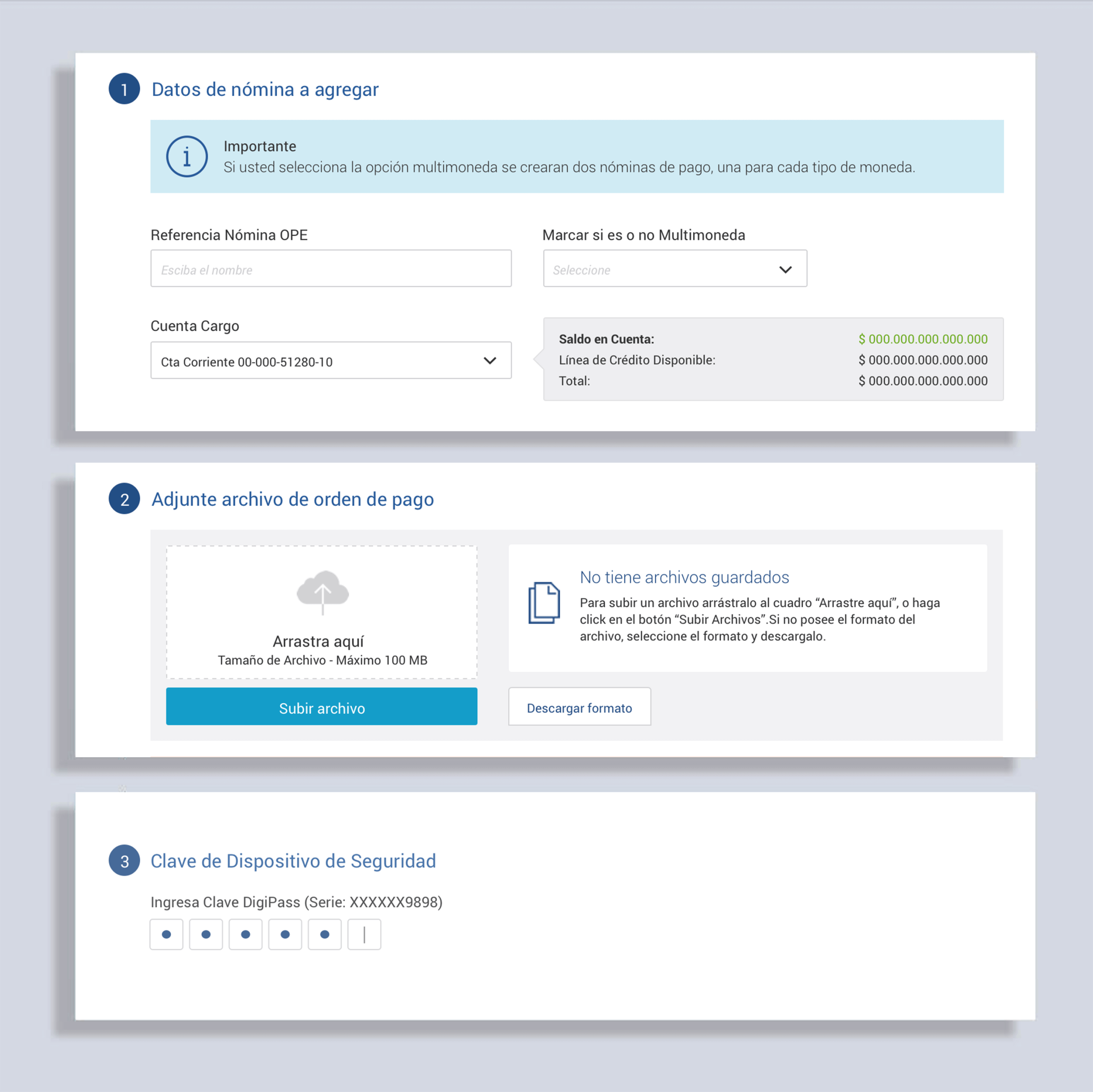
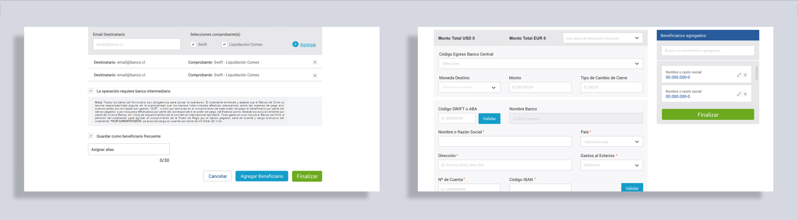
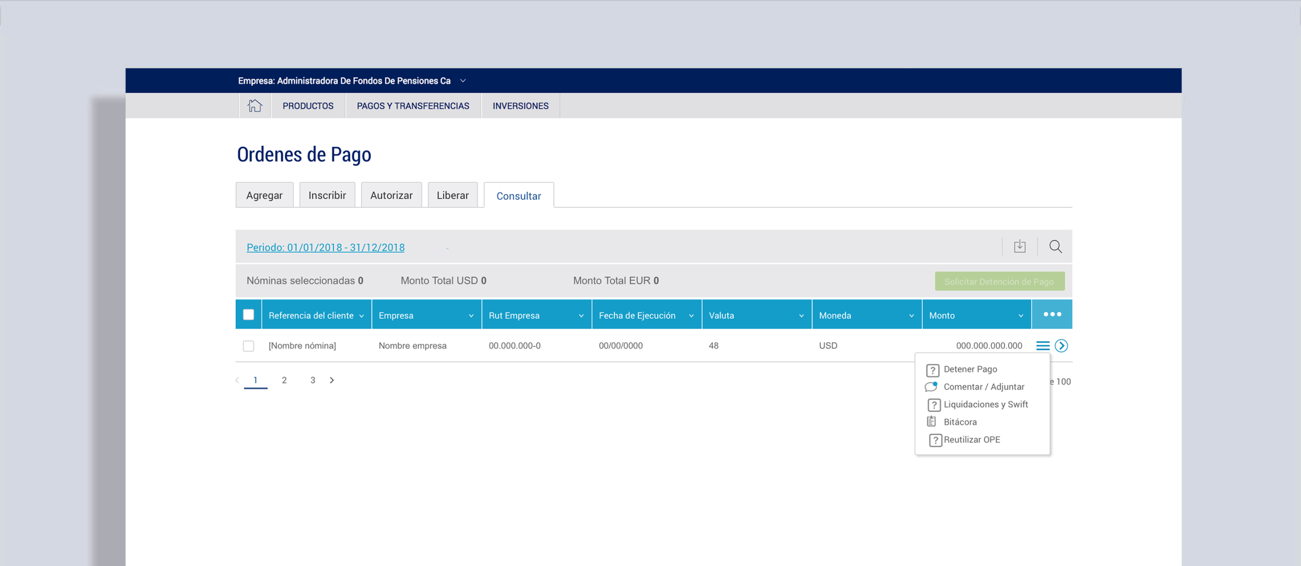
1. Designing a Payroll Application
Payroll processing was the core feature of the platform. I designed it with clarity, accessibility, and scalability in mind.
Persona focus: accountants or finance staff in medium-to-large companies, familiar with banking apps but needing streamlined tools to manage heavy transaction loads.
The flow was built around a shopping-cart-like loop, allowing users to create multiple payrolls, temporarily store them, and finalize when ready.
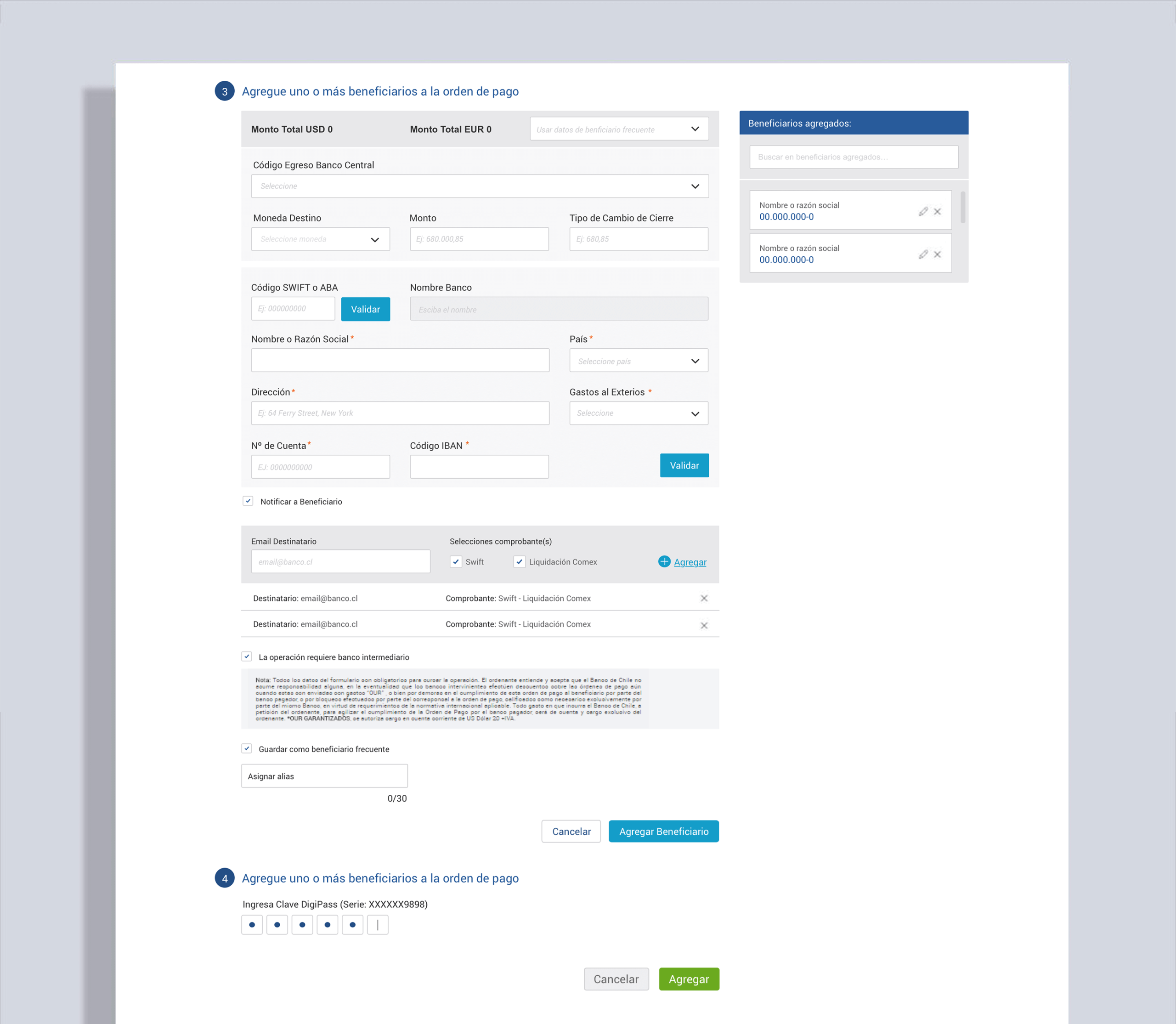
The step-by-step process (naming payrolls, entering company info, creating orders, confirming) ensured users had full control and visibility.
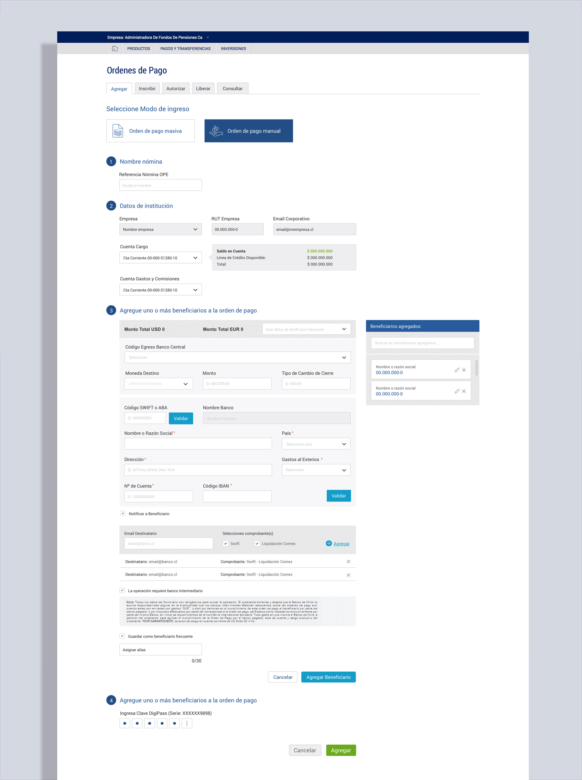
For complex flows, I collaborated with developers to resolve backend limitations while maintaining a clean, user-friendly design UI as much as possible.
I designed the interface using a flat, minimalist style with ample negative space to ensure actions were clear and easy to scan. Gradients, textures, and shadows were intentionally avoided, in favor of clean typography and high-contrast color schemes, fully aligned with the bank’s design guidelines.
2. Advanced Controls
New and improved tools for administrators and senior roles were introduced.
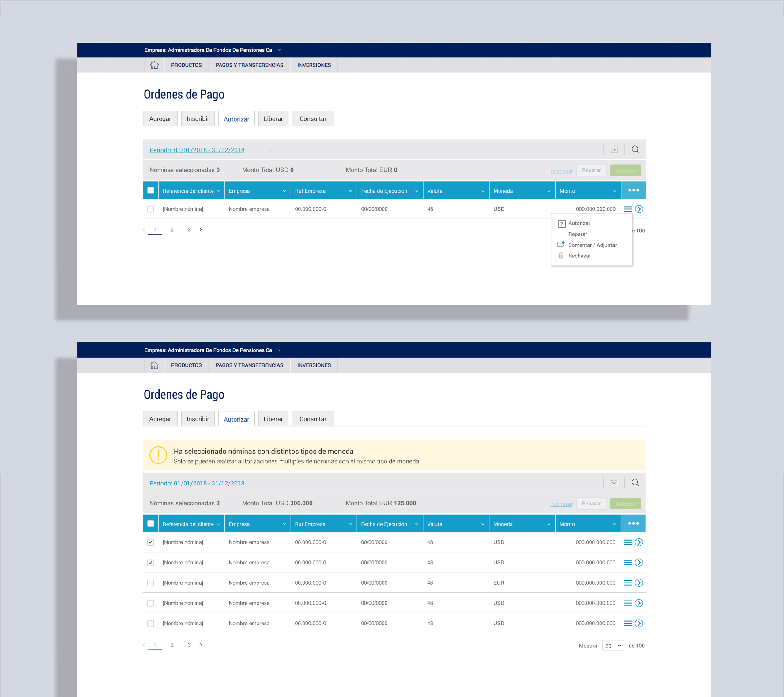
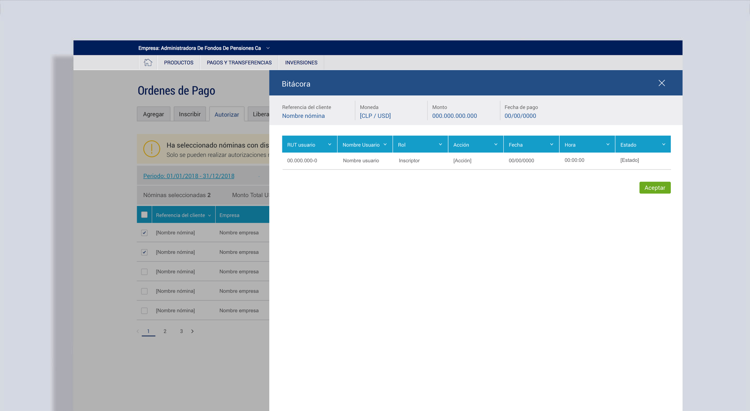
Operation summaries with quick actions (delete, approve, reject, request changes).
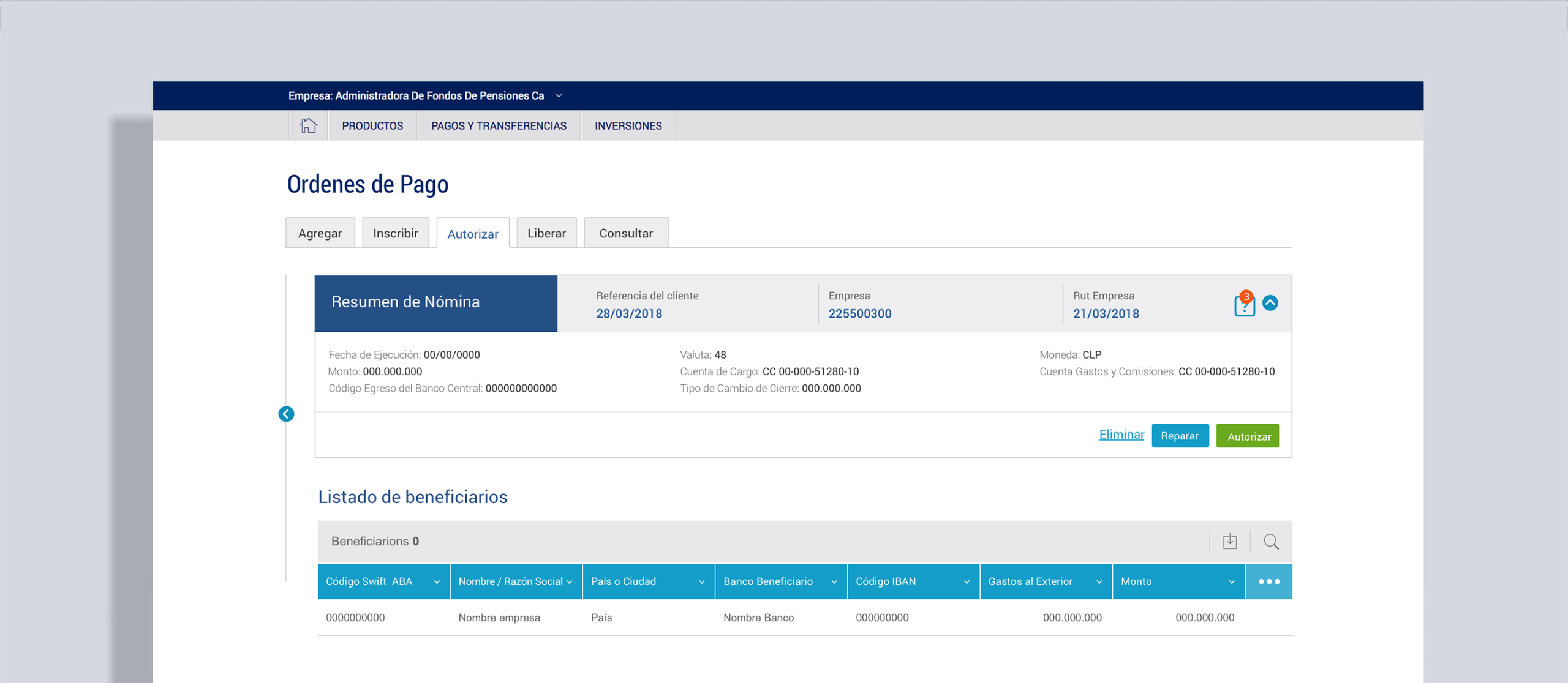
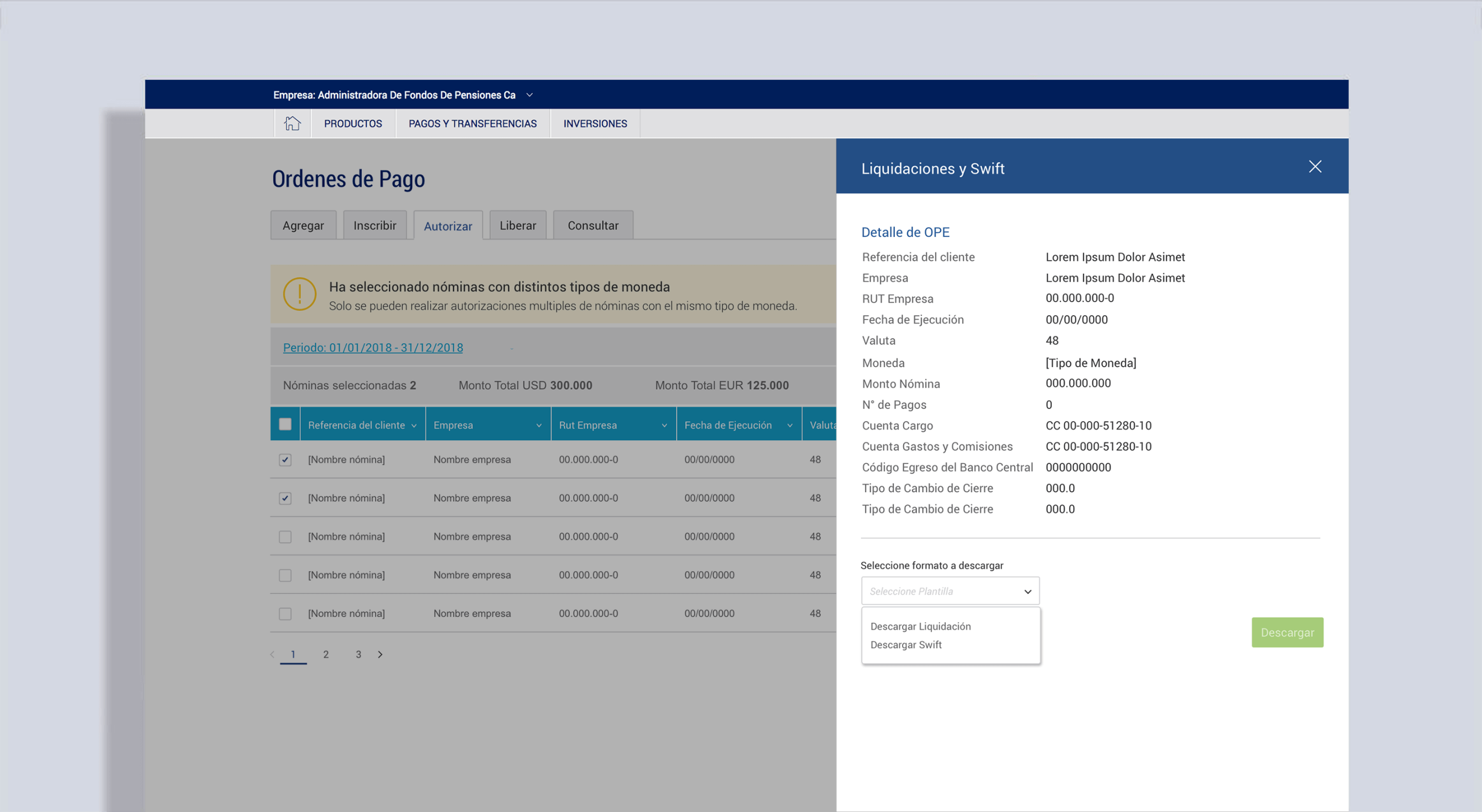
Automated international currency purchase, allowing approvers to confirm USD/EUR exchange rates in real-time.
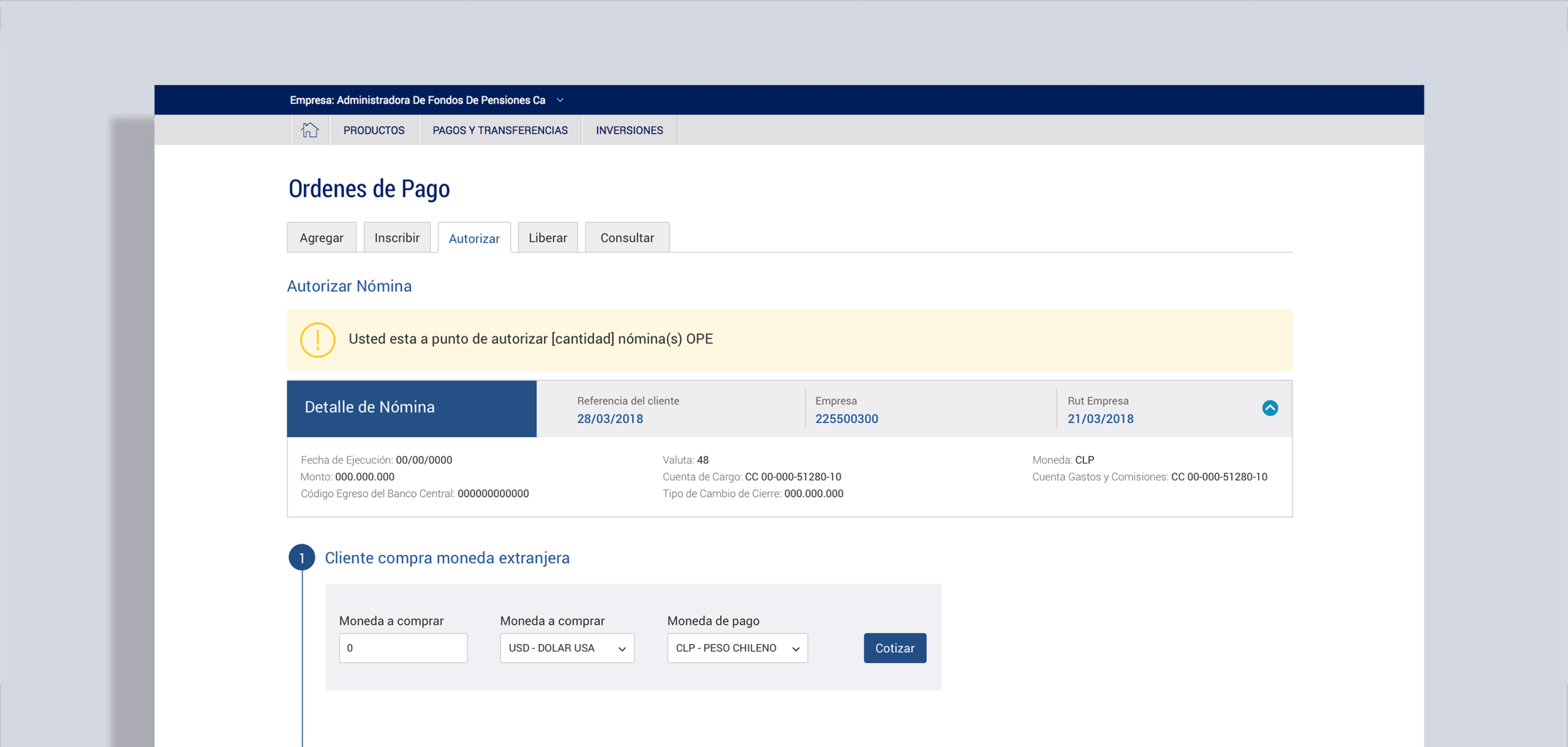
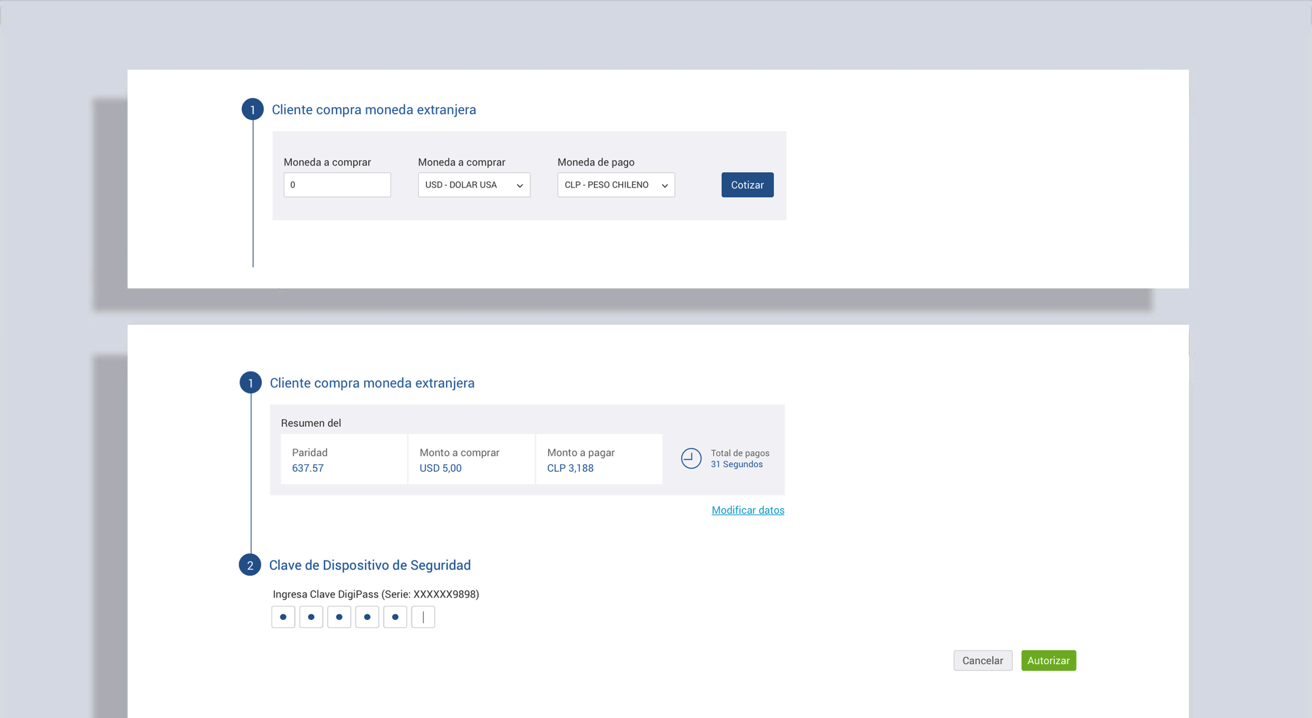
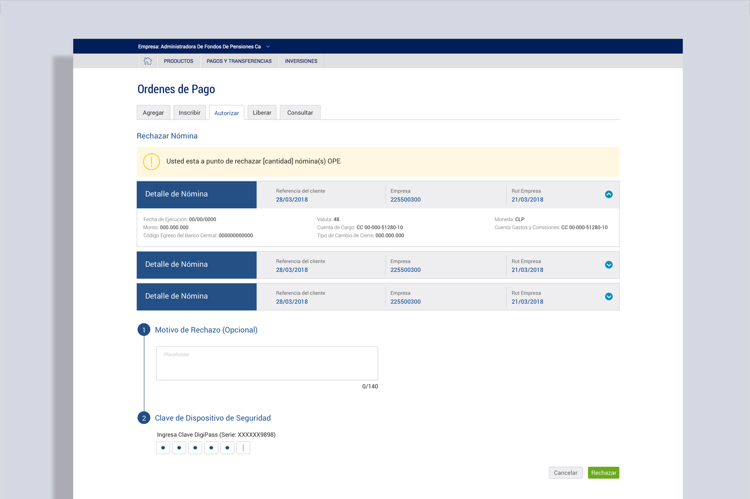
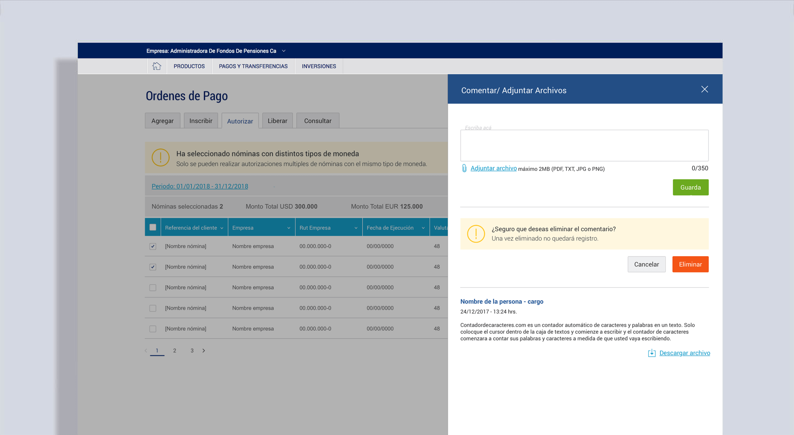
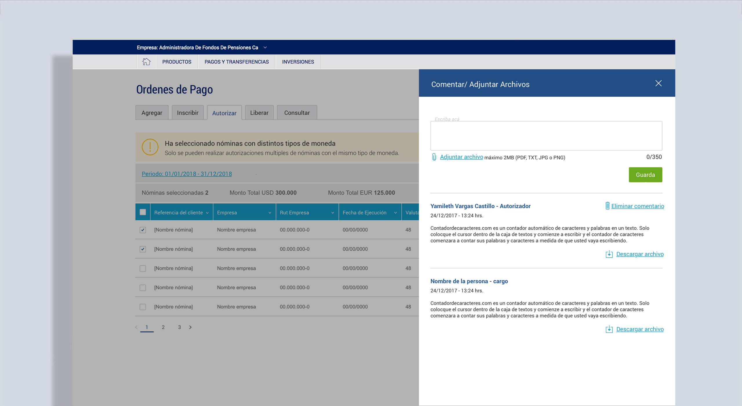
Approval workflows for payrolls, including authorization, modification requests, and messaging.
Role-based communication tools, including a message board (with SMS notifications for urgent updates).
3. Solving UI Constraints
A common issue was large tables with more than eight columns. Bank guidelines prohibited scrollable tables, so I introduced:
- Column visibility controls, allowing users to customize what data they see.
- Row-level sidebar actions, accessible through a hamburger menu, enabling quick access to contextual actions without cluttering the interface.

4. New Features & UX Enhancements
Some user needs couldn’t be addressed by the existing Design System. Based on prior research and insights from similar projects like Term Deposits, I finally had the green light to design them and integrate them into the Design System.
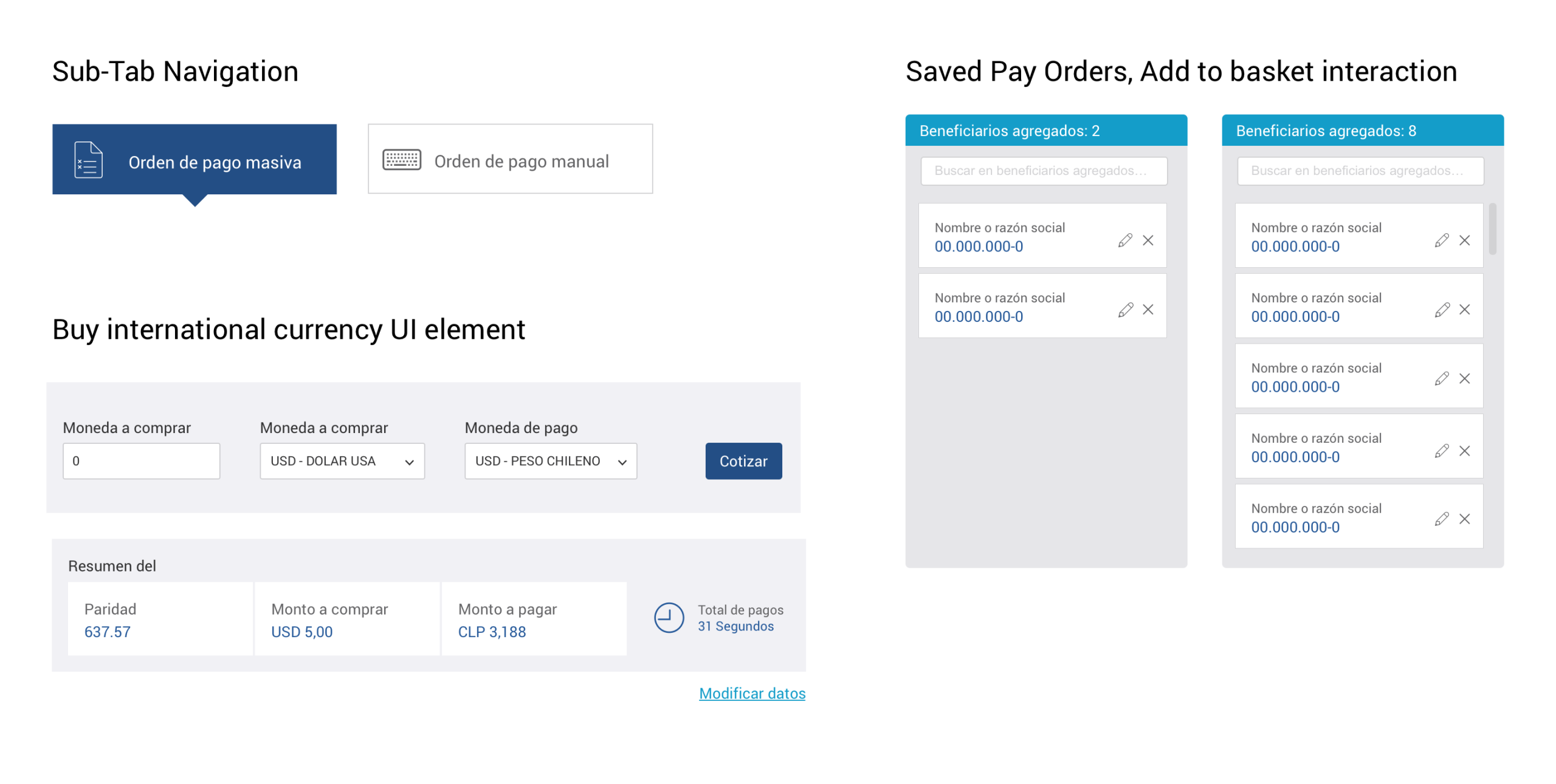
We introduced new interface patterns to improve usability:
- Improving sub-navigation design, as users previously struggled to find hidden actions.
- More prominent action buttons, alerts, and system feedback, moving away from the bank’s overly grey UI and improving clarity.
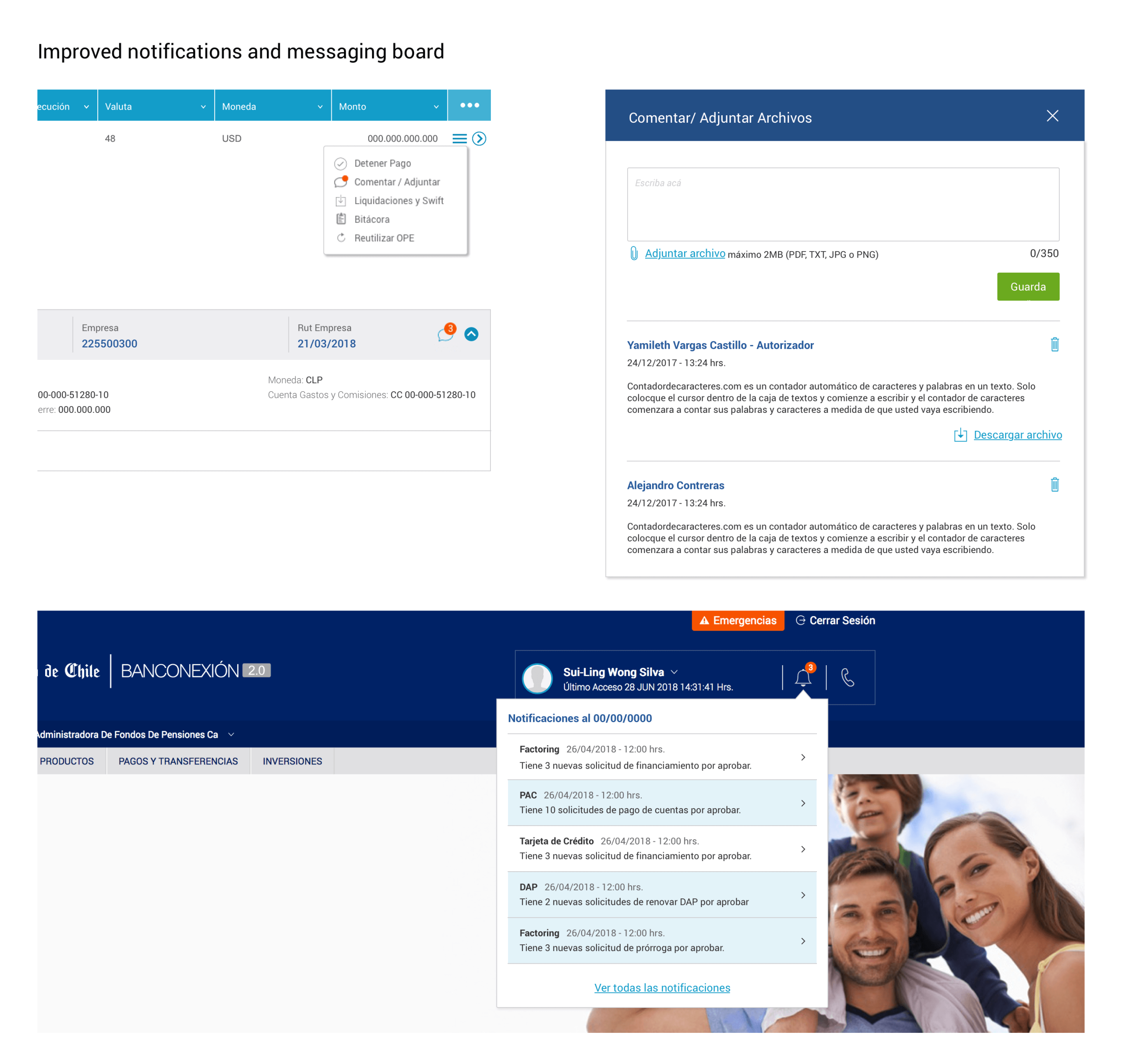
Customer service feedback has long shown that users struggle with sub-navigation (sub-tab) elements because they lack functionality and actions, as these elements are not prominent.
These elements were later integrated into the Bank’s official design system, expanding its capabilities for future projects.
LEARNINGS
This was one of the smoothest projects I worked on at the Bank, largely thanks to a knowledgeable Product Owner and clear business requirements.
The final solution:
- Delivered a fully digital external commerce service.
- Reduced user friction while maintaining compliance with banking and government standards.
- Expanded the Bank’s design system with new components for future use.
Although this presentation only shows a portion of the flows, the scope of the project was significant, covering dozens of screens and interactions.
This case reinforced my belief that in banking UX, success depends on deeply understanding the industry, the processes, and the user roles to deliver functional, intuitive, and trustworthy digital solutions.