Project Overview
Client: Bank of Chile, Chile’s largest financial institution with a nationwide branch and ATM network.
Challenge: Originally designed to approve banking transactions for individuals (B2C), the bank needed to extend MiPass to serve companies (B2B) — adding new levels of complexity to an app with an already established flow and strong user adoption.
The Problem
At first, stakeholders believed this would be a simple task: “duplicate the flow and rename it.” But once we began, it became clear that the challenge was far greater:
- The existing flows could not be reused for companies.
- Legal and compliance issues affected how company transactions were authorized.
- Technical limitations meant new backend capabilities had to be developed.
What seemed like a quick UI change became a redesign of both the product flow and the user journey.
MY ROLE IN THE PROJECT
As a UX Consultant, I had the support of the team to make design decisions. My role was to:
- Translate business and legal requirements into usable flows.
- Collaborate with product owners, stakeholders, and developers.
- Ensure the new B2B flow worked without compromising the simplicity of the existing B2C experience.
I saw my responsibility as not just designing screens, but reframing assumptions and guiding stakeholders toward a solution that balanced business, technical, and user needs.
APPROACH
1. Starting Over
Our first step was to reevaluate and redefine current flows and make the case for a change in trajectory to our stakeholders.

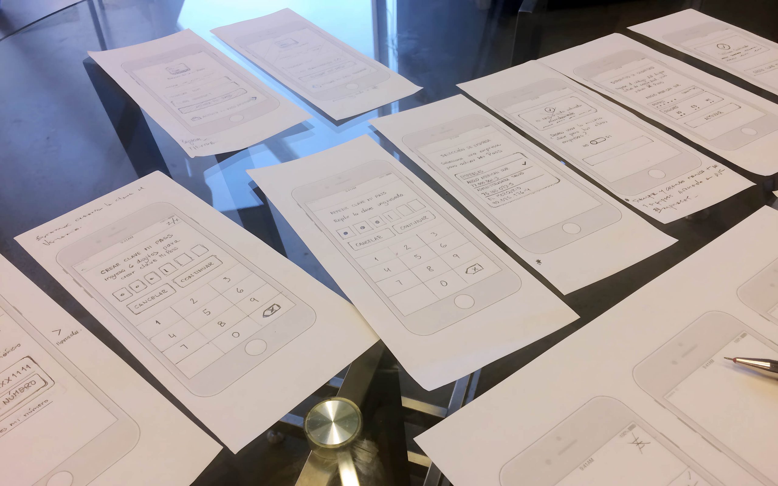
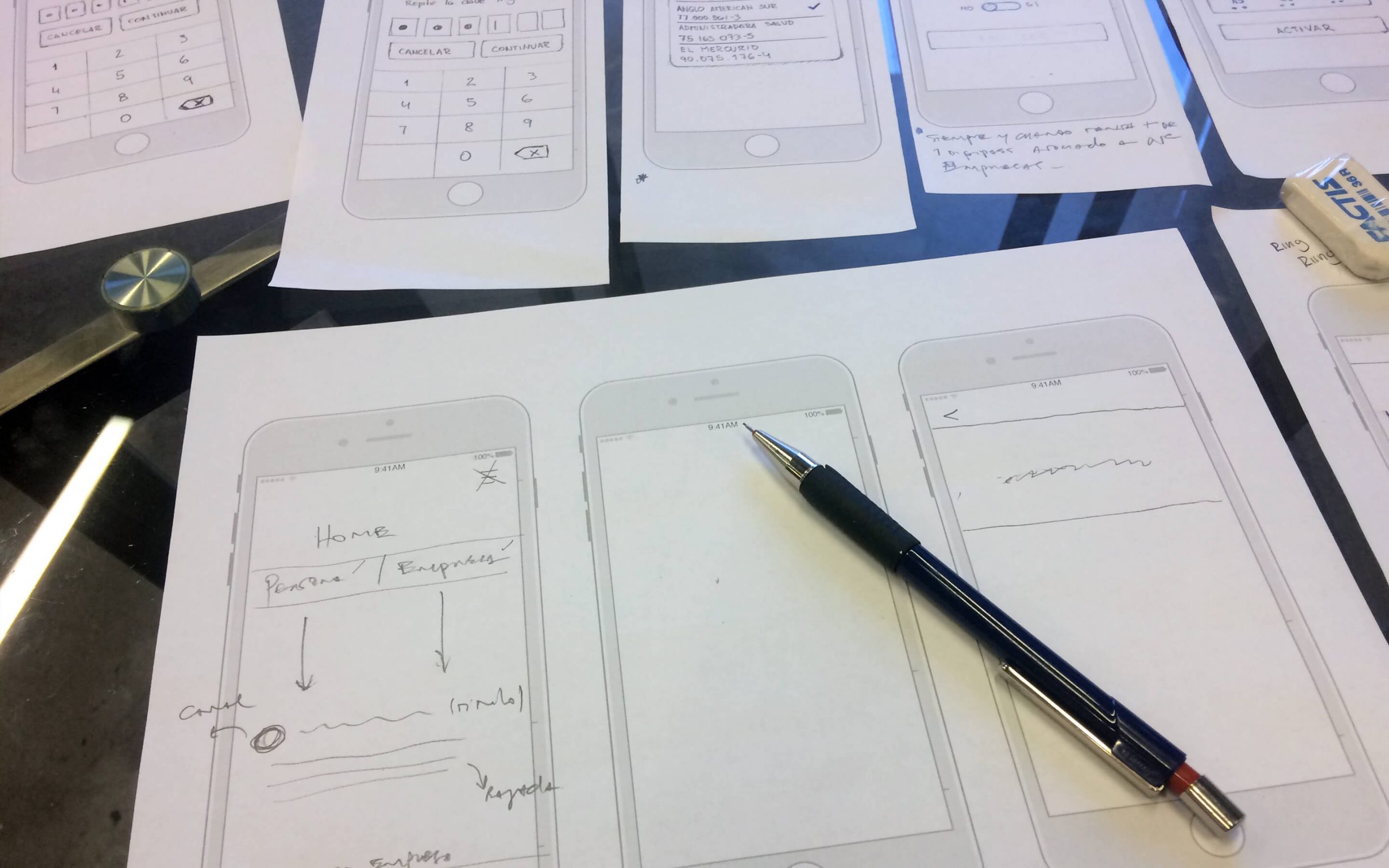
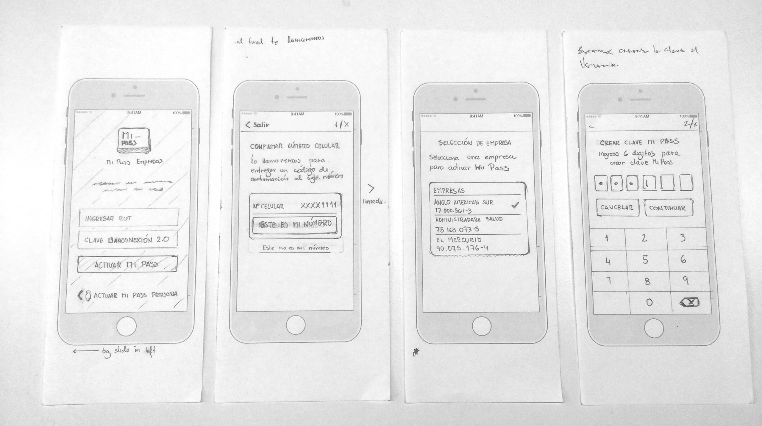
To rebuild the app flow, I worked directly with the Product Owner over two days, sketching wireframes and exploring alternatives. He was proud of MiPass’s success, so involving him in the creative process helped build ownership and alignment.
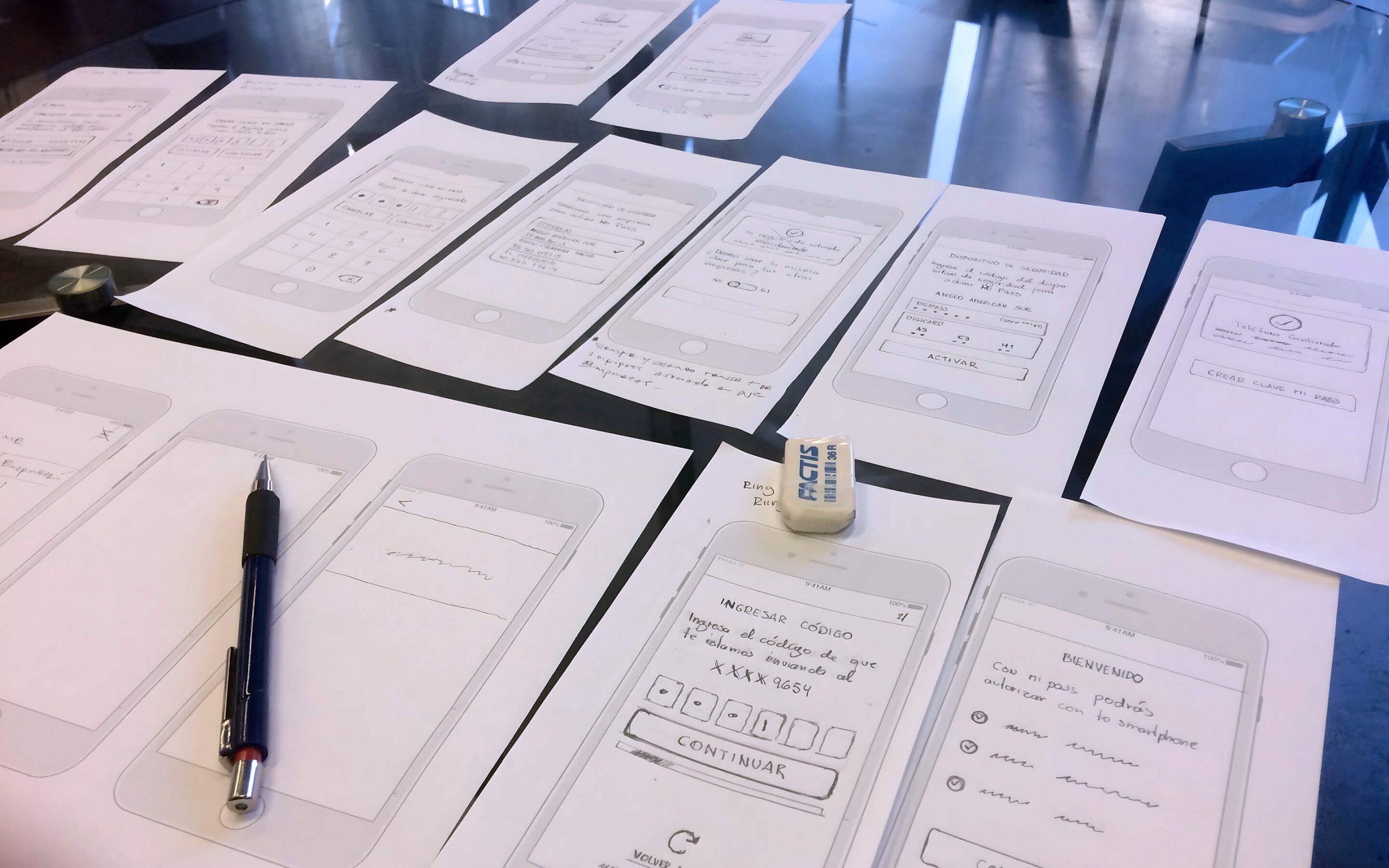
Including POs and stakeholders in early design work is always valuable — it gives them a sense of authorship and reduces resistance later on.
The goal was to address the issue within the boundaries and technical constraints without sacrificing the user experience.
Since there was no budget for research, we relied on tested patterns from past banking projects, bank guidelines, and informal “hallway testing” with colleagues (many of whom were bank clients themselves). These quick checks gave us the confidence we were on the right track.
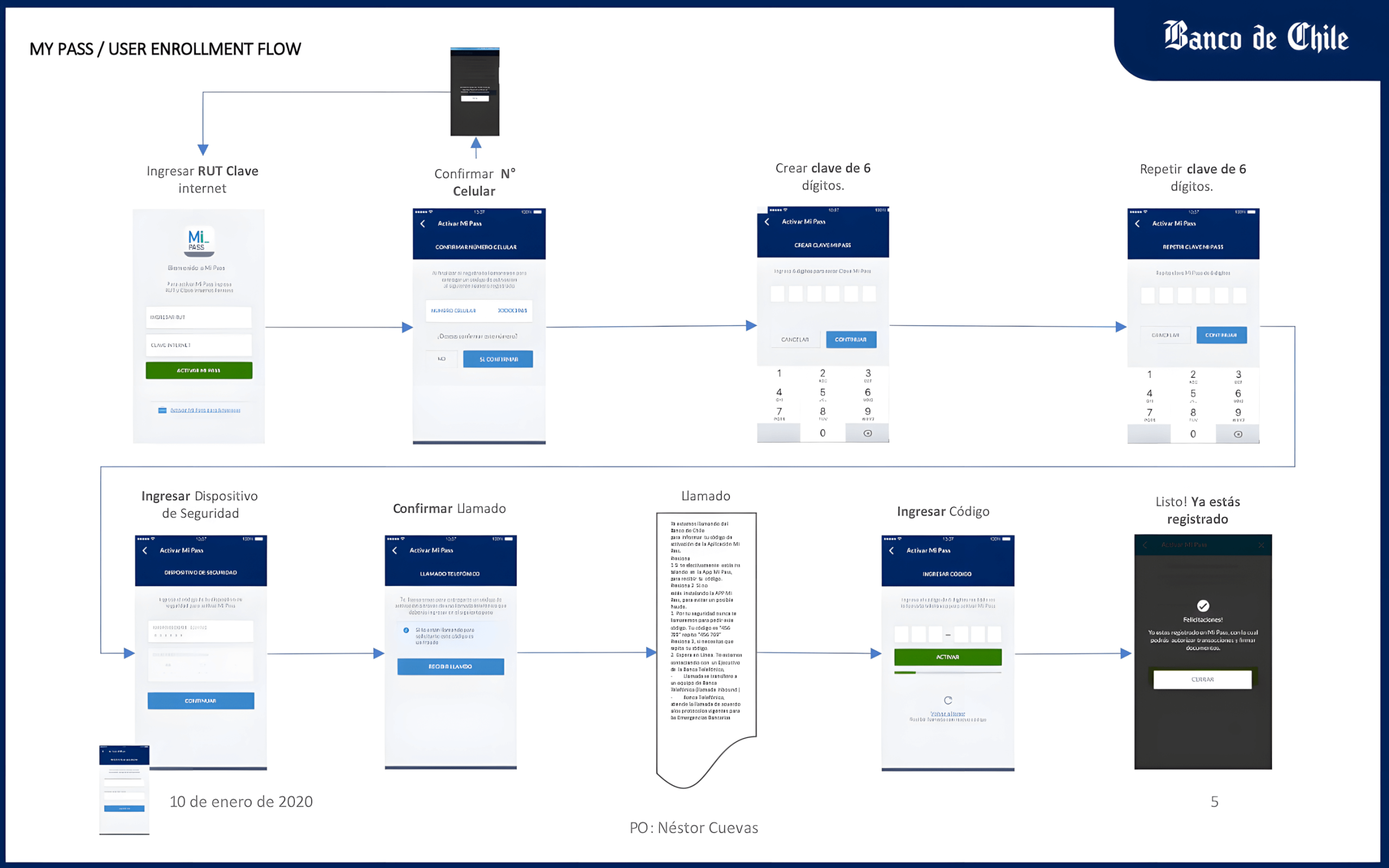
02. Designing the New Onboarding
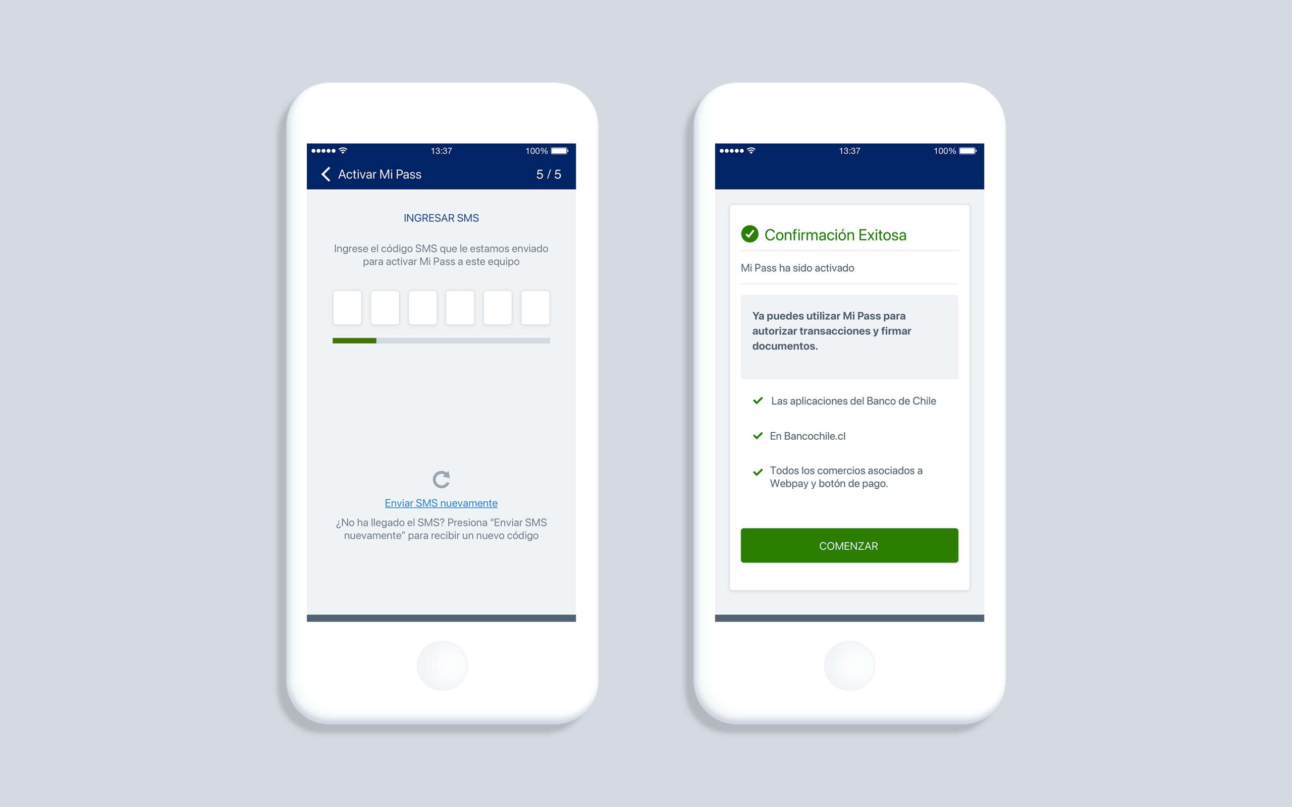
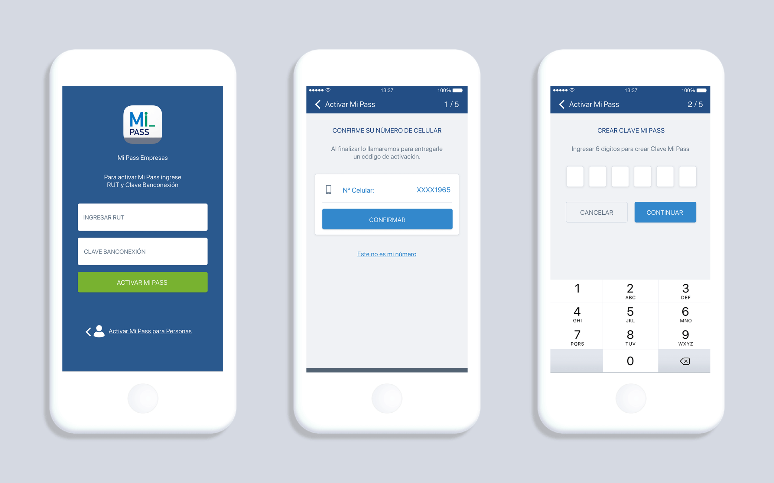
For individuals, onboarding was straightforward: verify a phone number, set a PIN, and confirm via SMS. But for businesses, the process was legally more complex. It required:
- A two-step verification with a special physical key requested from the bank.
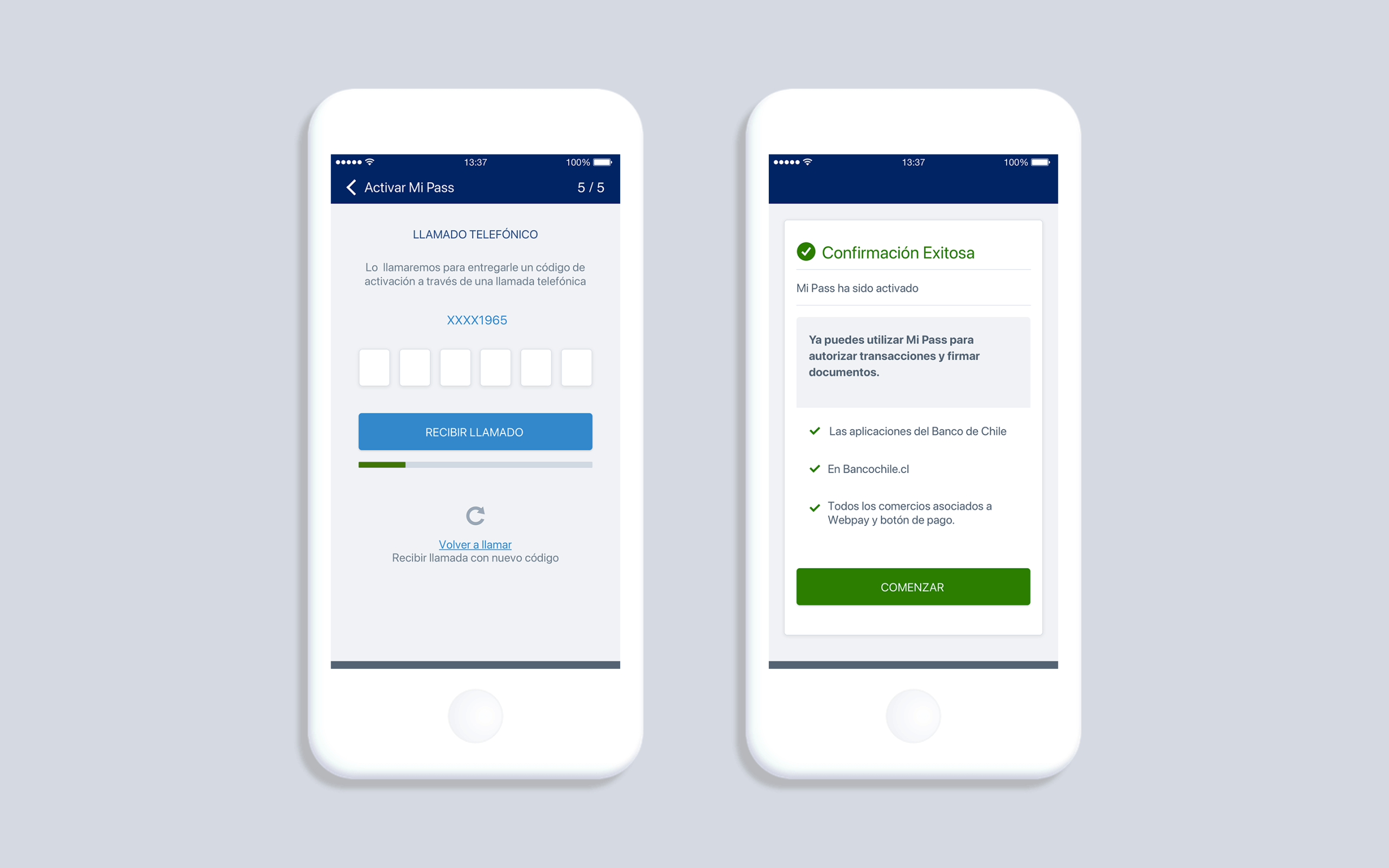
- A confirmation phone call instead of SMS, adding an extra layer of security.
My challenge was to design this flow so that it felt secure yet simple, minimizing friction while acknowledging the higher stakes of corporate transactions.
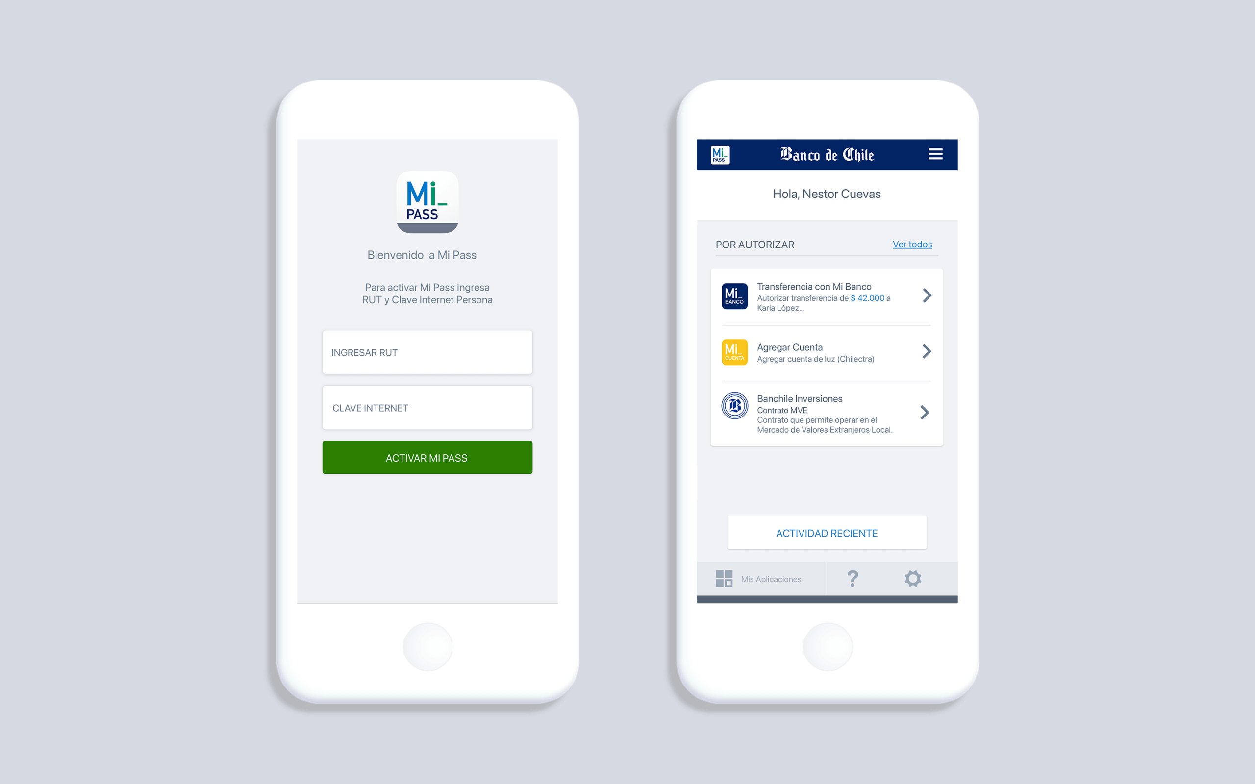
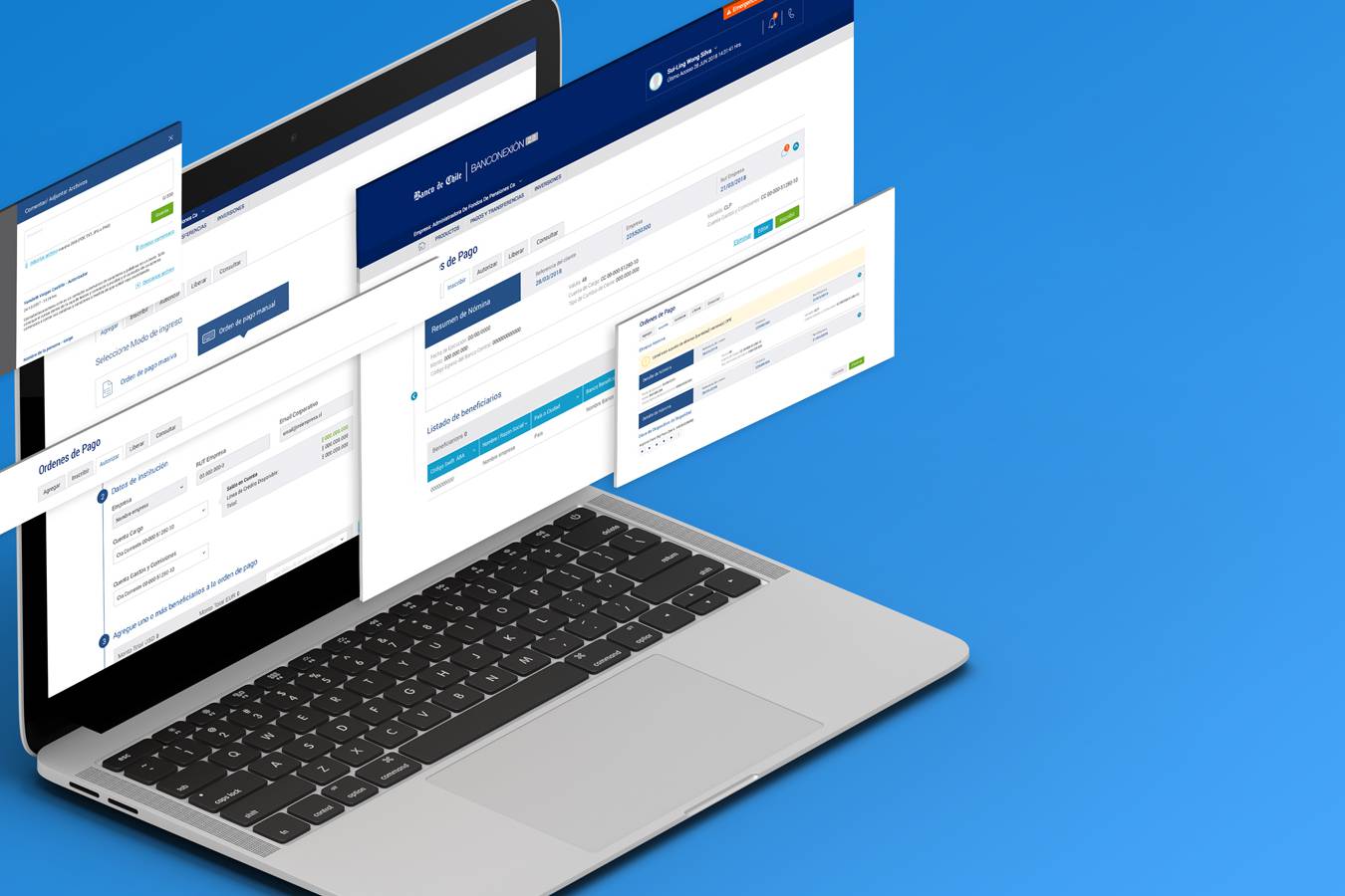
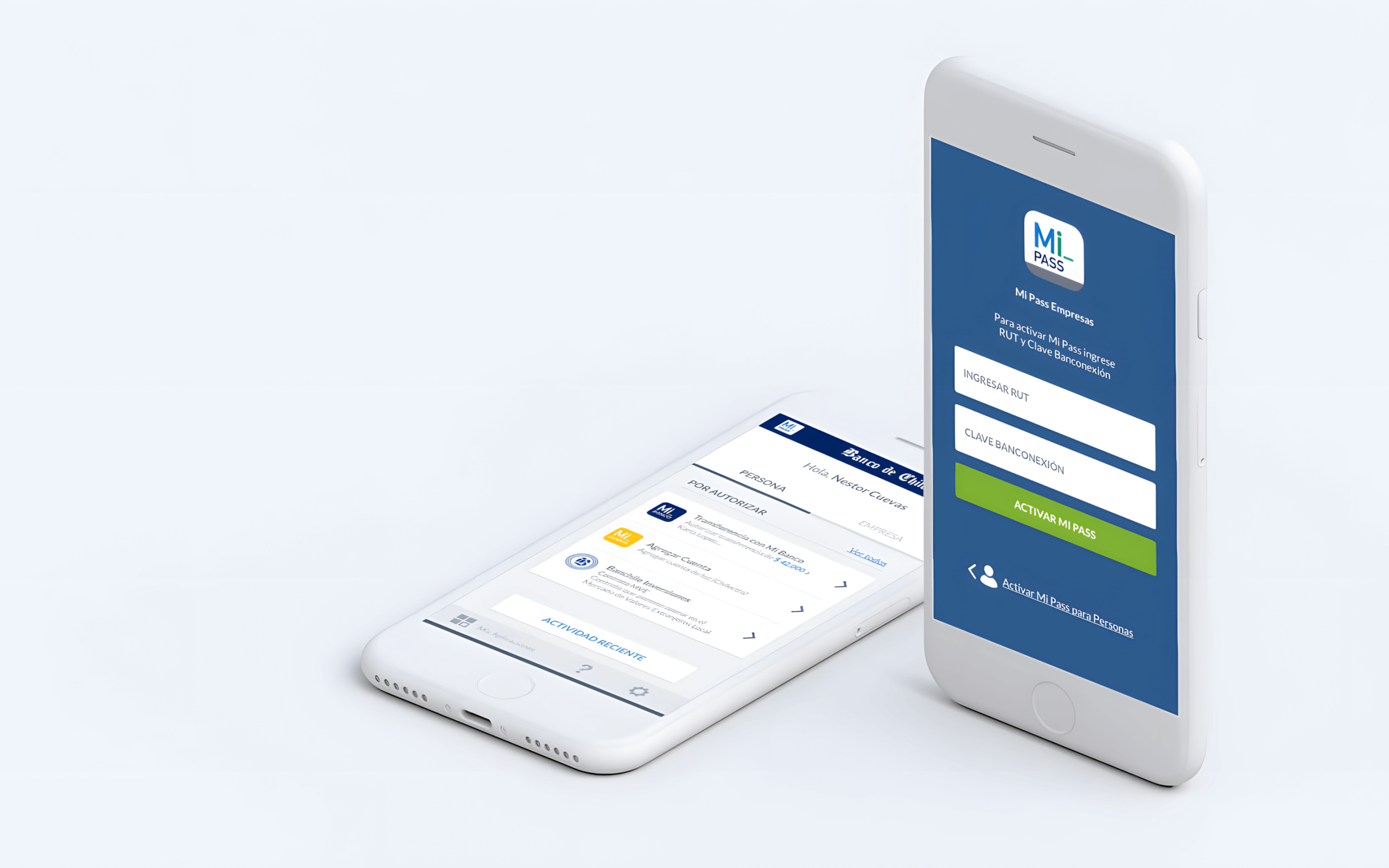
Setting up and accessing an account was a simple process of verifying a phone number and entering an SMS code, with subsequent operations handled via SMS notifications.
For a business, on the other hand, it was necessary to request two-step verification directly from the bank, which included a specific password and a physical security key.
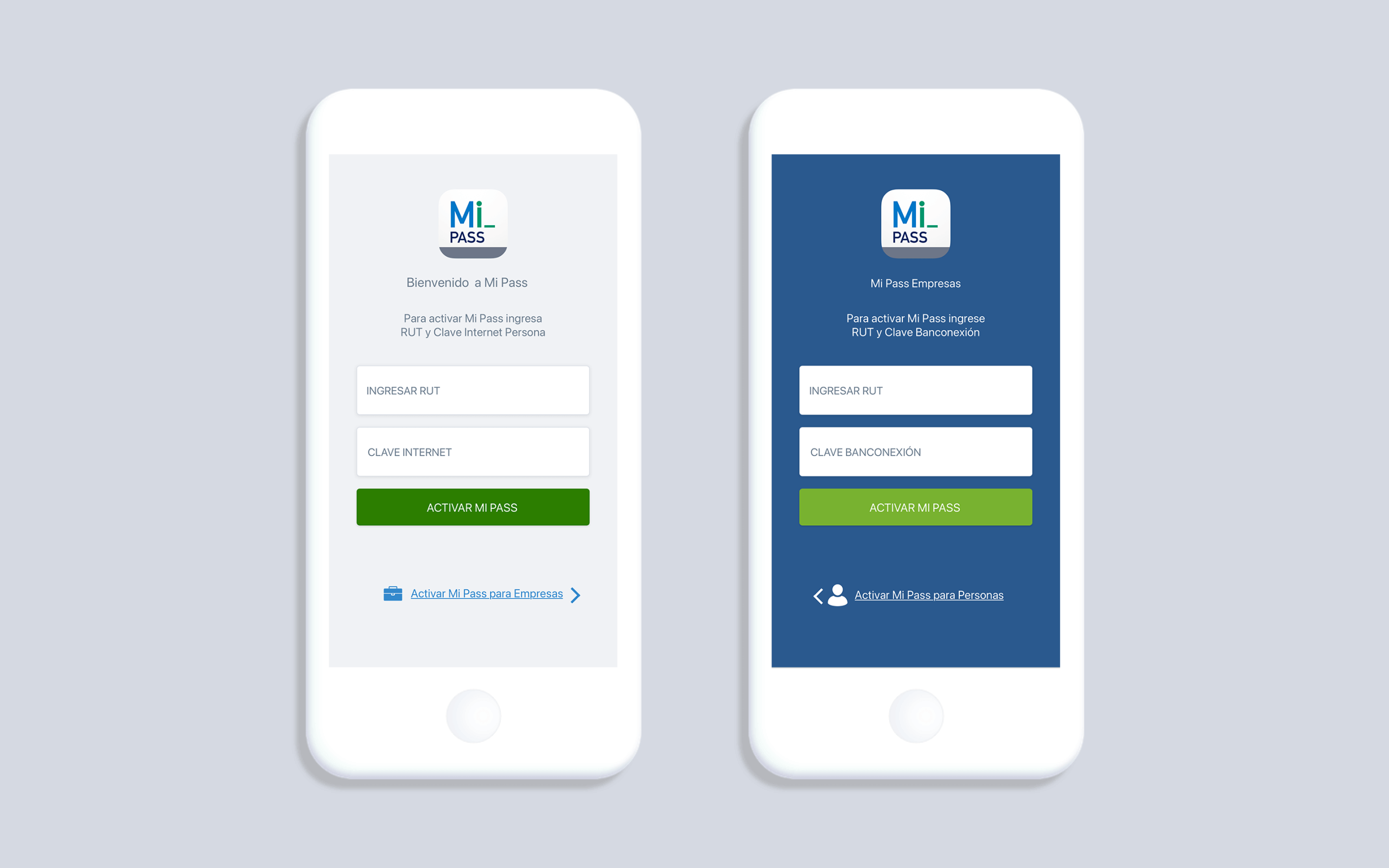
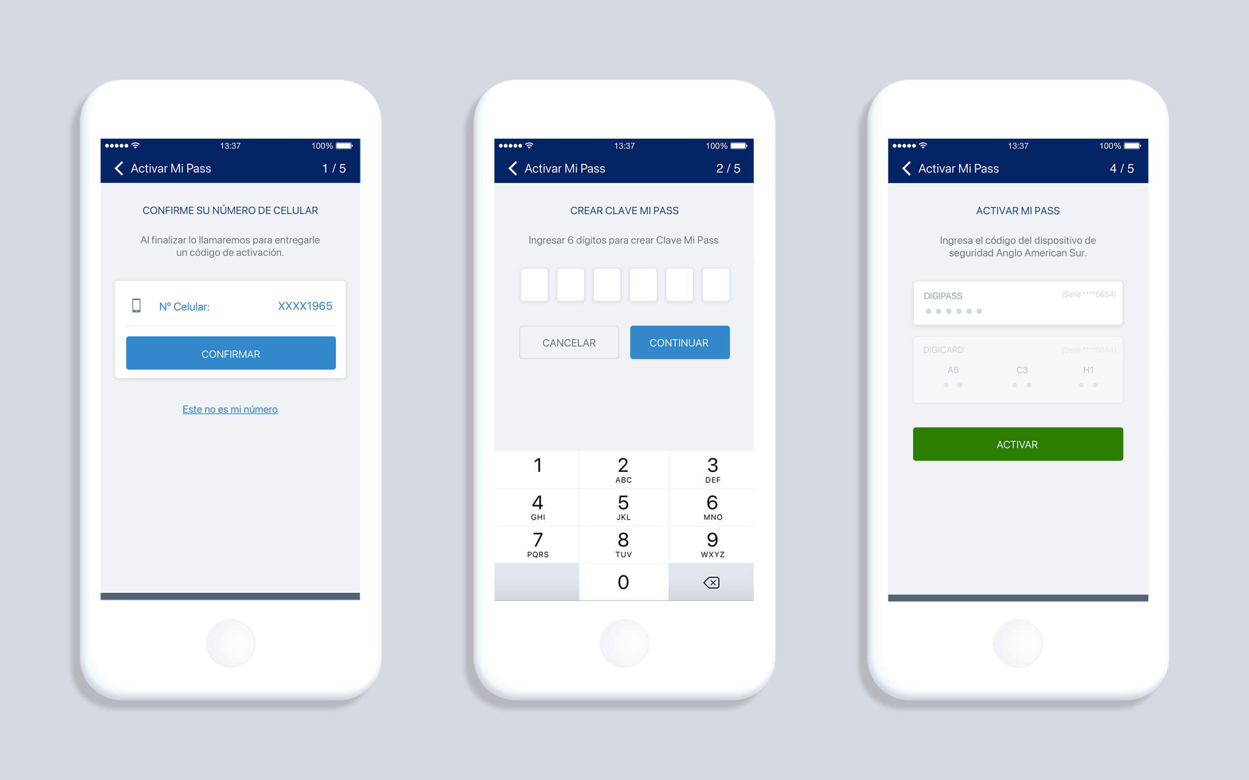
For business users, the process required an additional security step: instead of receiving a code via SMS, they had to confirm the operation through a personal phone call. This measure was critical given the large sums of money involved. However, the application’s back end did not yet support this process.
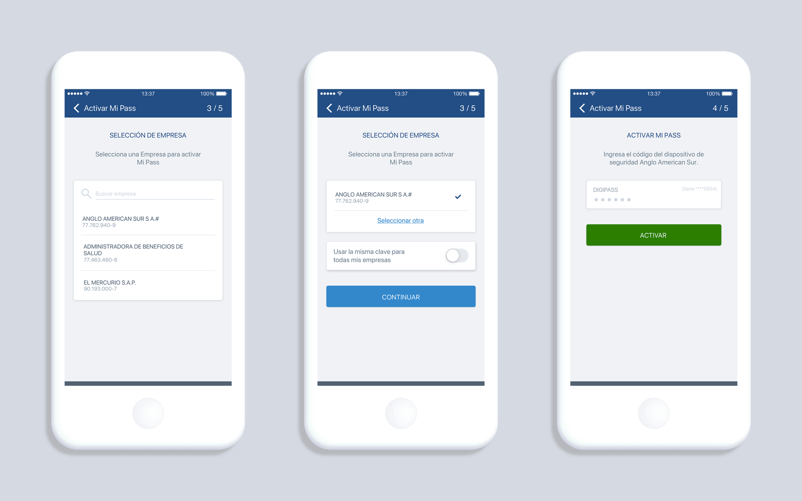
3. Supporting Multiple Companies
During design, we uncovered an overlooked requirement: some users manage multiple companies under one account. For example, a financial officer might authorize operations for several subsidiaries.
This forced us to rethink the navigation, allowing users to easily switch between personal and business operations — and between multiple companies — without losing clarity.
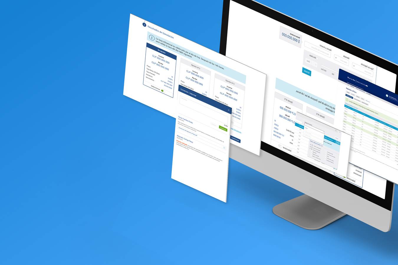
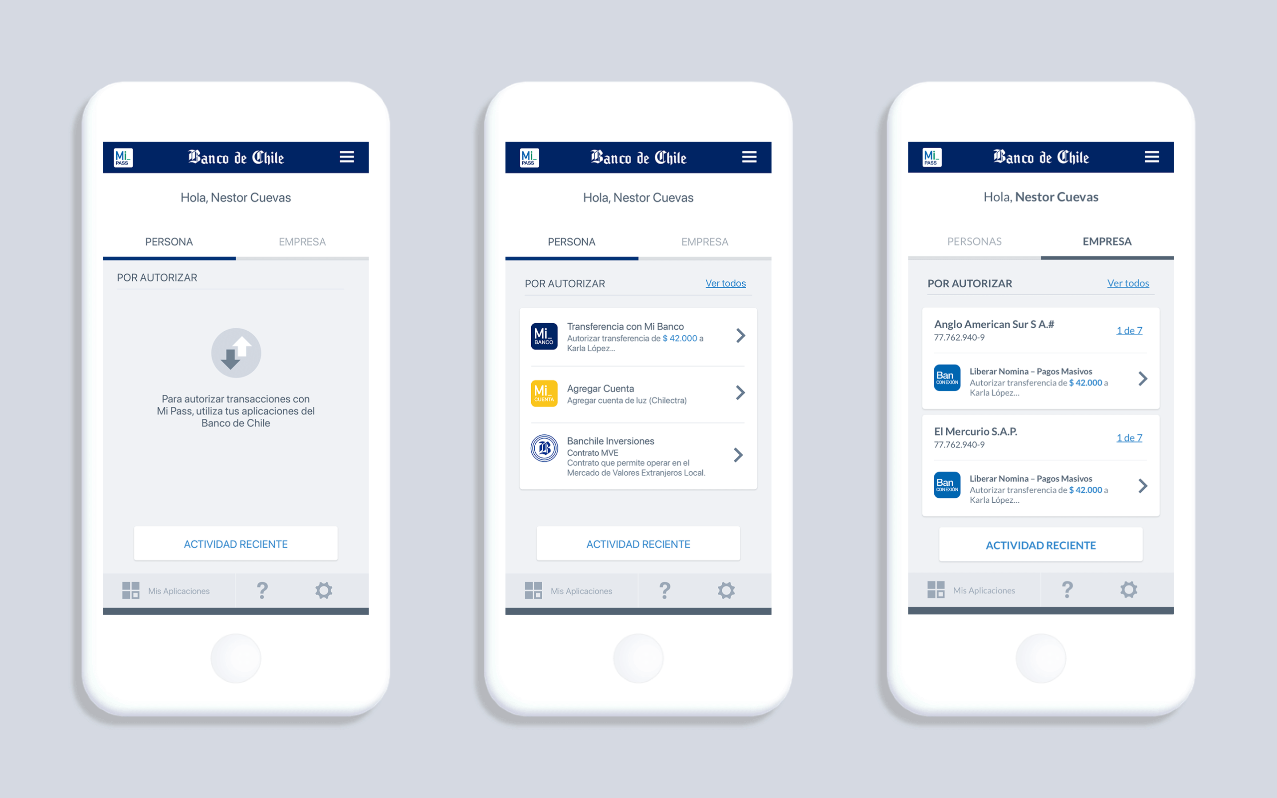
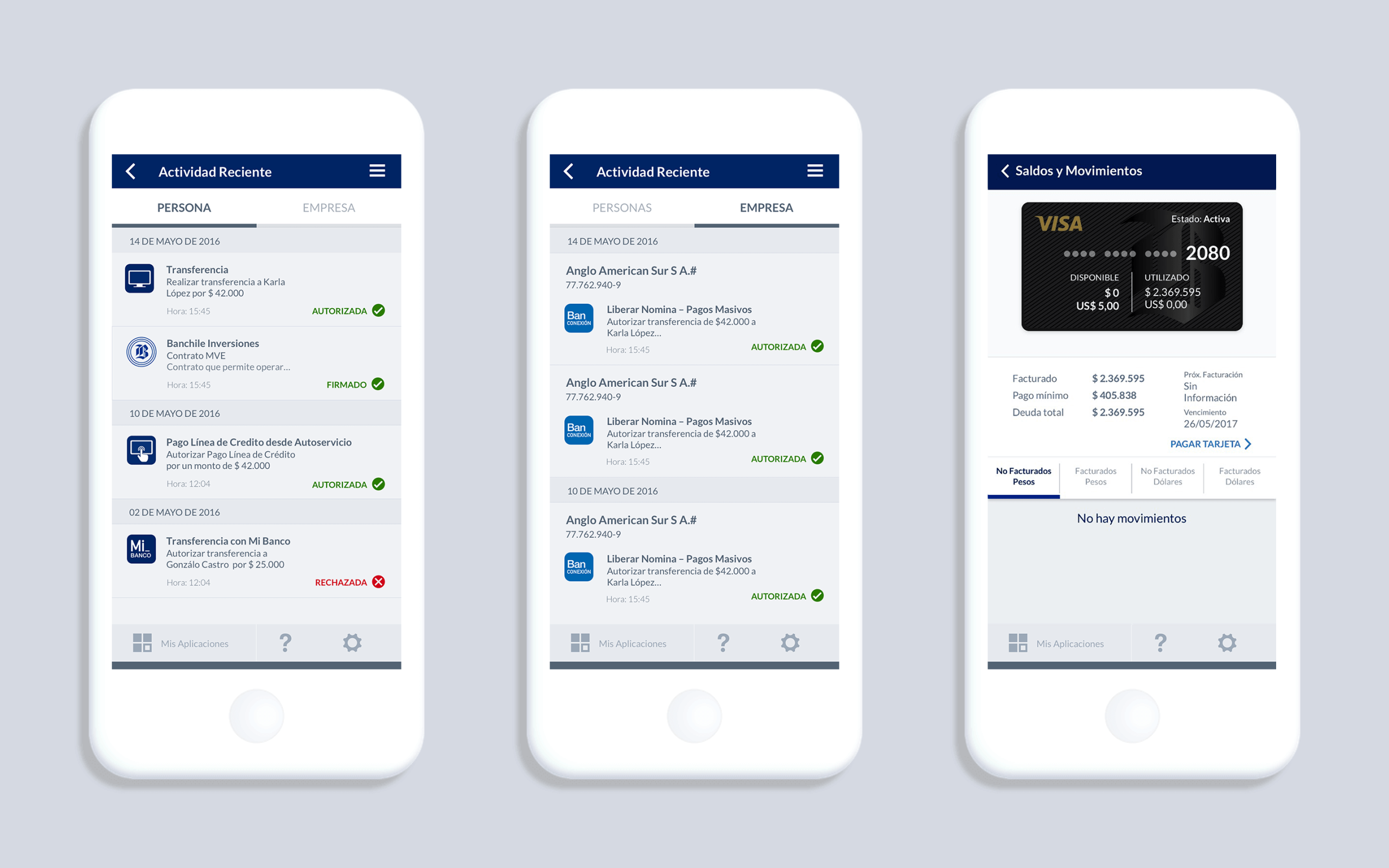
4. Using MiPass: B2C and B2B Together
The final solution allowed users to seamlessly switch between personal and business contexts:
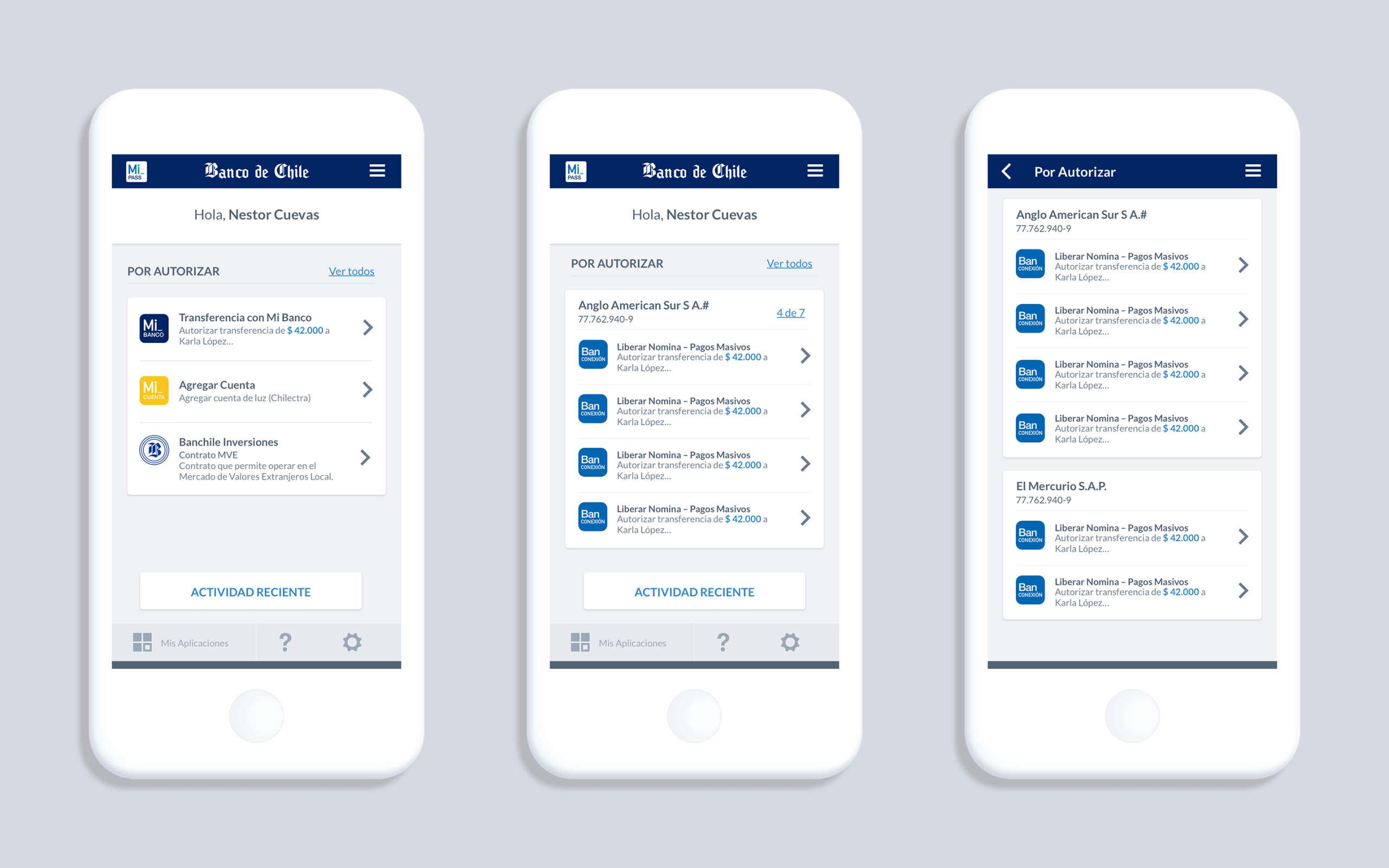
- B2C users could continue to approve or reject their personal banking operations as before.
- B2B users gained a new tabbed navigation with pending operations, history of approvals and rejections, and contextual details (like viewing associated cards before authorizing).
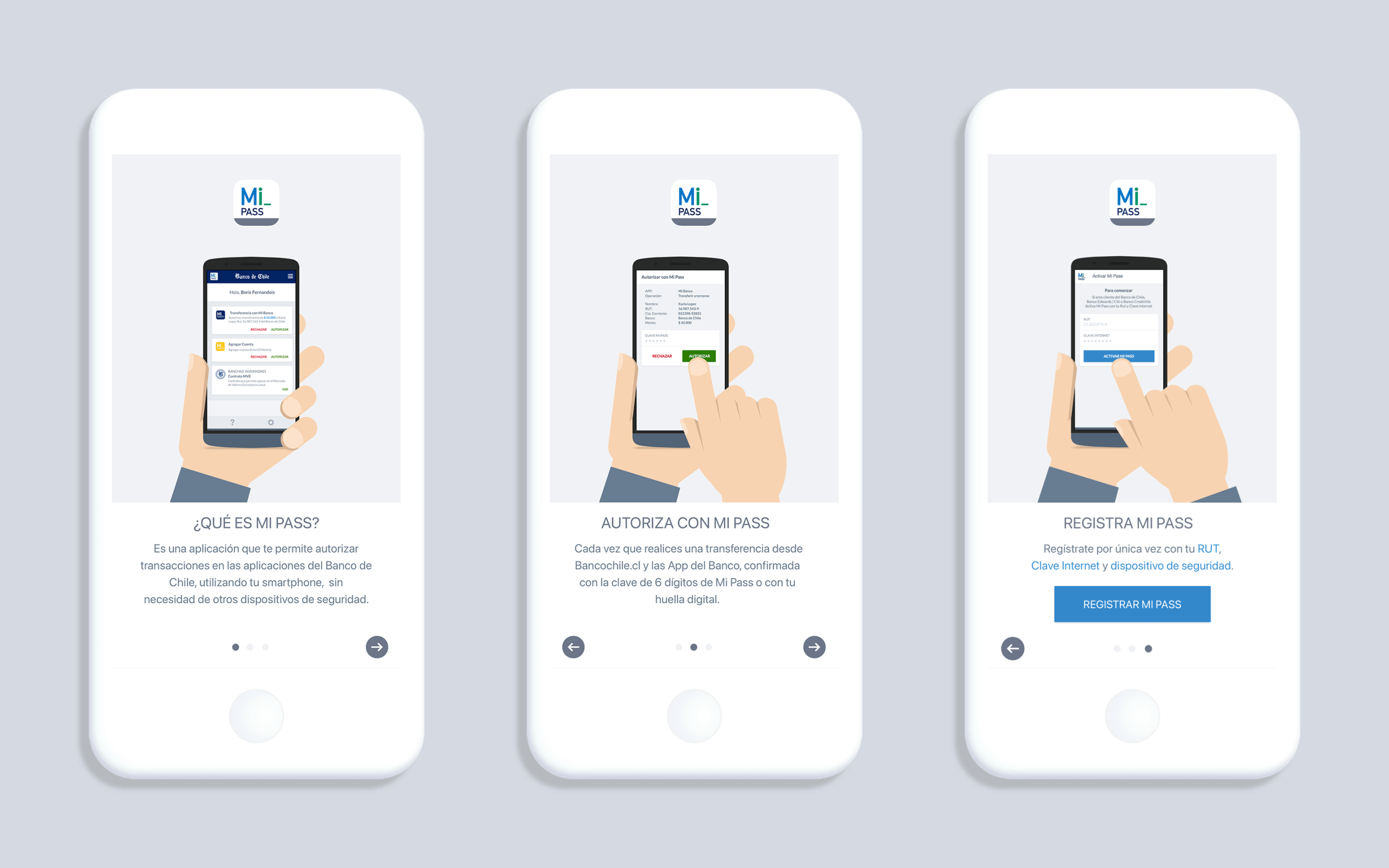
At the last minute, we added a short tutorial to help communicate the new changes.
Outcome
- We launched two weeks later than planned due to technical adjustments, but the extra time was necessary to ensure a cohesive and legally compliant solution.
- Stakeholders were pleased with the outcome, highlighting the clarity of the flows and the fact that both individual and business users could now use the same app without confusion.
Learnings
This project reinforced for me that:
- “Simple” requests are rarely simple: what looked like a quick flow duplication became a strategic redesign.
- Stakeholder inclusion builds trust: involving the Product Owner in the sketching process gave him ownership and made decision-making smoother.
- Deep product knowledge is essential: working in a highly regulated industry like banking means understanding not only users, but also legal, technical, and organizational constraints.
On a personal level, I appreciated the challenge of balancing two different user types (B2C and B2B) in one app and ensuring neither group felt compromised, and the importance of designing within constraints, not despite them.