Project Overview
Client: Bank of Chile, Chile’s largest financial institution with a nationwide branch and ATM network.
Challenge: Modernize the ATM experience by introducing a touchscreen interface for complex banking services and transactions, reducing branch congestion, and improving customer satisfaction while balancing accessibility, usability, and stakeholder expectations.
THE PROBLEM TO BE SOLVED
Bank of Chile wanted to launch a new touchscreen ATM to support more complex transactions outside of branch counters. The main goal was to reduce customer wait times in lines and improve satisfaction. However, the initial project had already gone through several iterations without getting the green light.
When I joined the project, the bank had already developed deliverables such as user stories, flows, and wireframes. But I quickly realized they were driven by product requirements rather than user needs. The main concern was “keeping up with competitors” rather than addressing the real frustrations of customers waiting in long branch lines.
For me, the challenge was clear:
- Bring a user-centered perspective into a project that was already in motion.
- Prove to stakeholders that solving for people first would also solve business goals.
MY ROLE
I was brought in as a UX Consultant to rebuild the project from scratch, translating business requirements into a usable, accessible, and intuitive product. My responsibilities included:
- Reframing business requirements into user-centered outcomes.
- Leading research efforts and translating insights into design decisions.
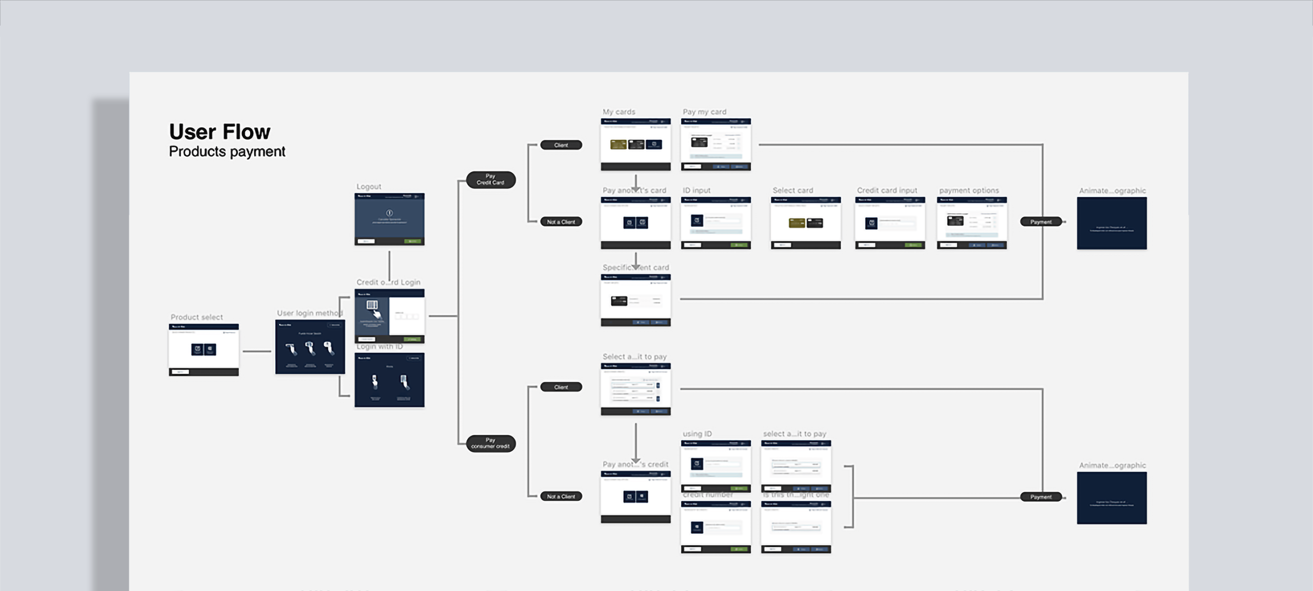
- Redefining information architecture, flows, and wireframes.
- Delivering high-fidelity UI while collaborating with developers and product owners.
I saw my role not only as a designer, but as a bridge — between business priorities and user needs, between stakeholders and developers, and between “the way things had always been done” and a more modern, user-first approach.
Approach
The first problem I had to face was that all existing deliverables (user stories, user flows and low-fidelity wireframes) were done from a product perspective, without taking into account user pain points, needs and motivations, and because the competition had already implemented a similar solution, the bank’s biggest concern was not to be left behind and not solve a real need of its customers.
1. Establishing a User-Centered Foundation
One of my first questions to the team was simple:
“Have we validated whether customers actually want this?”
To counter the competition-driven approach, I reoriented the project around actual customer needs. I conducted 18 unstructured interviews across different demographics to validate assumptions and uncover user expectations.
Key insights included:
Trust
Customers worried about making mistakes during complex operations and valued human guidance.
Capacity to adapt
Younger to young adult users (18–45) were eager for faster, more autonomous options.
Guidance
Some users, particularly elderly people and from low-income areas people, needed reassurance before finalizing decisions.
Ease of use for seniors
Seniors were surprisingly open to trying digital services — if interfaces were simple, legible, and forgiving.
Further research on senior users showed that although in Chile seniors consistently have lower rates of technology adoption, this group is more digitally connected than ever. In fact, some groups of seniors—such as those who are younger, more affluent, and more highly educated—own and use various technologies at rates similar to adults under 65. This has reduced the technological gap for them, making them more open to trying new options.
2. Designing for Clarity and Confidence
I focused the interface on task completion, not decoration. Some guiding principles were:
- Keep screens consistent and predictable, so each new task felt familiar.
- Reduce every flow to its minimum set of essential options per screen.
- Use large, readable typography and buttons accessible for all age groups.
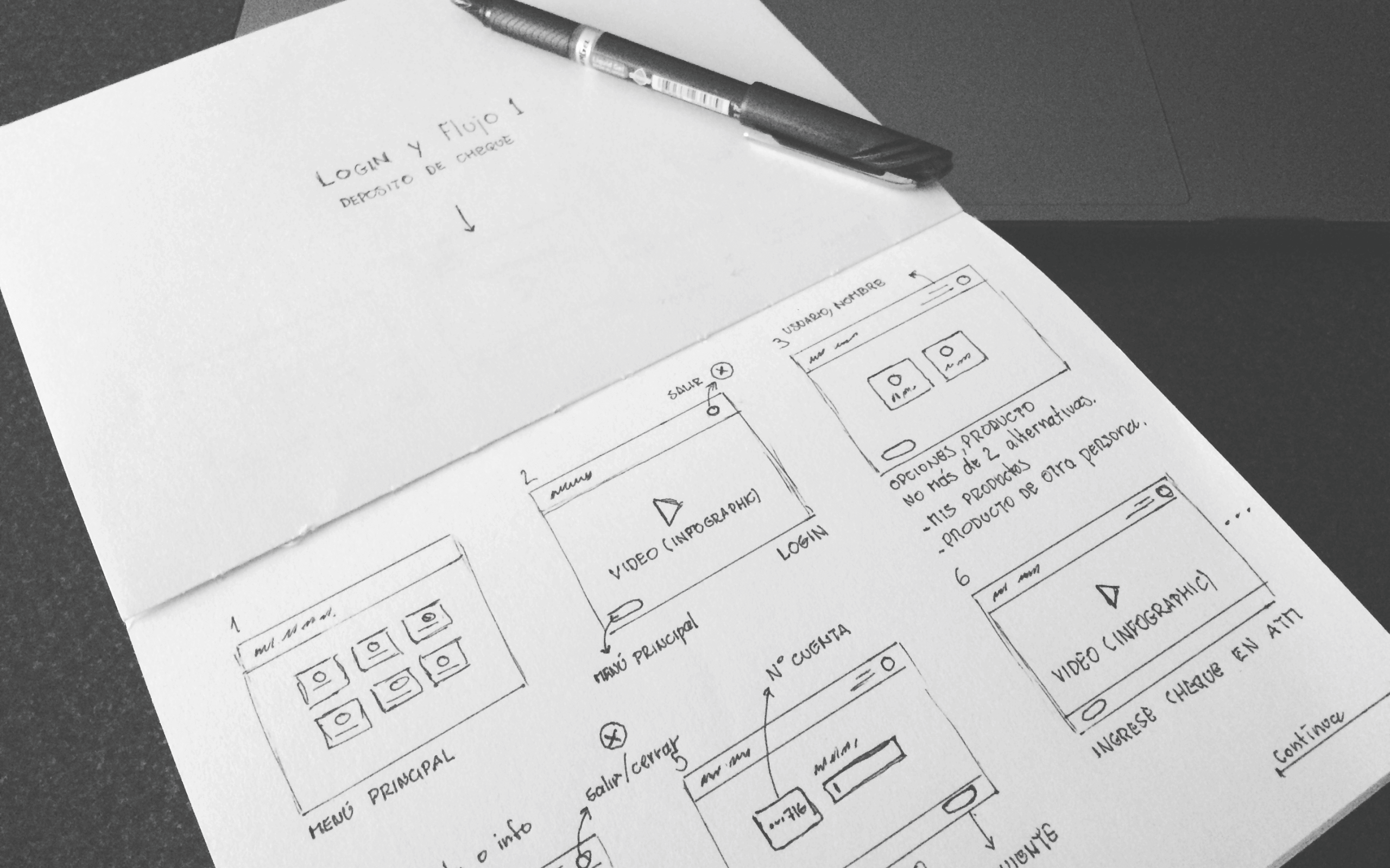
FROM INSIGHTS TO LOW-FI WIREFRAMES
Given the wide range of population and people with some degrees of disability, a touchscreen interface that is usable and has a low learning curve is less threatening, especially for beginner users and people in rural areas.
The key factors here were Usability and Utility, easy to understand, and letting users accomplish tasks in a small amount of time, therefore our design needed to be friendly and simple, avoiding fancy interactions or trends that most digitally savvy users were used to.
“I designed an easy and repetitive layout. As I like to say: “If the UI feels repetitive, it means the user can relax and focus on the task, not the interface.”.”
We reduced each page to its minimum common denominator, leaving the least amount of options allowed, focusing on the task at hand and avoiding distracting the user.
TURNING CONSTRAINTS INTO ADVANTAGES
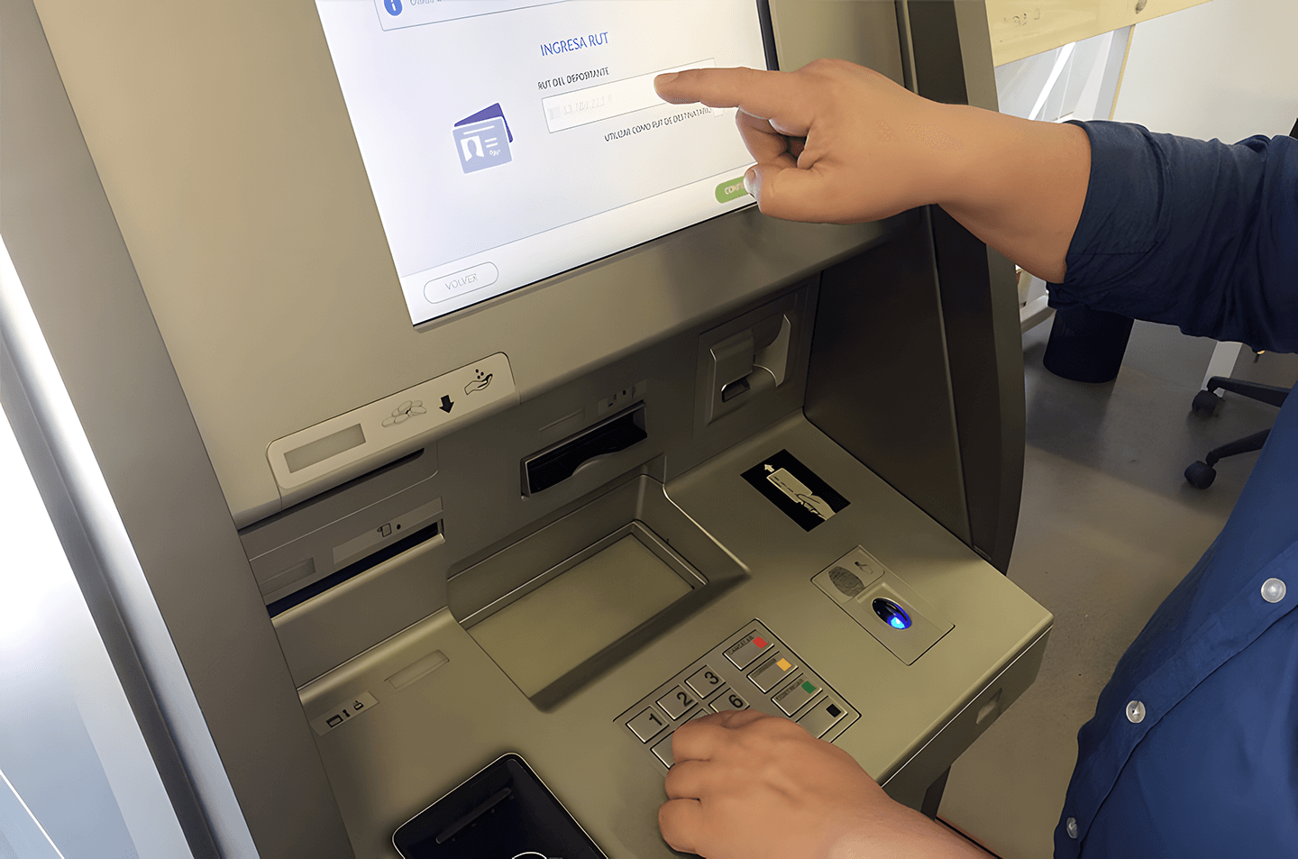
One of the bank’s requirements was to keep a physical keypad for numeric inputs, even though the ATM had a touchscreen-first approach to its design. At first, I saw this as a design contradiction. But over time, I realized it was actually an asset:
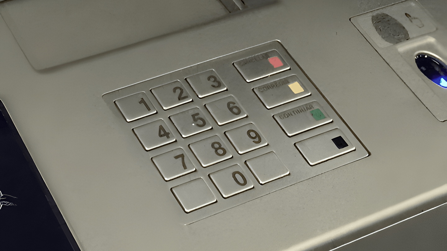
- The tactile feedback supported visually impaired users (Braille + button click).
- This was one of those moments where a constraint became an unexpected design opportunity as it freed up screen real estate for clearer visual content.
- Focus on designing for Accessibility and Simplicity.
3. Visual & Interaction Design
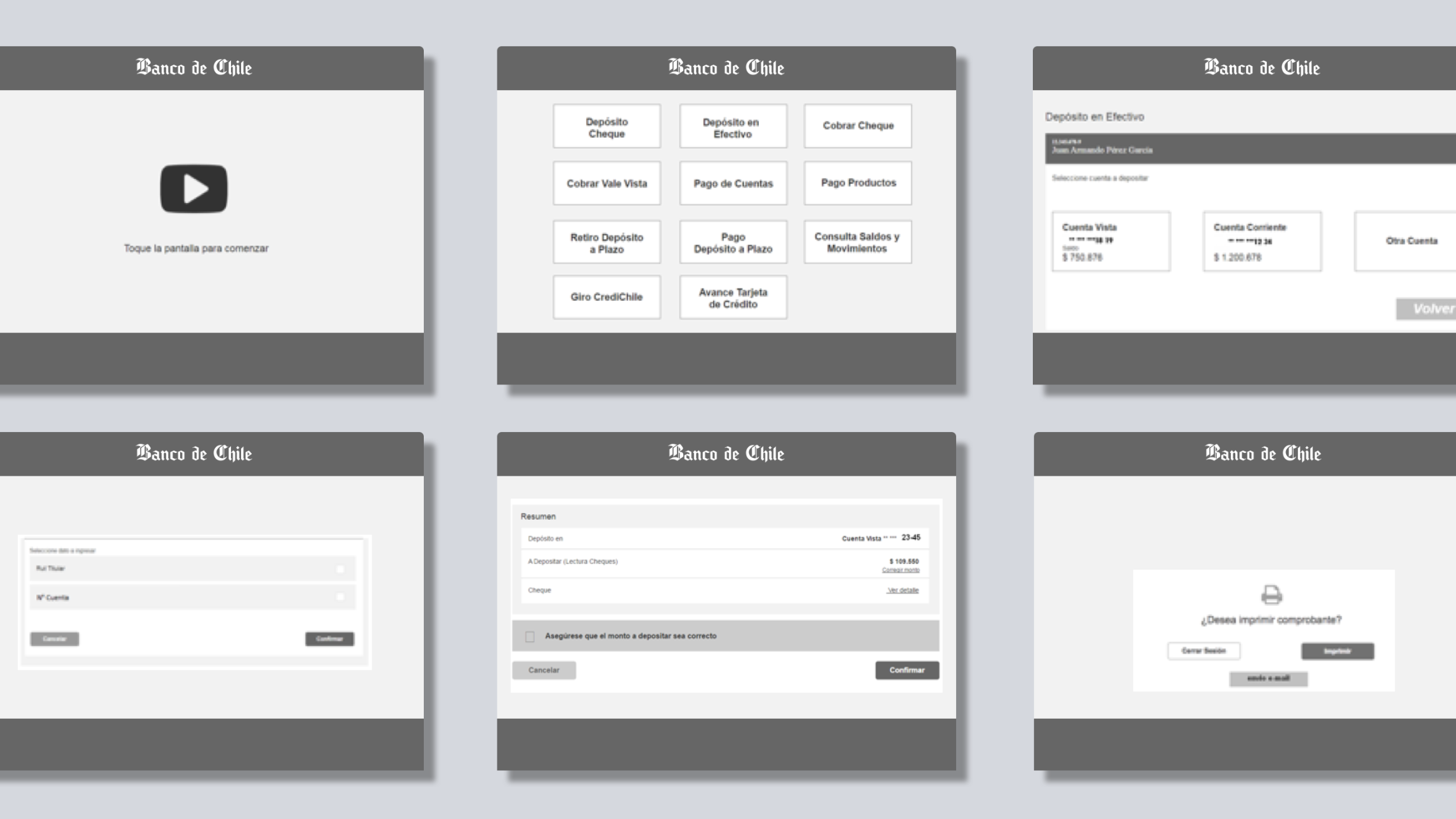
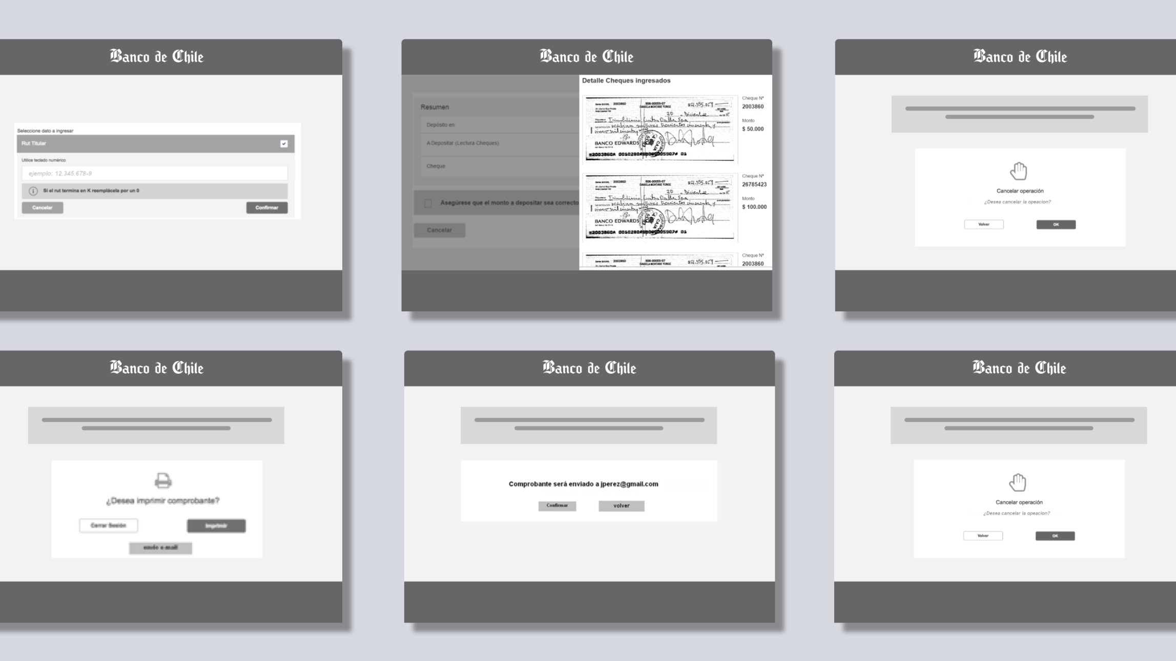
With validated flows and wireframes in place, I moved to high-fidelity design.
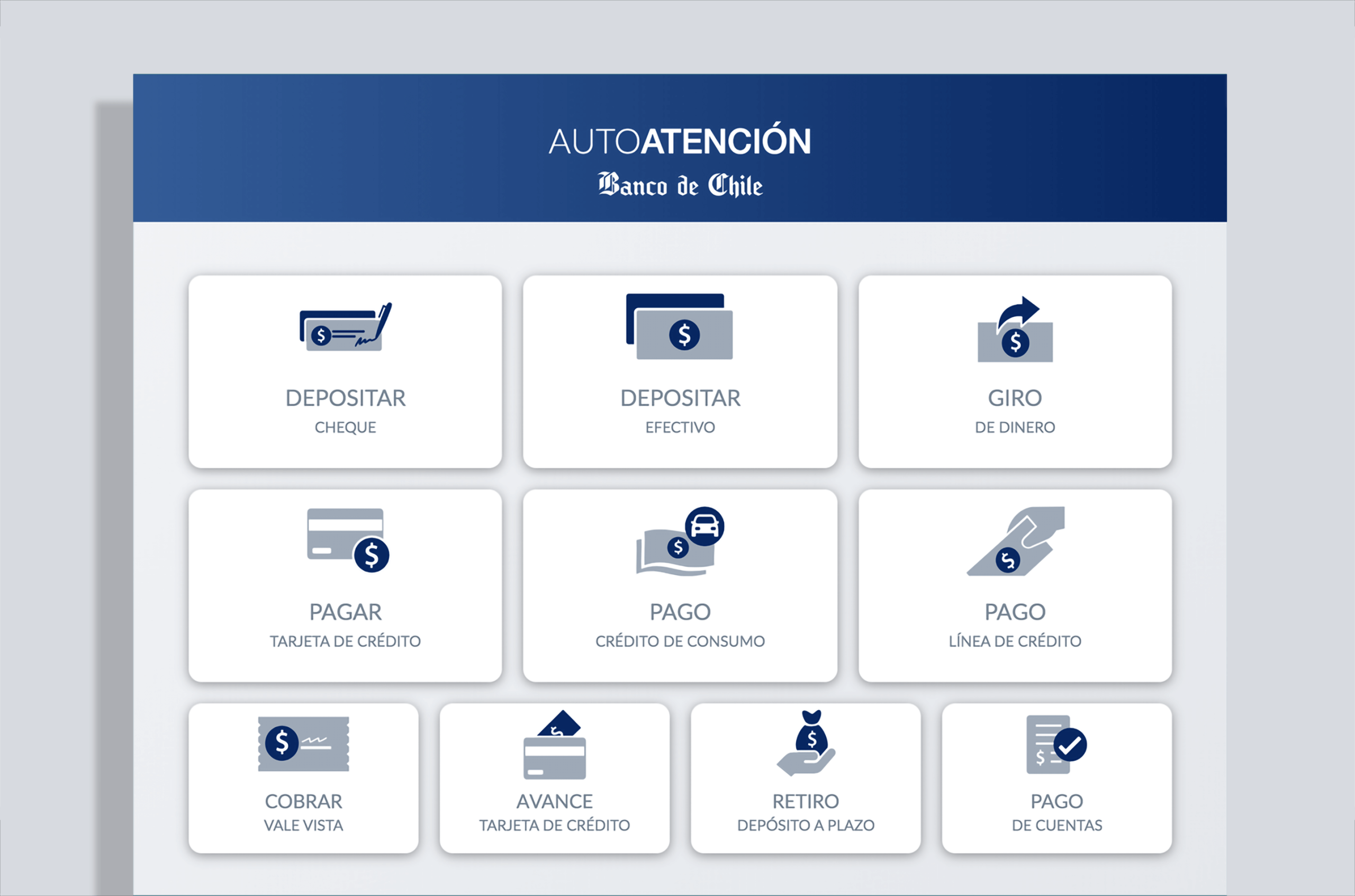
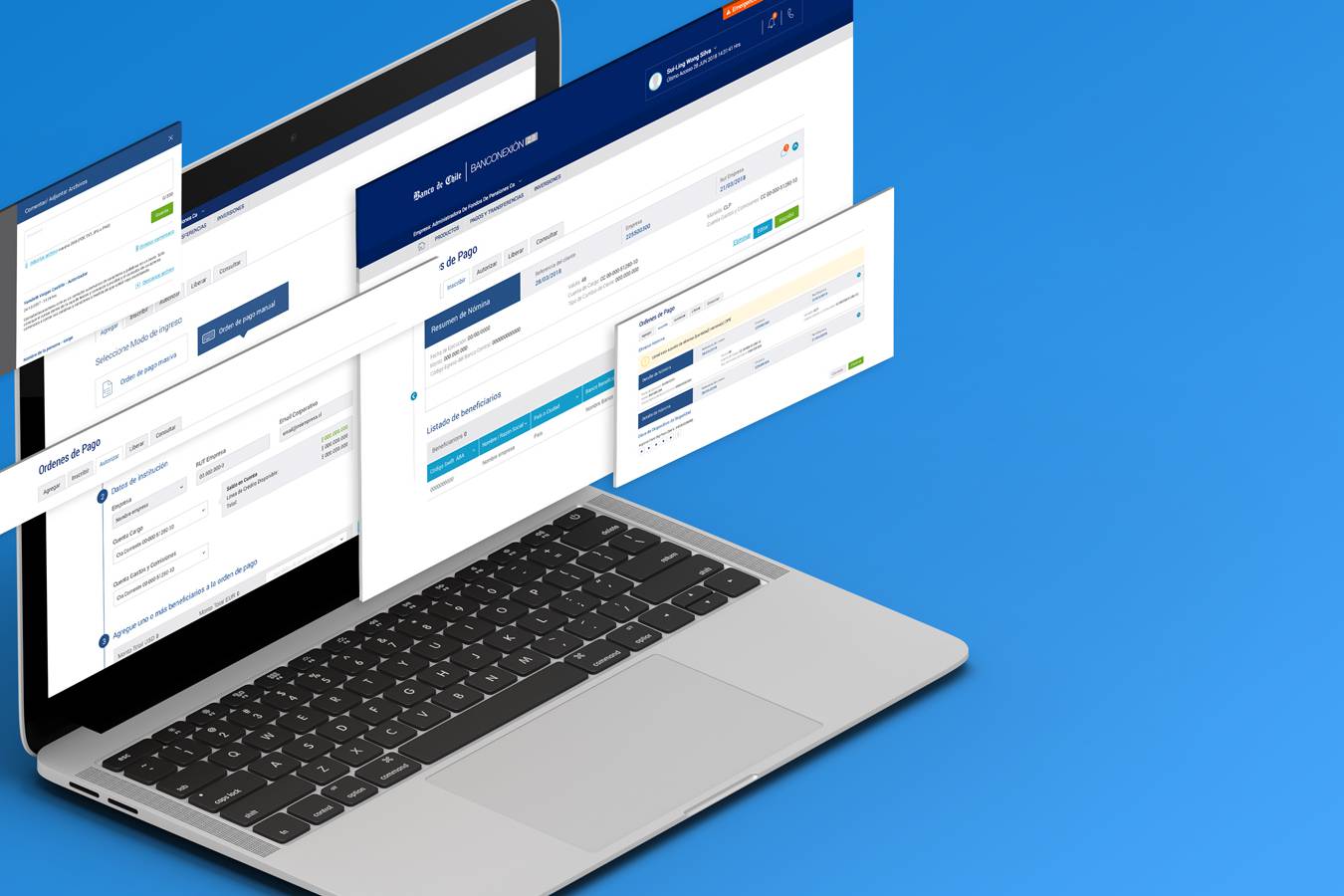
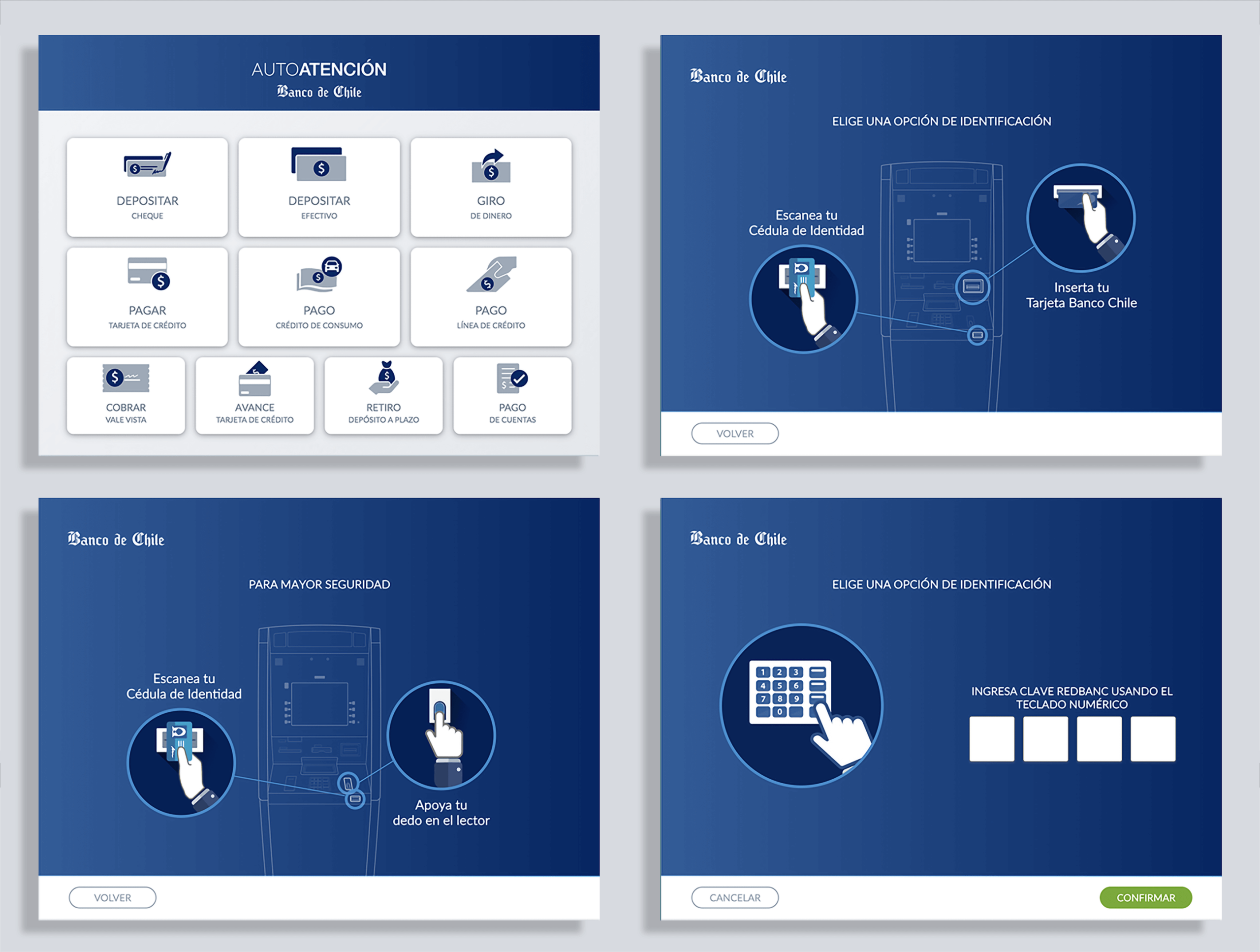
The starting page with all the available banking operations, this is the main screen of the ATM.
While constrained by the bank’s UI kit which was Web-Oriented, the bank approved the resource allocation to expand it with new components (e.g., improved buttons, titles, and animations) focused on touch interfaces.
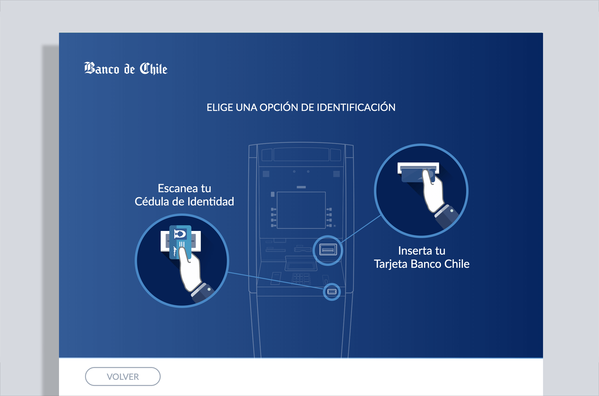
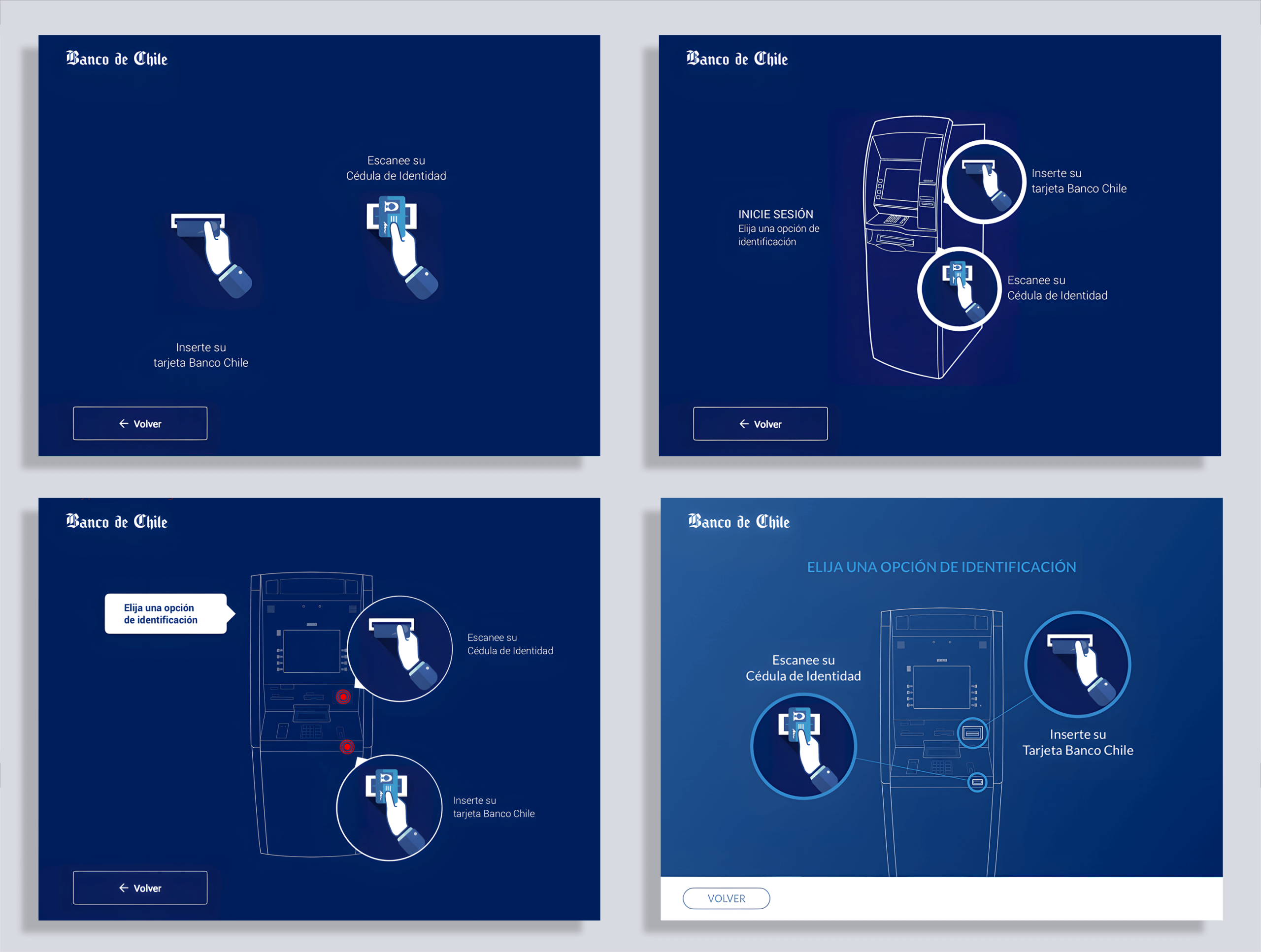
THE INTRO SEQUENCE
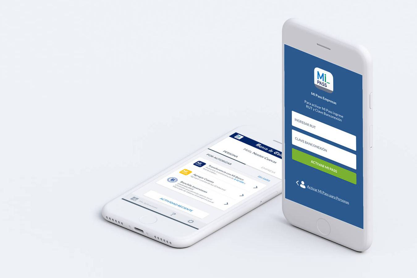
One piece I’m particularly proud of was the intro sequence. Since the ATM used two-step authentication (ID + fingerprint), I designed and coded (in HTML, CSS, and jQuery) a short animation to guide users through the process in under 10 seconds. It was one of the last times I coded directly, and it reminded me how much I enjoy the craft of making an idea tangible.
In the image below, we can see the evolution of the animation and design, from a minimalistic flat interface design to a bolder and impactful one.
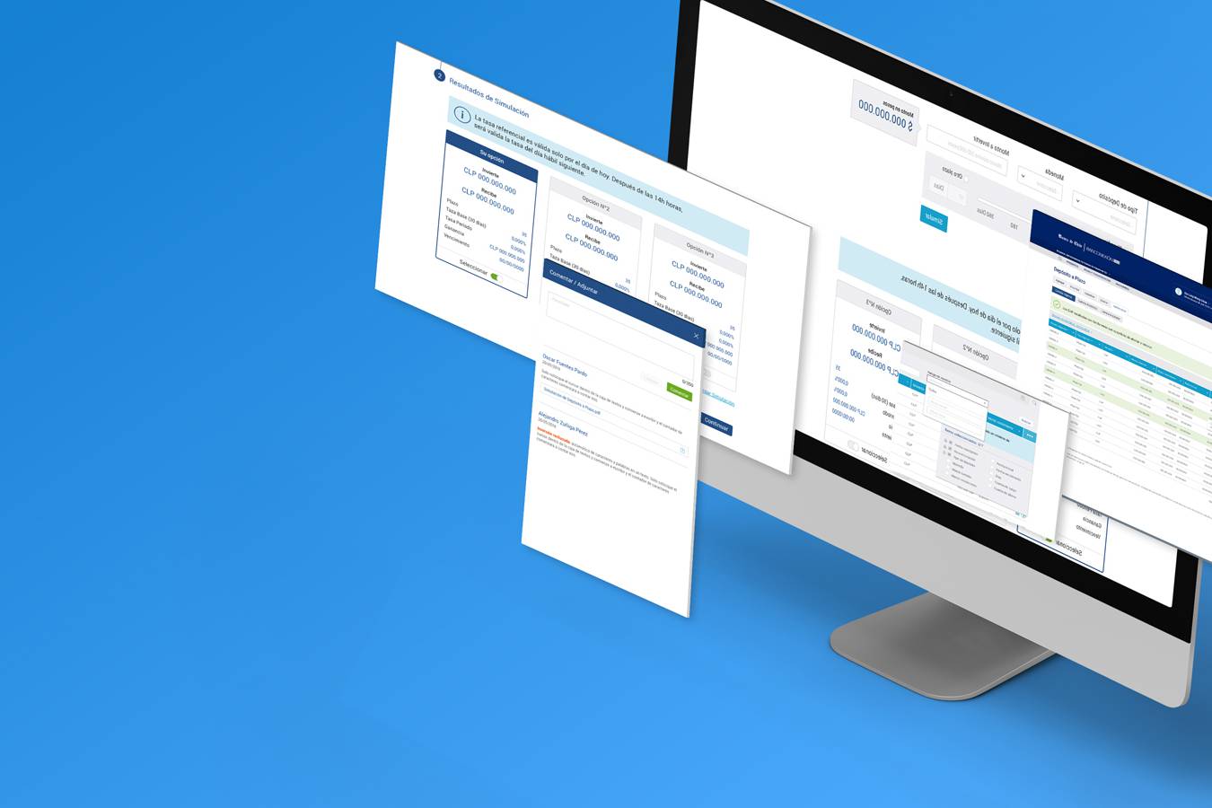
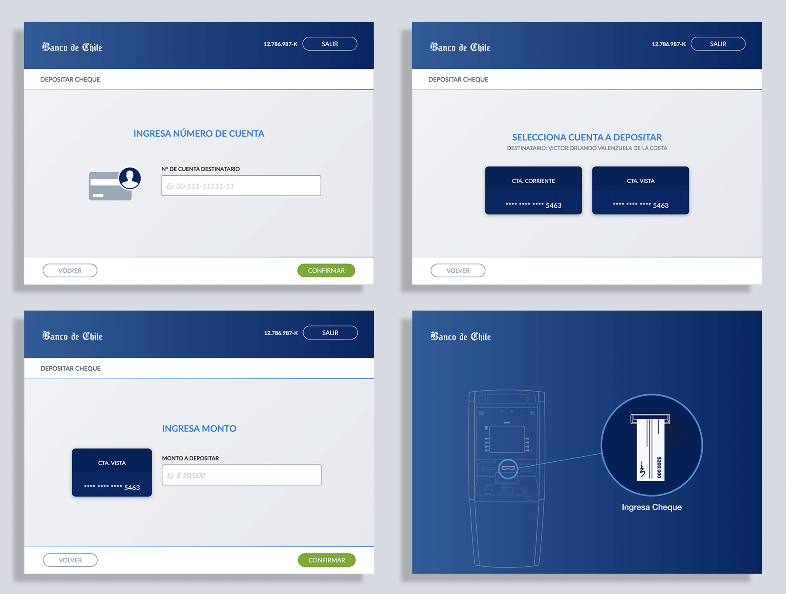
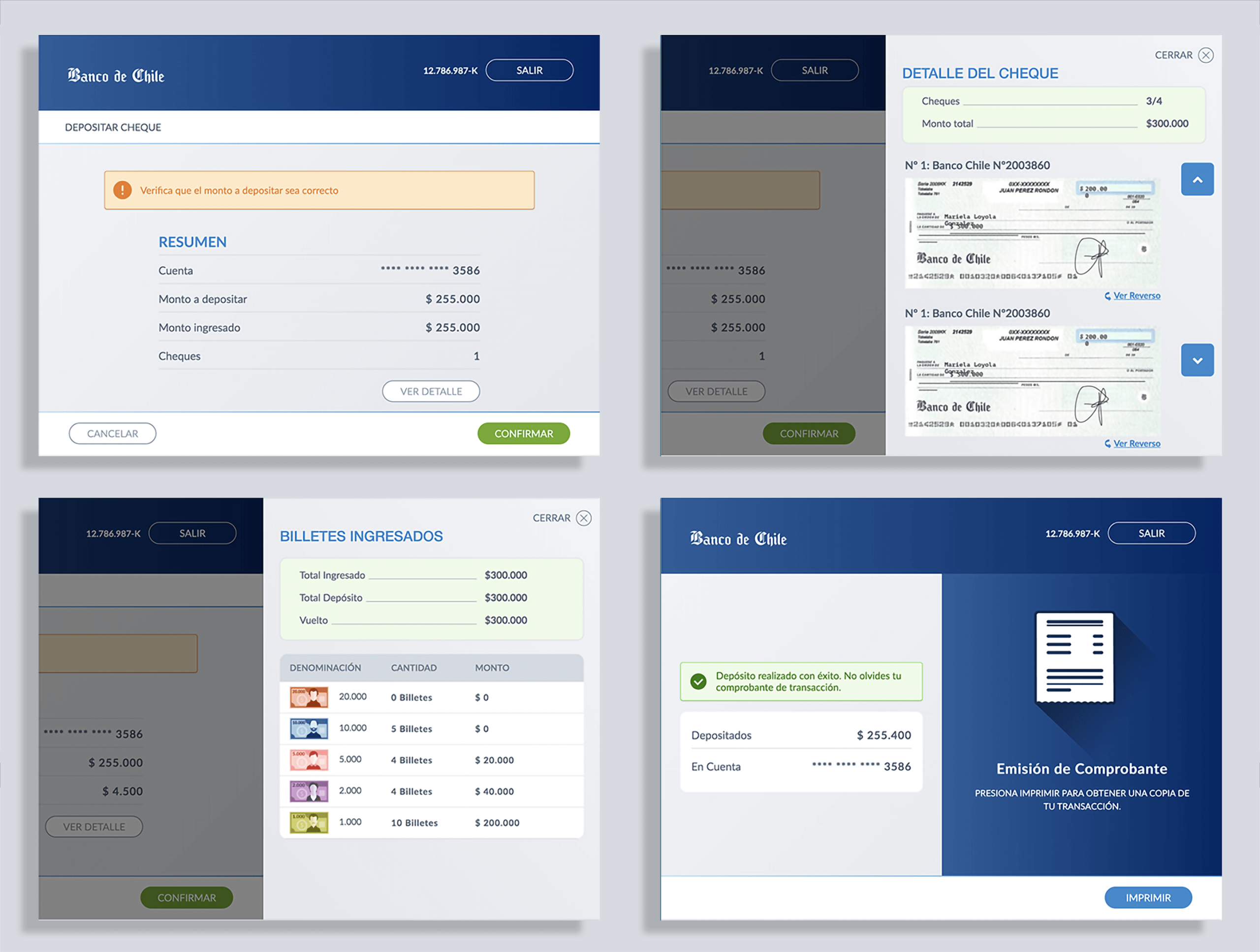
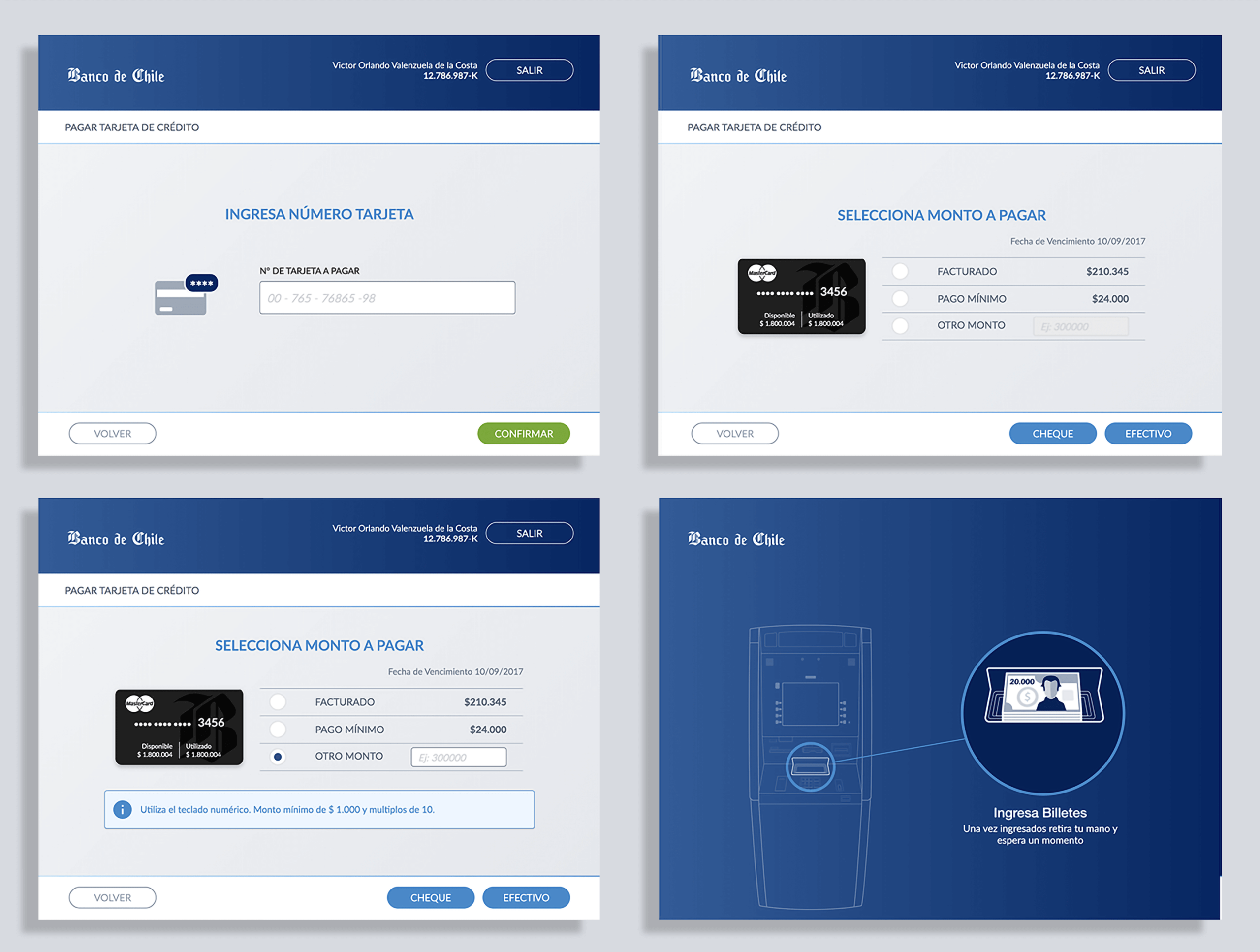
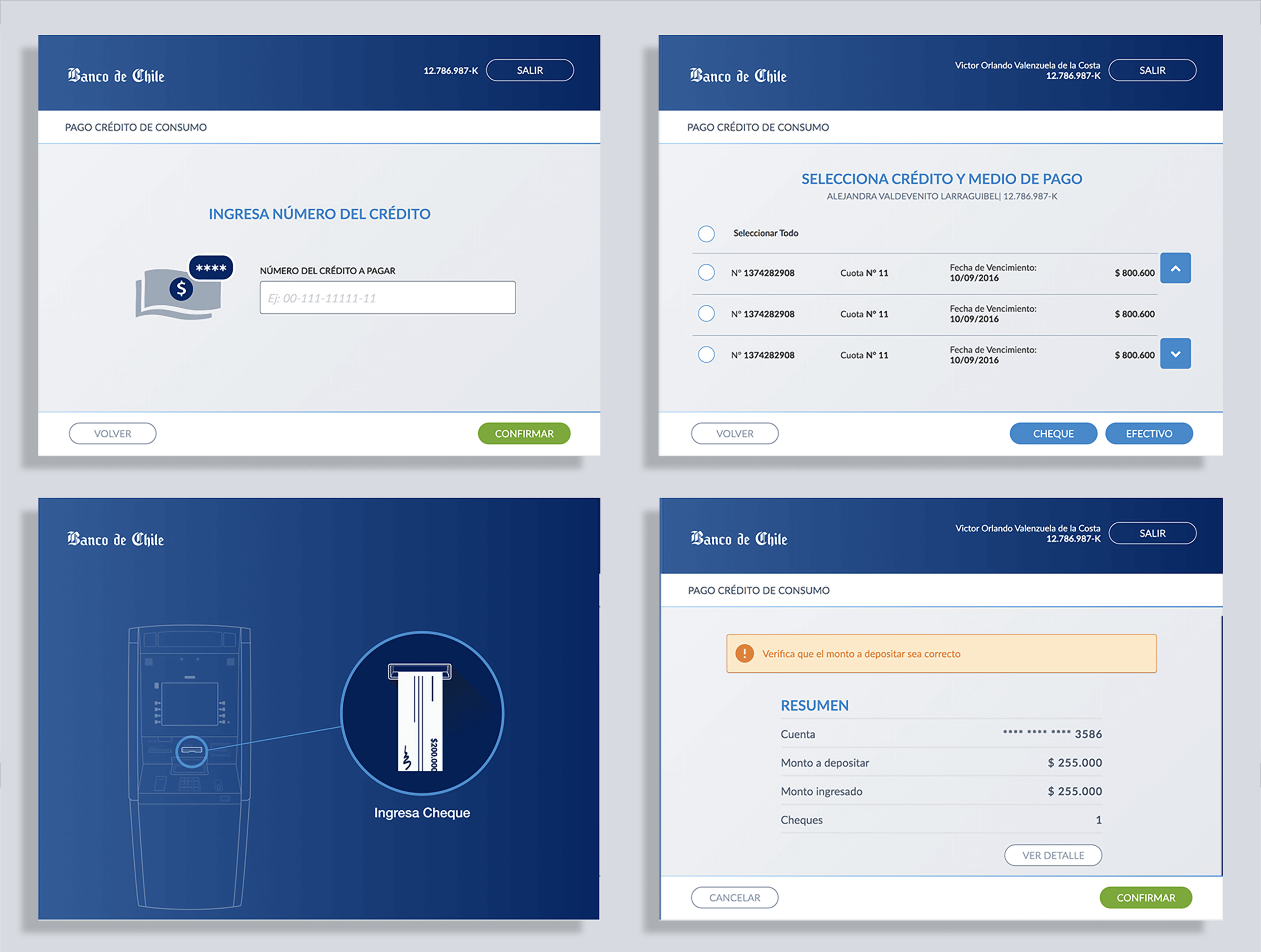
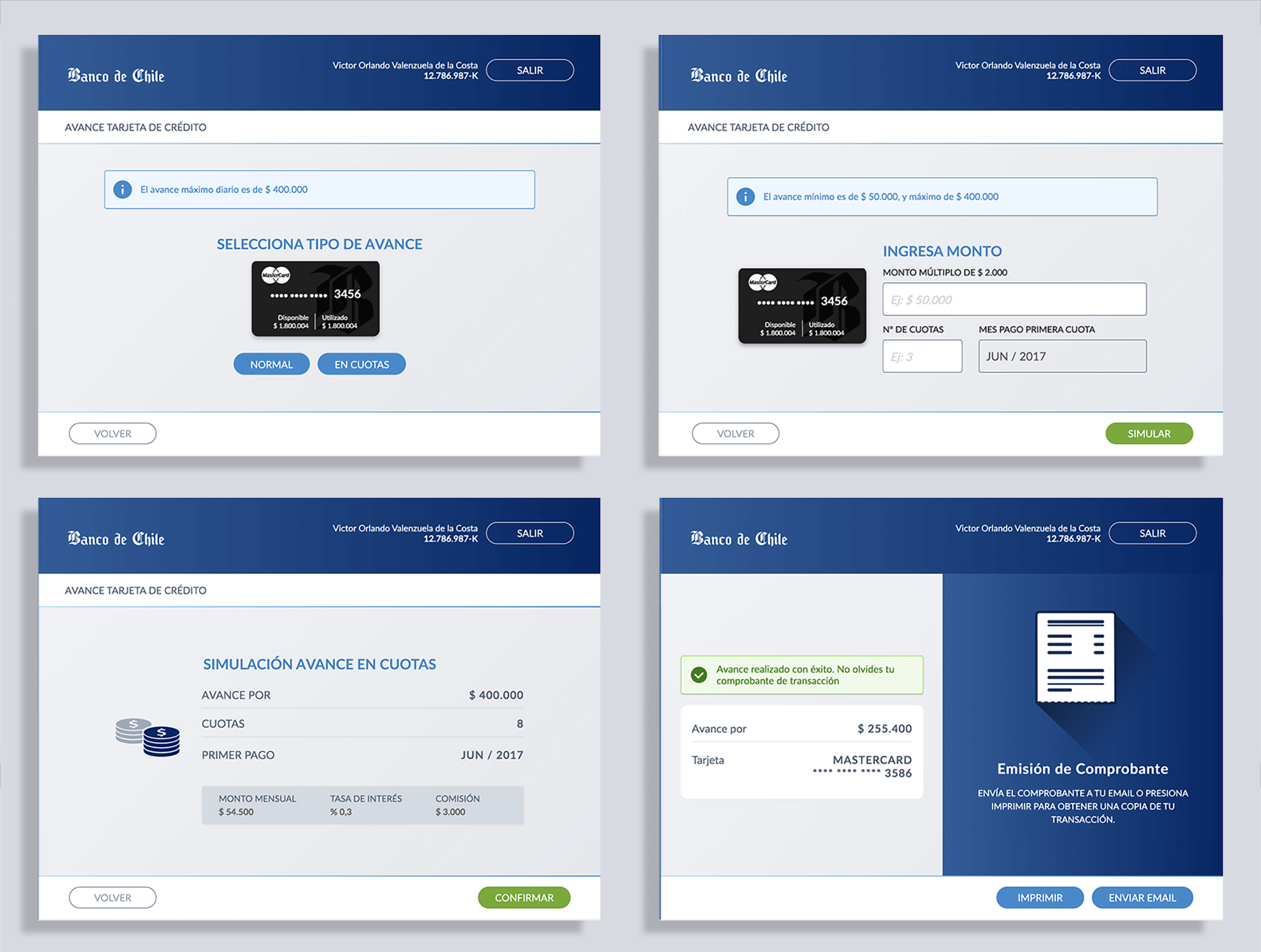
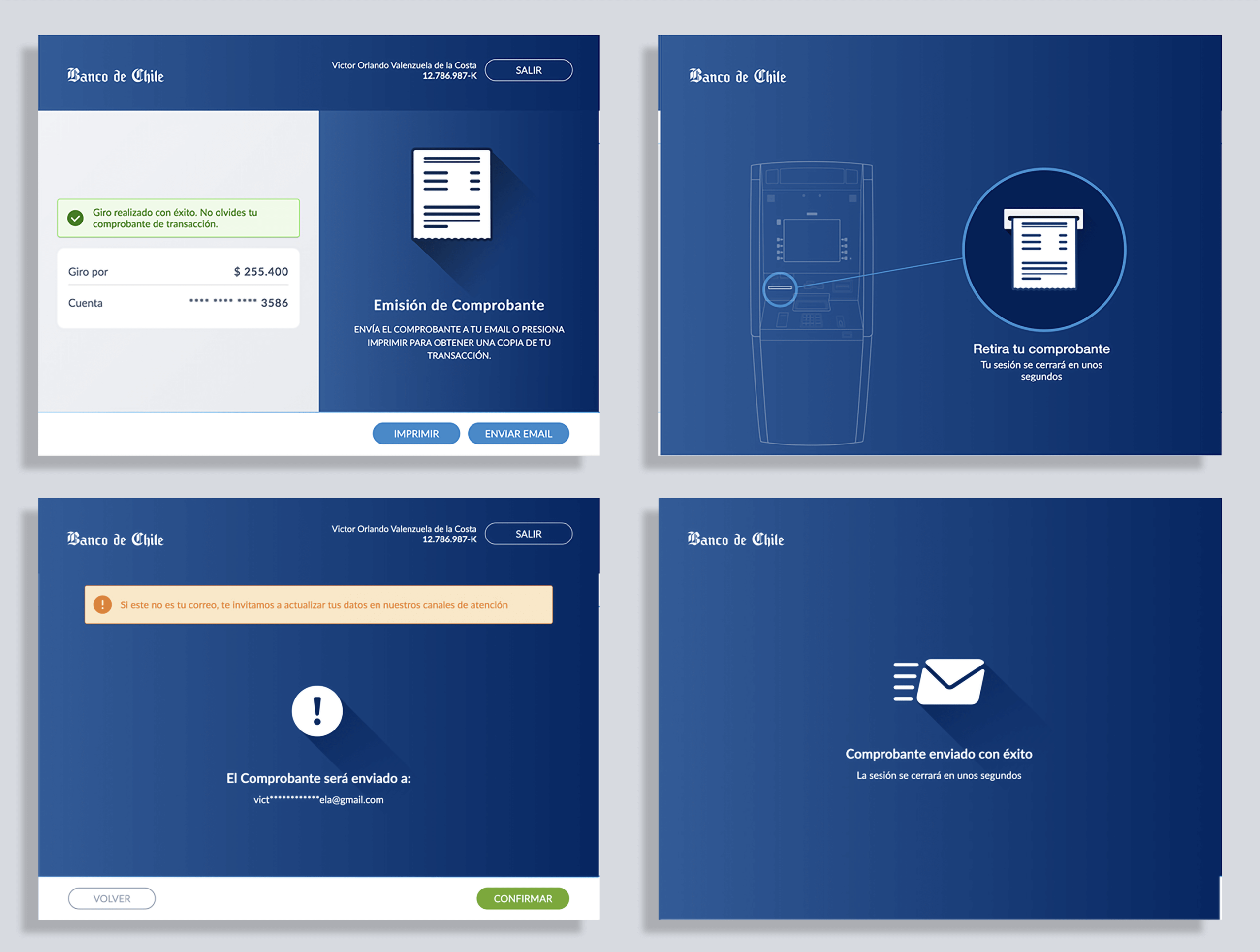
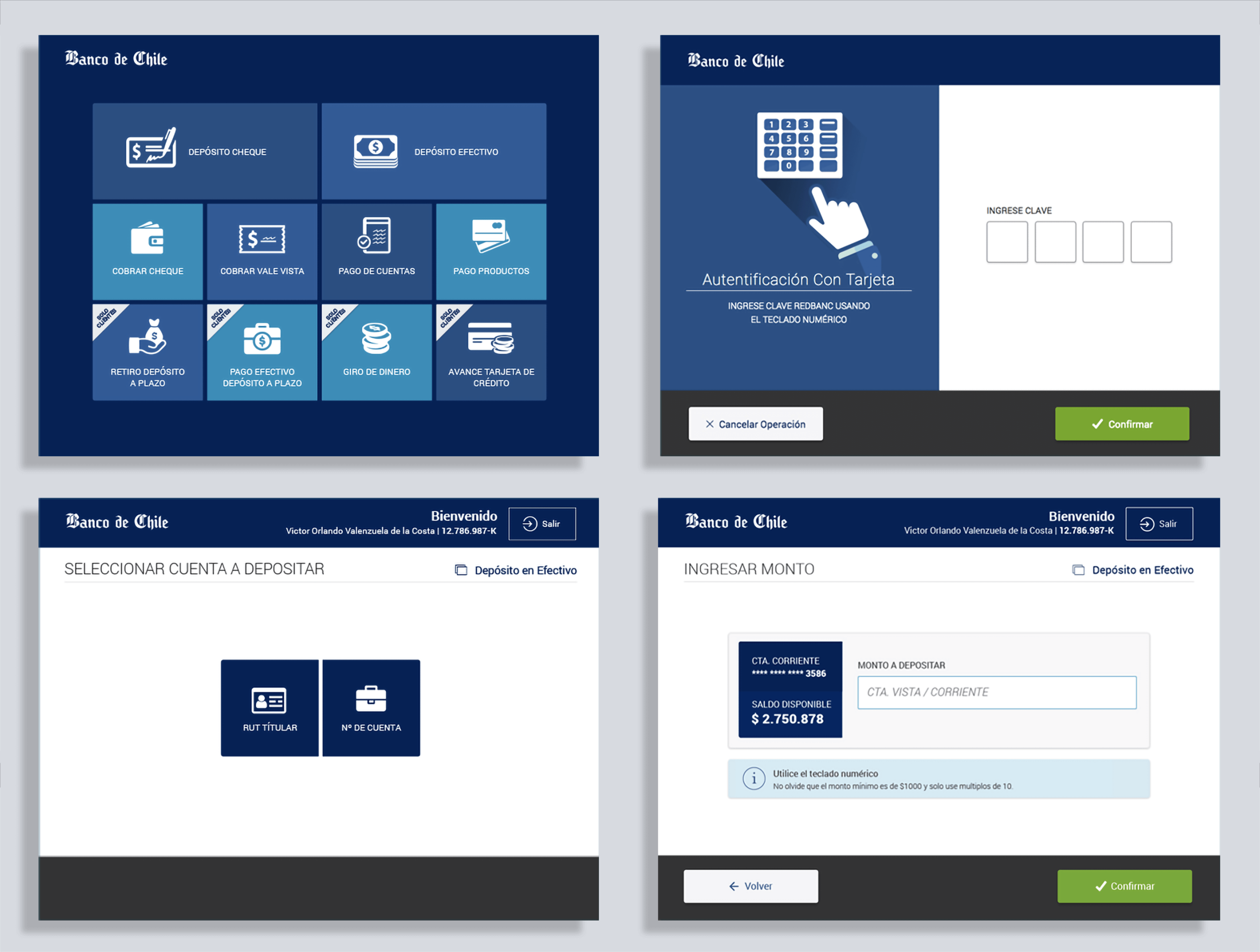
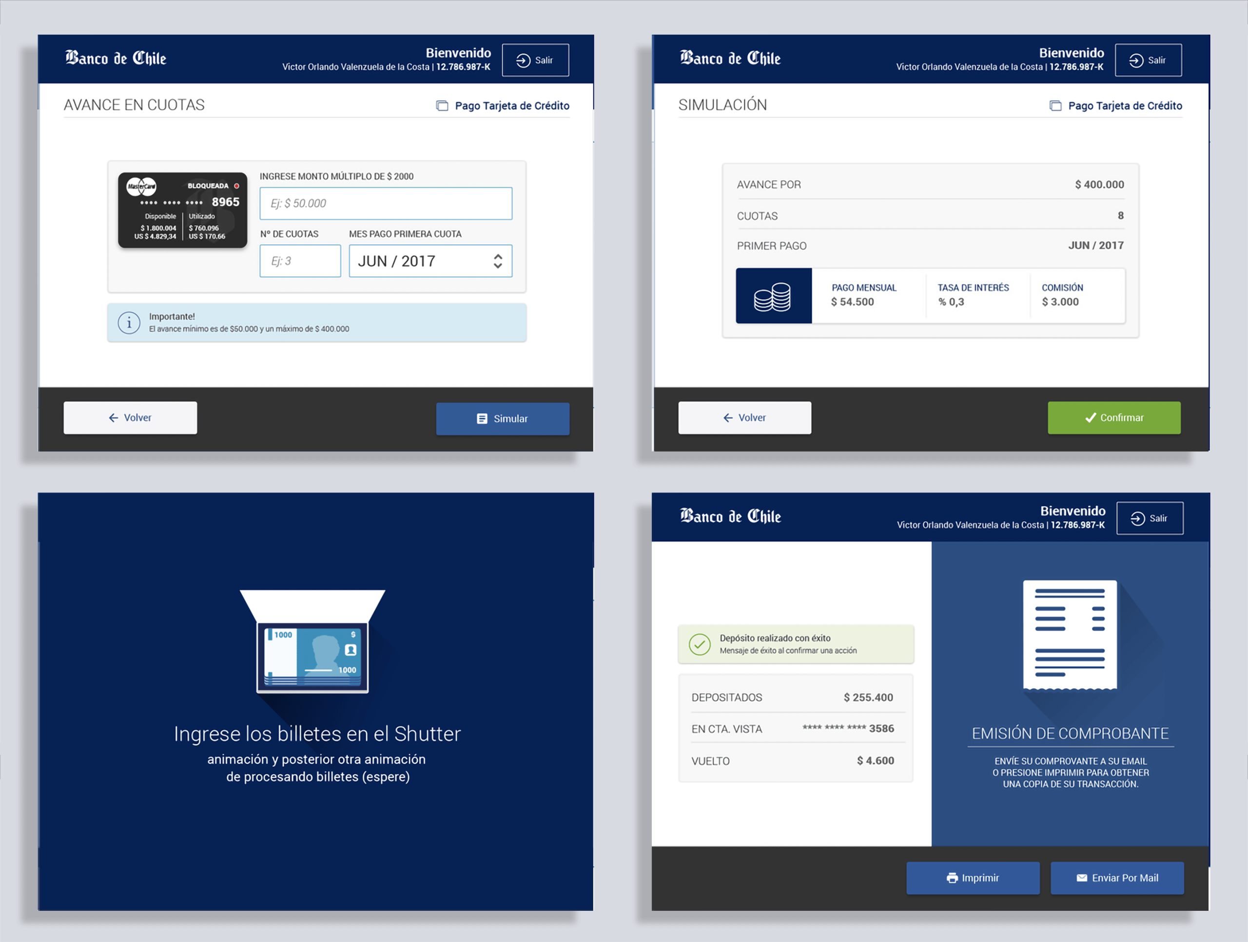
THE USER INTERFACE
After the approval of the stakeholders, the front end team started the development, all images below are screens from the version released to the market, and I must say that I’m very happy with the accuracy the development was able to tackle the project, almost pixel-perfect to our Sketch counterparts.
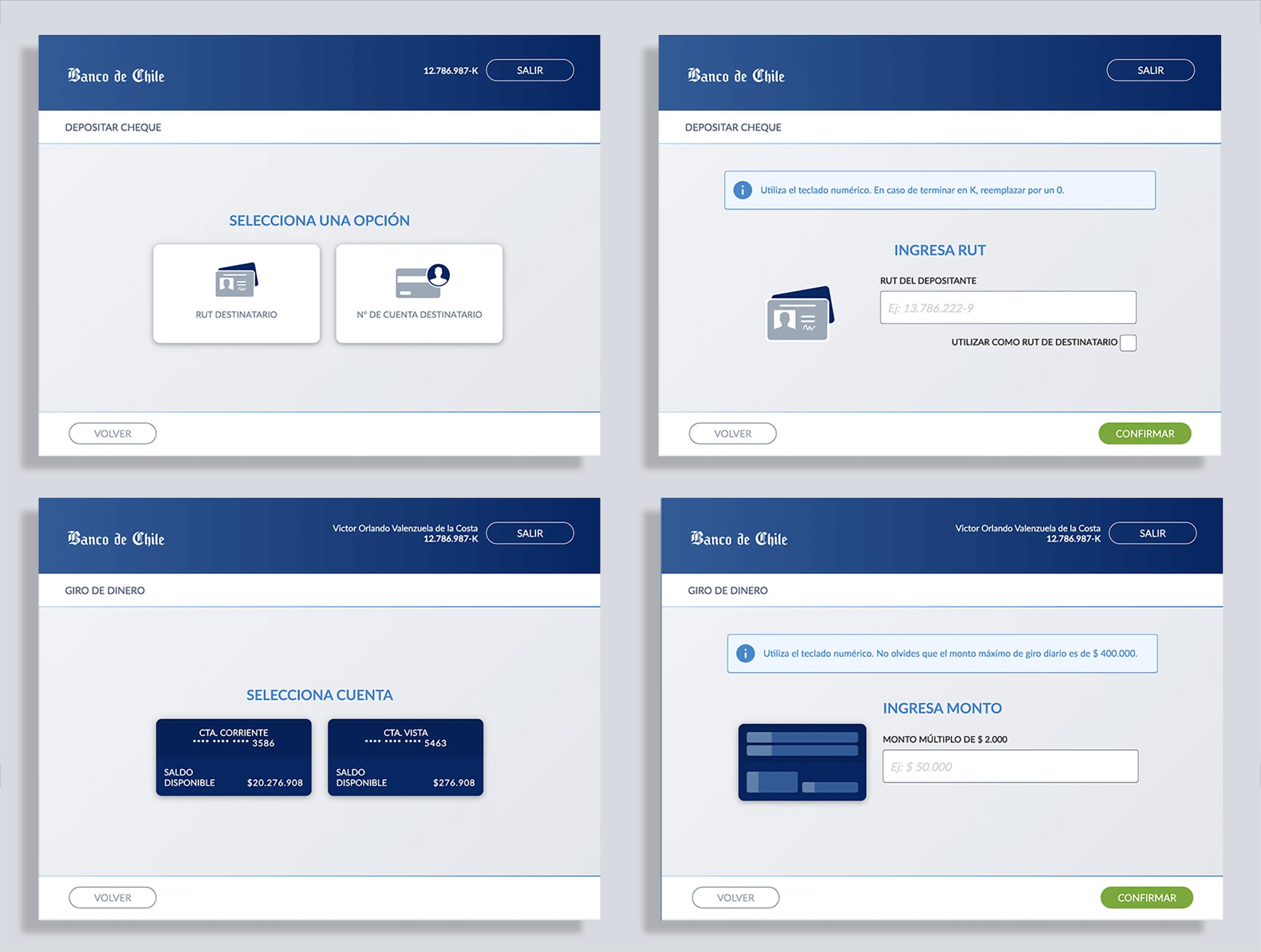
Using minimal resources and elements to create an intuitive and functional experience, avoiding adding questions to the user’s cognitive workload or distracting his attention from the task at hand was key during each stage of the design.
One of the advantages of a touchscreen is it can be customized, changed, or adapted, meaning that if you have new software functionality, we will not be forced to change the machine, something that happens a lot to conventional ATMs.
ALTERNATIVE SCREEN DESIGN
Before concluding, I want to share the alternative design with you.
Concerned about the wide range of users and people with some level of disability, we aimed for a flat design featuring large buttons and typography, clear text fields, and an intuitive user interface—a bold and impactful proposal.
We were also constrained by the Bank Web Kit, which we later decided to replace with the bank’s mobile UI Kit to save development time on new assets and enhance user friendliness. Nevertheless, looking at these screens, I remember how much fun I had working on this project.
Outcome
The new ATM interface launched successfully and was well received by both customers and stakeholders. Some highlights:
- Customer trust & adoption: Seniors and first-time users reported feeling more confident using the new ATMs.
- Operational resilience: During a major banking system outage, the ATMs became the main transaction channel — a strong test of both design and implementation.
- Pixel-perfect delivery: The final product closely matched our Sketch prototypes, thanks to tight collaboration with developers.
Learnings
This project reinforced several lessons for me as a designer:
- Constraints can spark creativity: what seemed like a barrier (the keypad) became an accessibility feature.
- Stakeholder alignment matters: involving decision-makers early in research and design helped secure support and avoid last-minute conflicts.
- Consistency reduces anxiety: a clear, predictable UI can transform intimidating processes into approachable ones.
Most importantly, it reminded me why I love UX design: the chance to turn complex, high-stakes interactions into experiences that feel natural, trustworthy, and empowering for people.
The product was later implemented on a modern touchscreen machine without a physical keyboard, continuing its logical progression.